If you want to get a quick grasp of a long boring data, adding charts and visually representing them is one way of doing it. But, to make it more professional you can opt for an interactive Dashboard.
These Dashboards can illustrate business insights, Key Performance Indicators (KPIs), progress, and so on.
If you also need to make a Dashboard for company deliverables like this, we will guide you on how to do it from scratch.
Dashboard- Overview and its Benefits
Dashboards are the visual representation of a company’s objective progress, customers, finances, marketing, growth, etc. Mostly, managers use this knowledge to create long-term and short-term strategies for their companies through Business Intelligence. Additionally, Dashboards are also significant for reporting business insights to stakeholders.
It contains metrics, target achievement graphs, cost and revenue bar charts, progress bars, a speedometer, etc. that showcase the company’s KPI (Key Performance Indicator). You can choose to decide what components you want to incorporate into your dashboard.
Let us learn how creating a Dashboard can benefit your company.
- A Dashboard with KPIs will help you to track the performance of an area within your company. For example, you can monitor and find out which product was the most sold this week compared to the last week.
- Dashboards are not just dedicated to high-level authorities such as Managers or company owners. In fact, it is displayed to all the employees so that there’s data transparency of the company’s current progress to everyone – ultimately encouraging them to perform better for business development.
- You can observe the real-time progress of the company whether it’s a positive or a negative one. As a result, you can forecast the newer opportunities beforehand and create strategies that will exceed the emerging trends.
Know your Dashboard Type
Generally, there are four types of Dashboards used in businesses – Strategic, Operational, Analytical, and Tactical. So, before you create a dashboard, it’s important you know each type first. And of course, in order to identify them, ask yourself these questions.
- What is your primary objective of creating a dashboard?
- What is your Job Function? Are you a Business owner, Team Lead, or an Expert in a specific field?
- What is the category or department you are trying to represent in the Dashboard? For example, is it a Real-time sales monitoring or the strategic KPIs of a department?
- How long is the Dashboard applicable?
Before we dive into the details, here’s a quick summary of various dashboards.
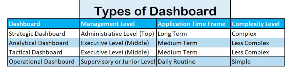
Strategic Dashboard
Strategic Dashboards are used to keep track of the overall company goals and make long-term strategies for business growth. Mostly, the top-level managers of the organization’s hierarchy create strategic dashboards.
Examples: Chief Financial Officer’s Dashboard, SaaS Management Dashboard, Chief Marketing Officer’s Dashboard, Chief Technology Officer’s Dashboard.Analytical Dashboard
Analytical Dashboard, used by the Executive-level managers, is helpful in the company’s decision-making process. A manager studies trends, forecasts upcoming targets, and creates a strategy with the Analytical Dashboard. It differs within the businesses.
Examples: Analytical Dashboard of the FMCG Industry, Digital Marketing Dashboard, Healthcare Analytical Dashboard, Financial Performance DashboardTactical Dashboard
Middle-level managers create a Tactical dashboard to analyze how their unit is accomplishing and progressing with the tasks. Eventually, just like the Analytical, these types of Dashboards also support the decision-making process of a business.
In general, the Tactical dashboards lie in between the Strategic and Operational dashboards. So, it is more detail-oriented and tracks the operations in a real-time.
Examples: Social Media Dashboard, Supply Chain Management Dashboard, Human Resource Management DashboardOperational Dashboard
The Operational Dashboard is used to monitor the short-term (day-to-day) operations of the companies. This type of dashboard is created by the junior level to measure the performance of certain departments within the organization on a real-time basis.
Examples: Marketing KPI Dashboard, Manufacturing Production Dashboard, Website’s Operational Dashboard, Customer Service DashboardHow to Create a Dashboard in Excel
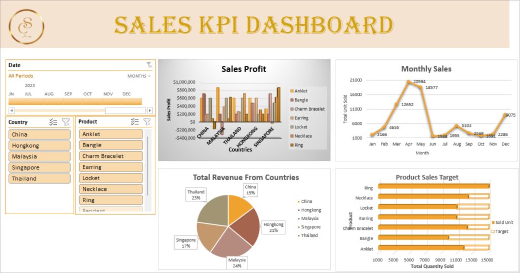
As an example, I will create a Sales KPI Dashboard in Excel.
Step 1: Import Data and Add a Heading
Firstly, prepare your data in an Excel Workbook. If you need to import the data from external sources, use Excel’s Power Query feature. You can import different file formats like JSON, CSV, XML, and many more.
Once you’re ready with all the required records, insert a new worksheet to create a Dashboard. Simply hover over the Sheet tab at the bottom and click on the + icon. Double-click on the Sheet name and enter a New name.
To add a heading, follow the given steps.
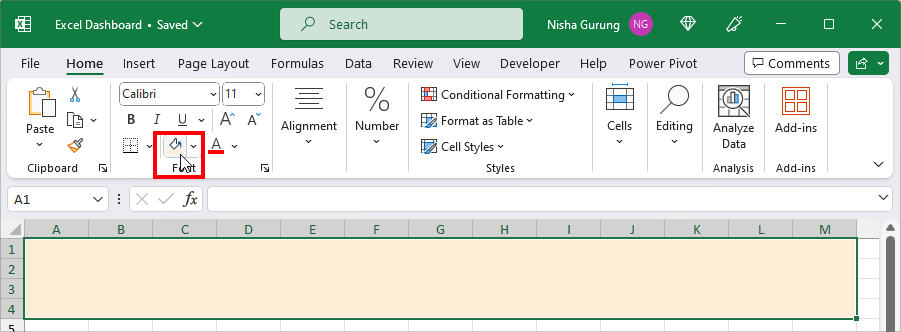
- On a New Sheet, select the Cell ranges and click on Merge and Center in the Home Tab.
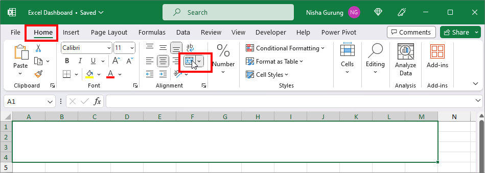
- While the cell range is still selected, Fill color from the Font group.
- Now, head to the Insert Tab. Click on Pictures > This Device.
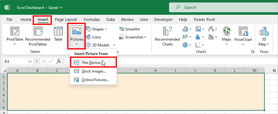
- Select your Company logo and click Insert.
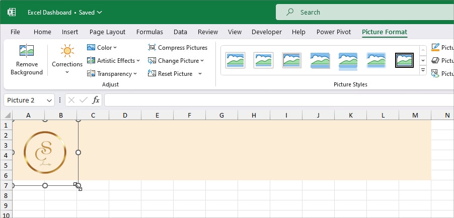
- Adjust the Image Size to fit in the Heading.
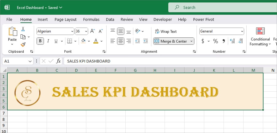
- Double-click on the Merged Cell and type Dashboard Heading. Select the Text and set your preferred Font type, Colour, and Size.
Step 2: Add Pivot Table
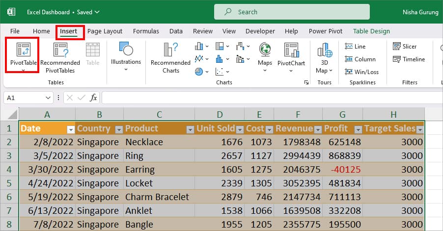
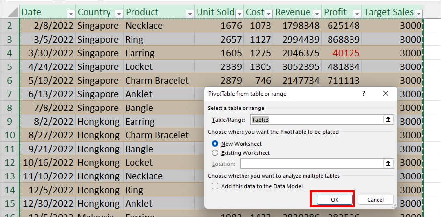
- Go to the Sheet with raw data and Select all. Enter Ctrl + T and confirm in the prompt box to turn them into a Table.
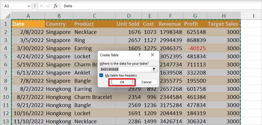
- Select the Table. On the Insert Tab, click on PivotTable.
- On PivotTable from table/range window, click OK.
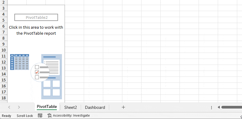
- Now, you’ll have the PivotTable Field List in a new sheet.
- Create a copy of PivotTable Sheet to add multiple charts. Hold down the Ctrl key and select the Sheet. Then, Drag the sheet in between other sheets. Here, I have added 4 copies.
Step 3: Edit Pivot Table
- Go to one of the Sheets with Pivot Table.
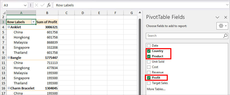
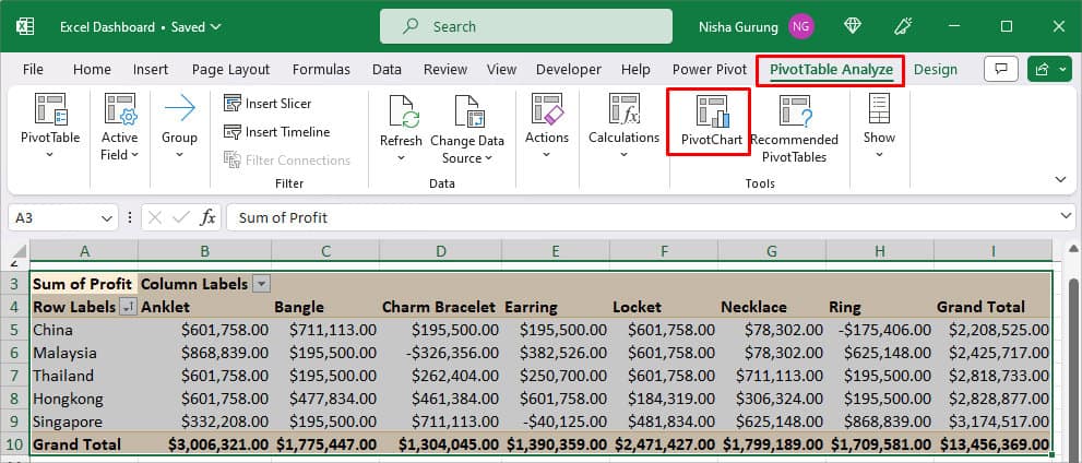
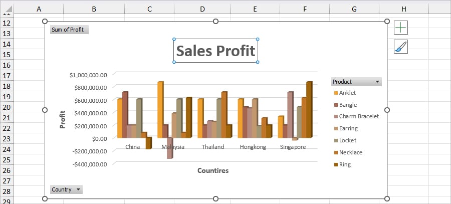
- On the PivotTable Fields, tick the boxes for the Variables you need in the Chart. To show Profit, I checked the boxes for only Country, Product, and Profit.
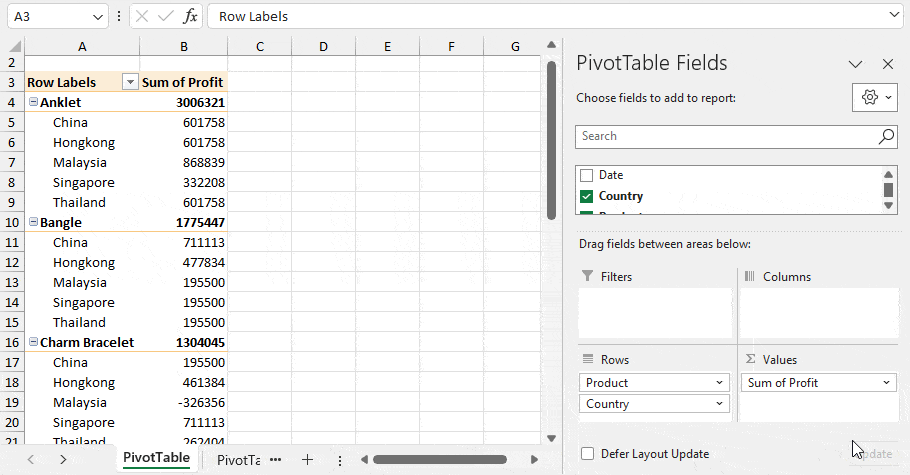
- In case you want any of the variables to be in the columns. Drag and drop the category into the Columns Field.
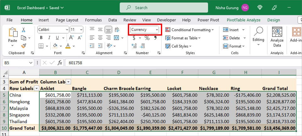
- Select the Data and choose the correct Formatting in the Home Tab. Here, I chose Currency.
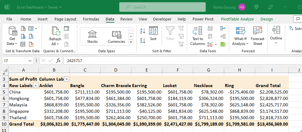
- To know the most to the least profitable country, select the Grand Total Column. Head to Data Tab and click on the A to Z sort order.
For all the other Sheets with the PivotTable field, follow the same steps as above to prepare your data for the chart.
Step 4: Insert Charts
Now, that your Data is ready, you need to choose the appropriate Chart for your data.
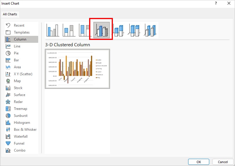
- Select all data in your Pivot Table.
- Navigate to the PivotTable Analyze Tab. In the Tools section, click on PivotChart.
- On the Insert Chart window, hover over each Chart. Select the chart that represents your data the best and click OK. Here, I picked a Clustered 3-D chart for my Data.
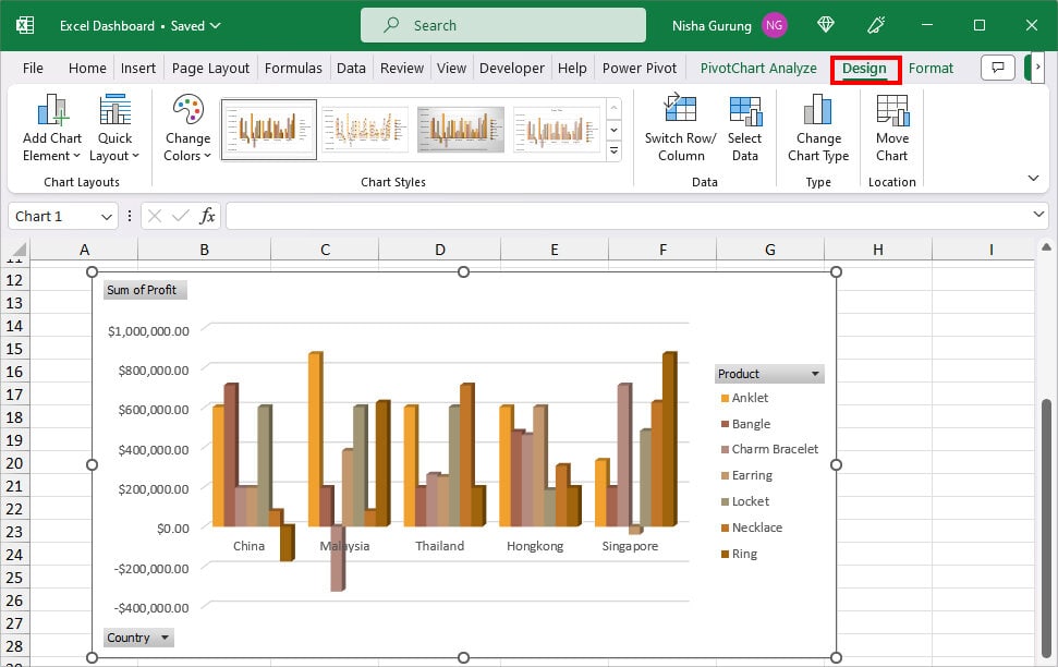
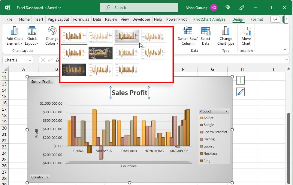
- To edit the chart, click on the Chart area and go to the Design tab.
- Select Quick Layout and pick the one that has a Chart Title and Axis Title. Here, I selected Layout 9.
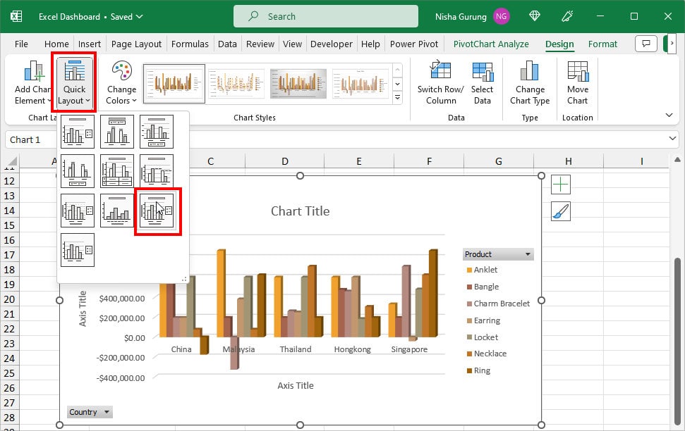
- Rename Chart Titles and Axis Titles.
- From the Chart Styles group, select a Design for your Chart to make it more appealing.
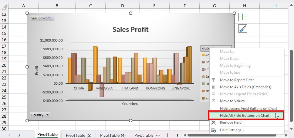
- Right-click on the Field Button and pick Hide All Field Buttons on Chart.
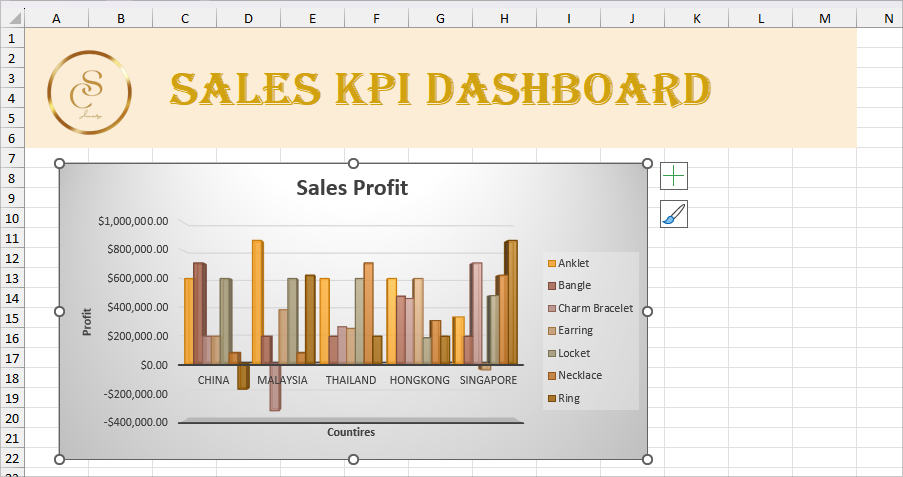
- Once you’re ready, copy the Chart and Paste on onto the Dashboard Sheet.
We followed the same Step 3 and 4 to add other charts. But, we picked a different chart. Here are the Pivot Table Data Source and the Charts we added.
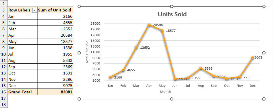
Pivot Table 2 – Line Graph for Units Sold
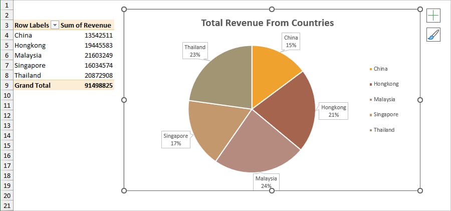
Pivot Table 3 – Pie Chart for Total Revenue From Countries
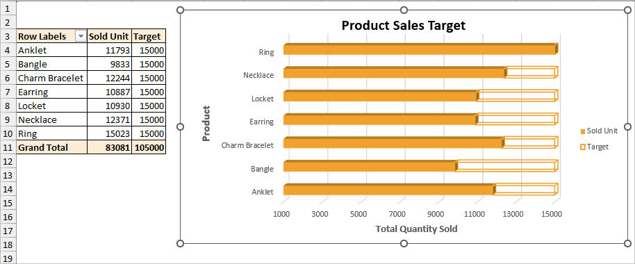
Pivot Table 4: Stacked Bar for Product Sales Target
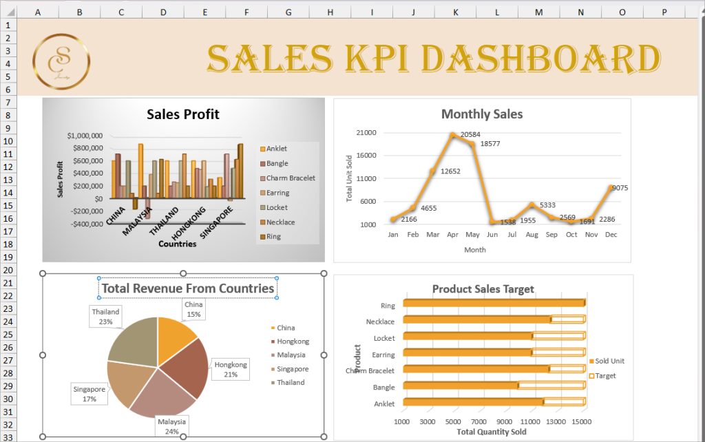
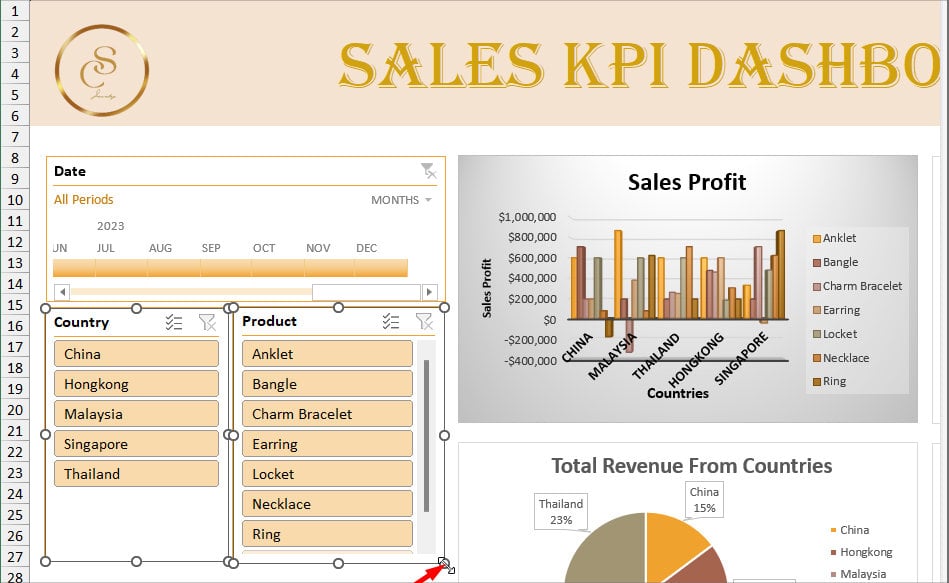
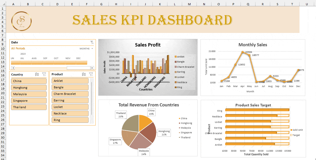
This is what your Dashboard should look like now with all the charts.
Step 5: Insert Slicers and Timeline
Once you have all the charts ready on your Dashboard, add Slicer and Timeline.
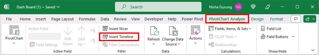
- Select a Chart. Go to the PivotChart Analyze Tab and click on Insert Timeline.
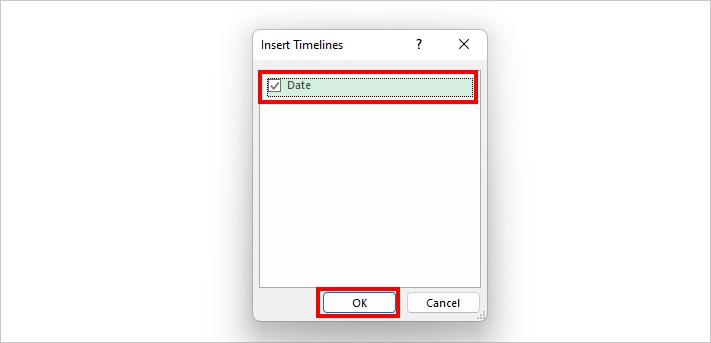
- Tick the box for Date and click OK.
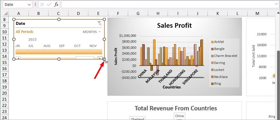
- Adjust the Timeline dimensions and move it towards the left.
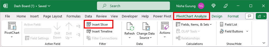
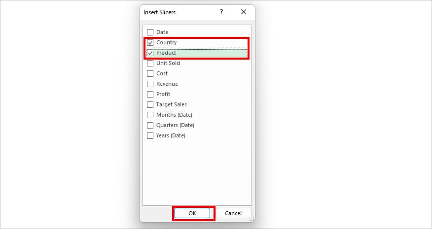
- Again, select Chart and choose Insert Slicer in the PivotChart Analyze Tab.
- On Insert Slicers, tick the box for the categories you wish to display and click OK. Here, I checked the box for Country and Product.
- Again, resize the Slicers dimension and place it just below the Timeline.
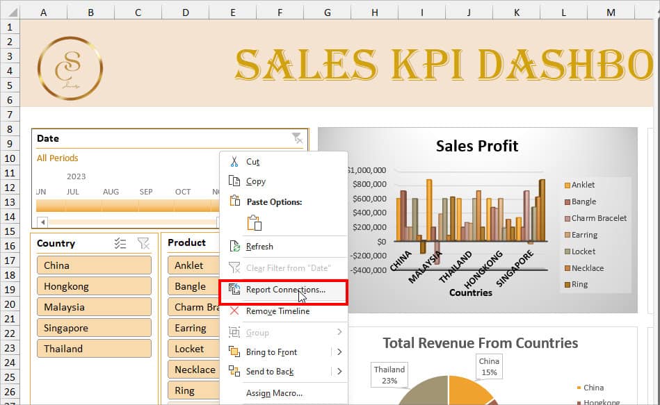
Step 7: Connect Timeline and Slicers to Pivot Charts
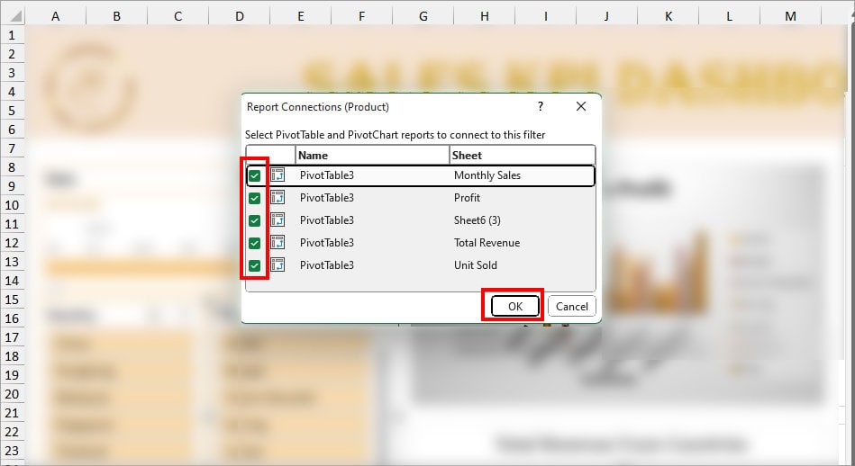
- Right-click on Timeline and choose Report Connections.
- On Report Connections window, tick options for All Pivot Tables and click OK.
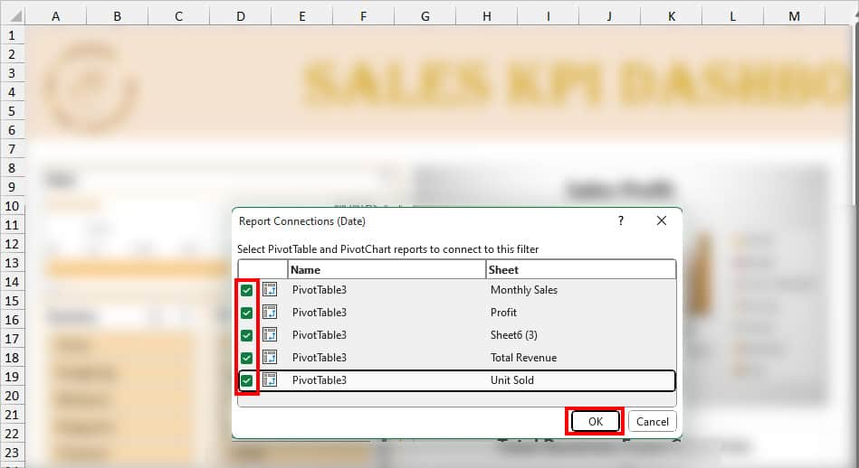
- Repeat the Process for Two Slicers.
Now, you can apply the Filters to change and make your Dashboard more interactive.
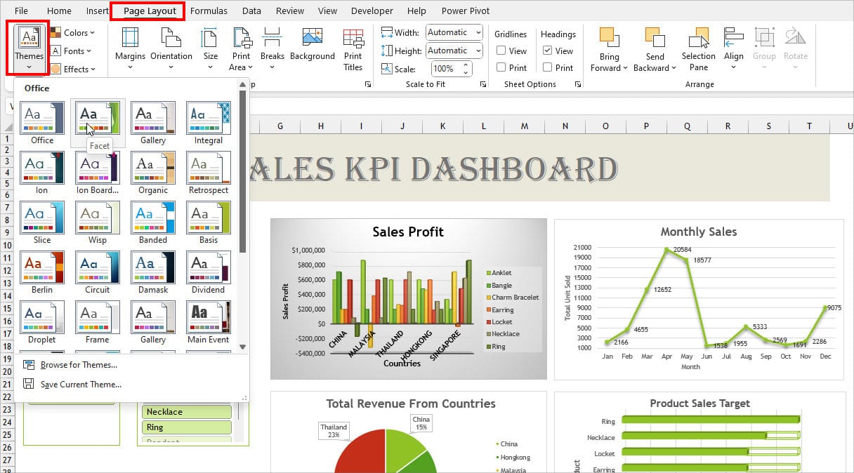
Step 8: Customize Dashboard Theme
- Navigate to the Page Layout Tab.
- In the Themes Group, click on Themes.
- Hover Over each Theme to see the color and click on any one to Apply.
Step 9: Refresh Data in the Dashboard
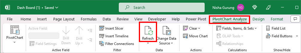
If you remember, we created the Table for our source data in Step 1. So, whenever you add new information within or last adjacent cells, the table will automatically include them too. This means, that simply refreshing the PivotChart is enough to update it.
Select any Chart on your Dashboard and navigate to the PivotChart Analyze tab. In the Data group, click Refresh.
Congratulations! Finally, your Dashboard is ready in Excel. You can now share them with your manager or employees.