Charts like Line, Scatter Diagram, and Columns have two axes (Y-axis and X-axis). The X-axis, also known as the Horizontal axis, represents the text labels like the Time periods, Product Names, Companies, and many more.
If you want to customize the X-Axis at its full potential, here’s how you change the range, scales, position, interval, and categories.
Change X-Axis Scale
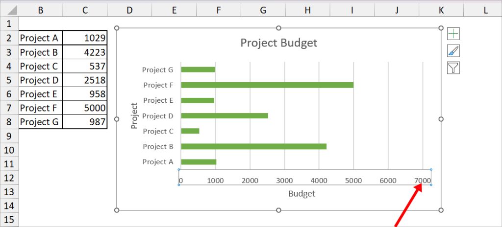
When your X-Axis contains numbers or dates, it can appear either cluttered or too wide initially. This is because of the uneven X-axis scales.
For instance, you have 5000 as the highest value in the original table. But, in the chart, the Axis might be 7000 by default which affects how graph size appears in the chart.
So, you can specify the Bound and Units value to change the Axis scale.
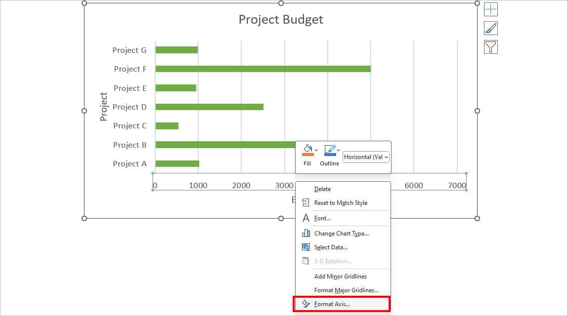
- Right-click on the X-Axis (Horizontal Category) and choose Format Axis.
- Below Axis Options, set the Bounds Value.
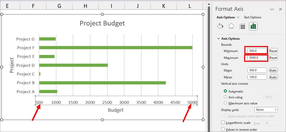
- Minimum: Set the starting value for the graph.
- Maximum: Set the ending point for the graph.
- Under Units, set the Major unit to Specify the distance between each point.
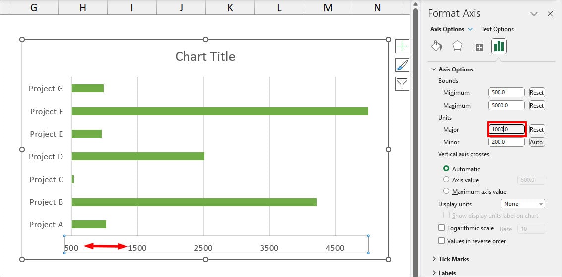
- When you’re done, close the Format Axis panel.
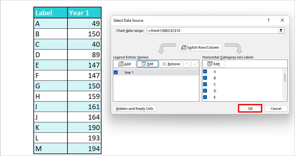
Change X-Axis Range
Excel does not auto-update the Axis ranges unless the data source is in a table format. So, if you’ve added information, here’s how you change the X-Axis range.
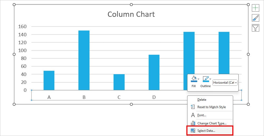
- On your Excel Chart, right-click on the X-Axis and pick Select Data.
- In the Select Data Source window, navigate to Horizontal (Category) Axis Labels and click the Edit Button.
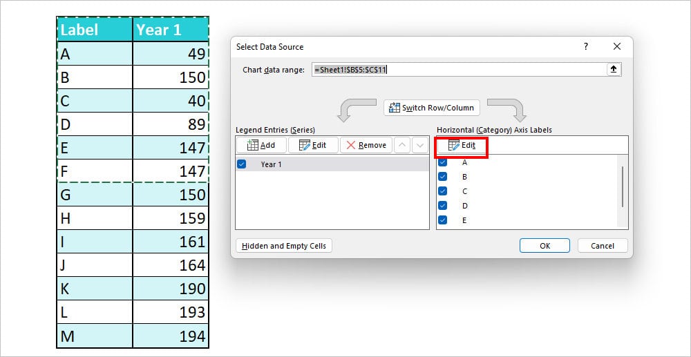
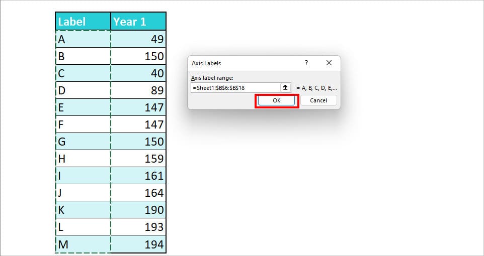
- On the Axis label range, click the Collapse button and select the Data source on your sheet. Click OK.
- Again, under Legend Entries Series, choose Edit. Select the Series Values and choose OK.
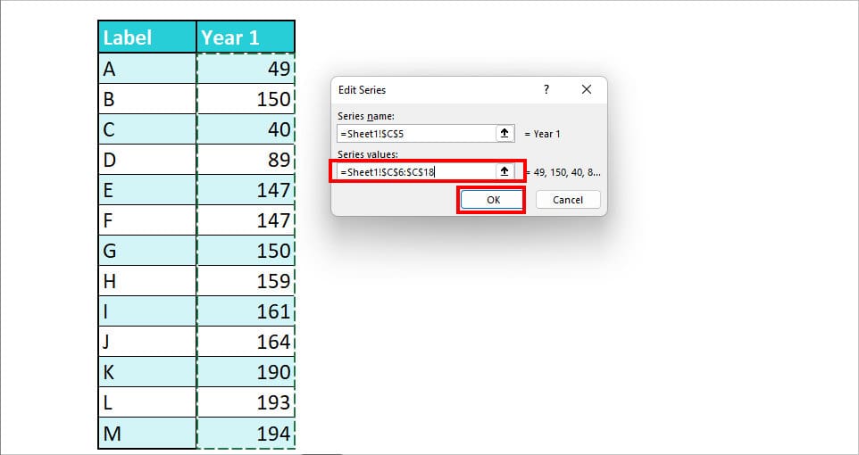
- Hit OK.
Change X-Axis Position
By default, almost all charts have an X-axis at the bottom. However, for some charts like Gantt Charts, you would want your X-axis to be on the top. Or maybe in a different location. For this, you can change the Label Position.
- Double-click on the X-axis range of your chart to bring up the Format Axis.
- Expand the Labels menu. On Label Position, choose any one option.
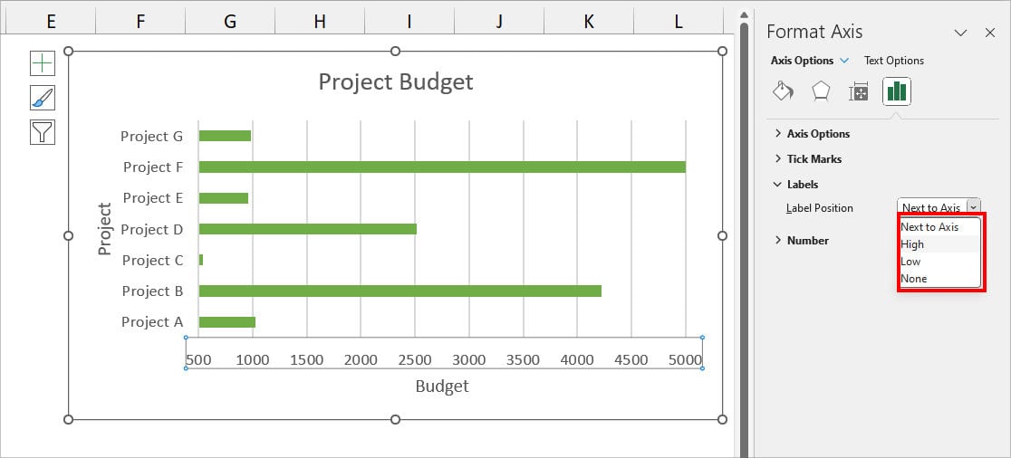
- Next to Axis: Default X-Axis position
- High: X-Axis on Top of the Chart
- Low: X-Axis on the bottom of the Chart
- None: Removes X-Axis Label
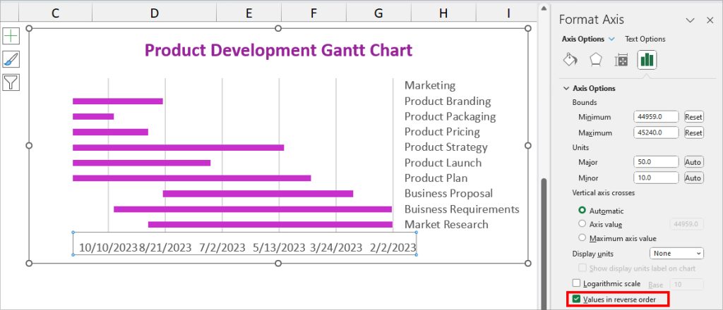
Change X-Axis in Reverse Order
Suppose you need the X-Axis range in the reverse order. Now, manually editing the data source would be extremely tiring and change the entire chart.
So instead, you can change only the formatting of the X-Axis range in Reverse order while keeping the original data source intact.
Click on the X-Axis Range of your Chart twice. At the bottom of the Axis Options menu, check the box for Values in reverse order.
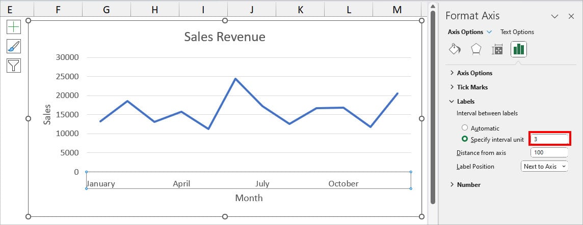
Change X-Axis Interval
If you have Text strings in the X-Axis Range, like the Months or Weeks, you’ll have all of them included in the Chart. But, let’s say, you want to have an interval between those values.
For instance, 3 months Gap in X-Axis like Jan, Apr, Jul, etc. For this, you can set the Interval between those values.
- Right-click on the X-axis and choose Format Axis.
- Expand the Labels menu. Below the Interval between labels, choose Specify interval unit and enter a number. As an example, I typed in number 3.
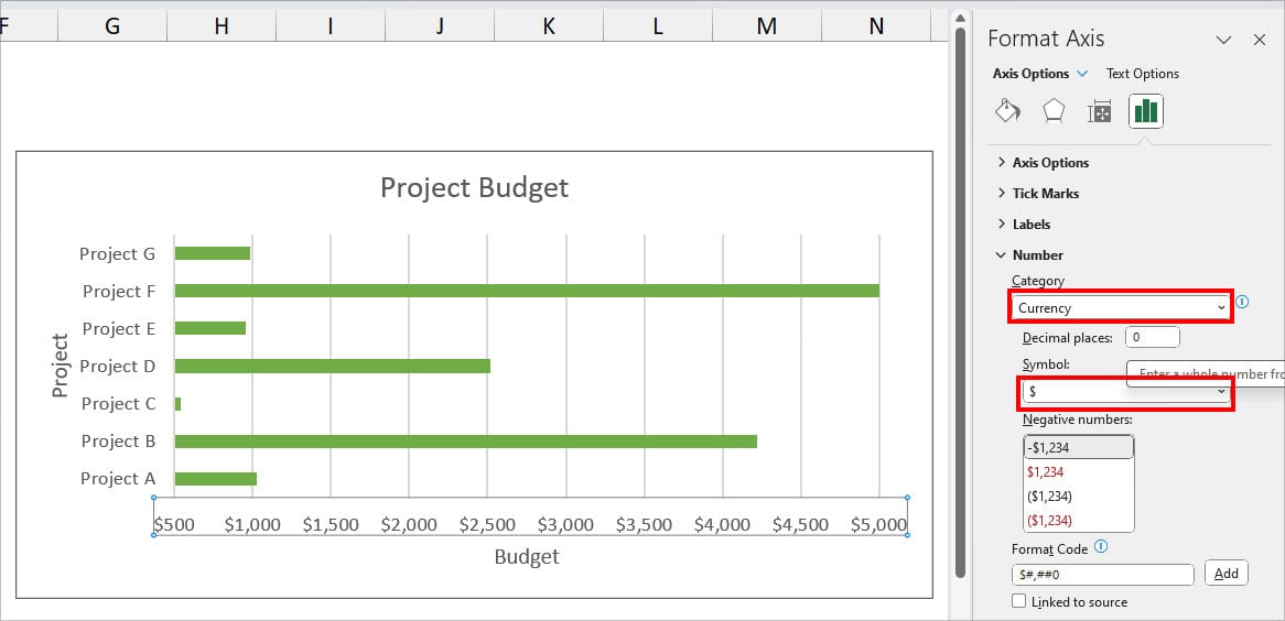
Change X-Axis Number Category
For Number labels in X-Axis, you may find the need to format them as Date, Currency, Time, Fraction, Percentages, and many more.
Here, as an example, I will change the number to Currency format.
- Click on the X-axis range twice.
- On the Format menu, go to Axis Options and expand the Number section.
- On Category, click on the Drop-Downlist and choose any one Number Formatting. You’ll get the Sub-menu for each format type.
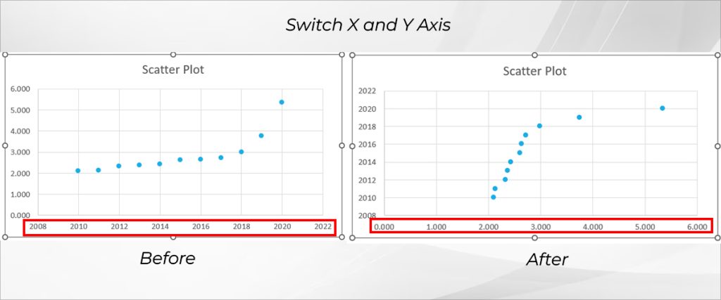
Switch X and Y Axis
When you plot a chart, we all know that the Y-axis appears on the left part and the X-axis at the lower part of the chart by default. However, you can switch the X and Y Axis Positions whenever needed.
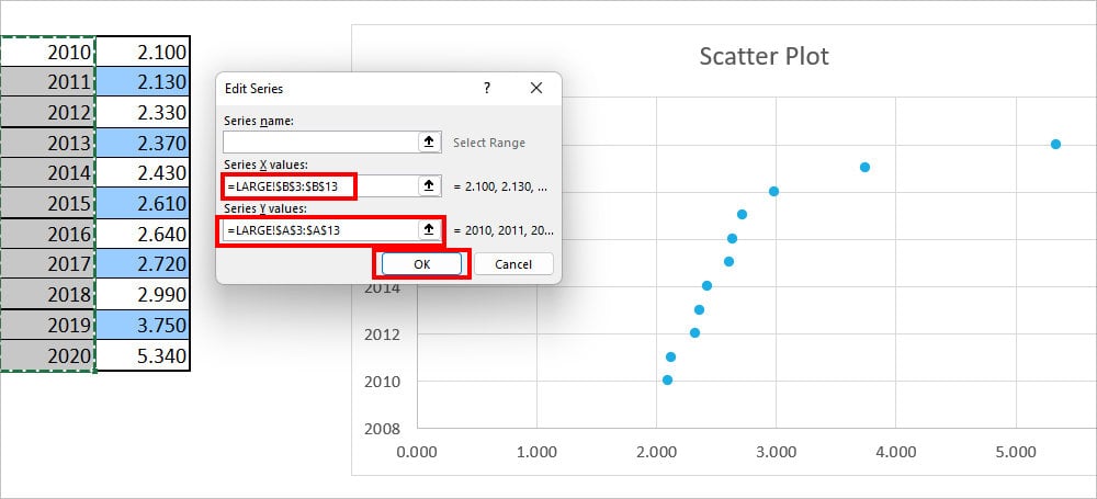
In this example, I will switch the X and Y axes for the Scatter Diagram.
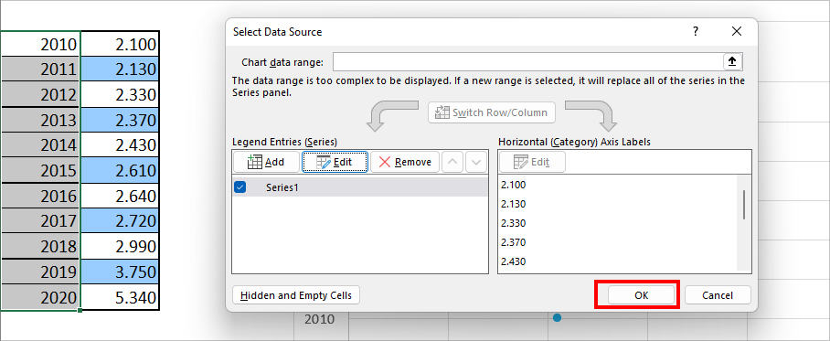
- Right-click on the X-Axis Range and click on Select Data.
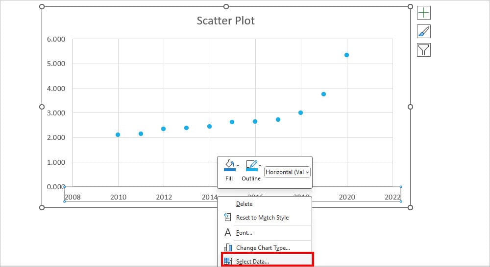
- Under the Legend Entries(Series), click Edit.
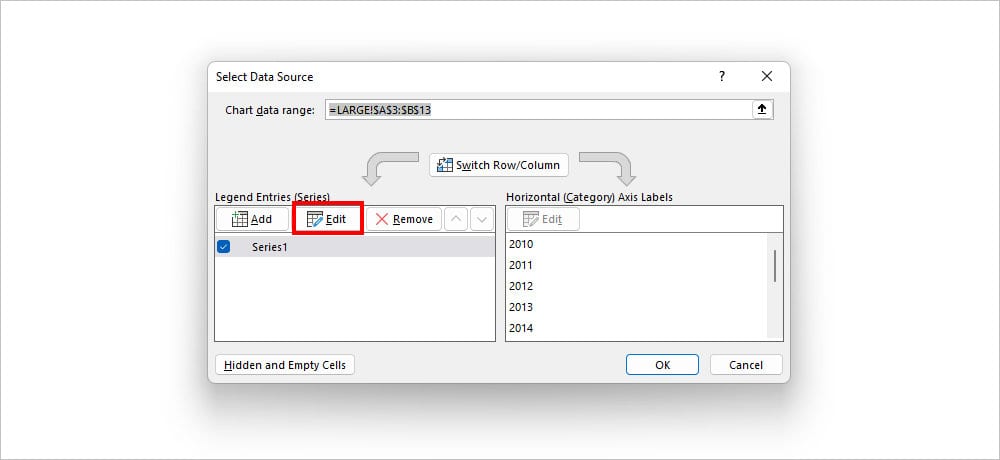
- On the Series X values, use the Collapse icon and select the cell ranges of Y. Similarly, on Series Y values, select the X-Axis cell ranges using the collapse icon. Click OK.
- Again, hit OK.
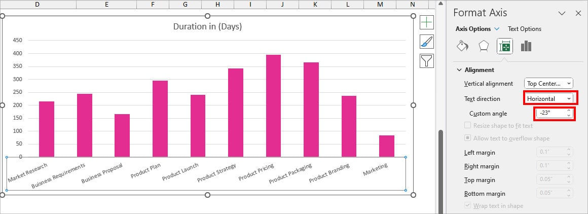
Customize X-Axis
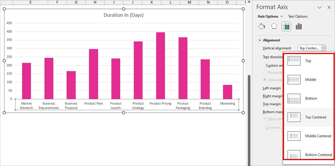
If you have long words in the X-Axis Lables, they can spill and overlap with the next points. During that case, change the Text Direction and Alignment to organize your labels.
- Double-click on the X-Axis to bring the Format Axis Menu.
- On Axis Options tab, head to the Alignment section. On Vertical alignment, expand the drop-down and choose an Alignment.
- Then, expand the drop-down for Text direction and choose the Orientation. Or, on Custom angle, increase/decrease the angle.