According to Linearity, it is easier for the brain to retain data when they’re visually represented. Especially for larger data sets, it is always a good idea to illustrate your data with color-coded formatting, charts, and graphs.
Excel is a powerhouse when it comes to analyzing data. It also contains many data visualization tools, including 19 types of charts, heat maps, and 4 library icon sets.
We’ll be going through these tools and discuss what data they best represent through examples!
Charts in Excel
Charts are best used to monitor performances and analyze results. If you’re creating a presentation to compare annual sales, represent it in a chart.
Excel offers a variety of charts from simple bar charts to even map charts! Each chart is usually of these types:
- Clustered Chart: Visualize your chart in a 2-D format that includes the horizontal (X), and vertical (Y) axis.
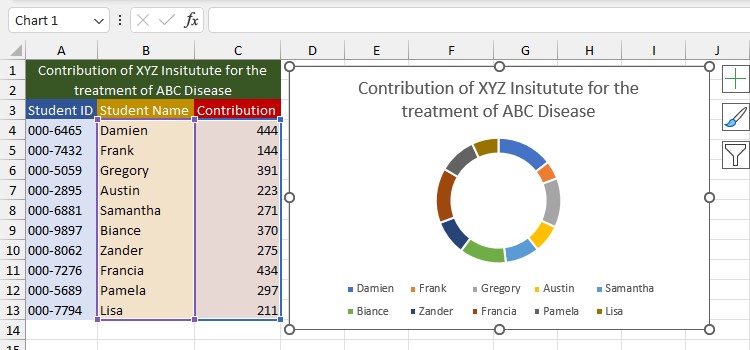
- Stacked Chart: Illustrates the contribution of each data value in the entire data set.
- 100% Stacked Chart: Show the relative percentage of each data value in the set. The total value of one stacked chart is equal to 100.
- 3-D Chart: Includes a third axis called the depth (Z) axis.
To insert charts in Excel, first select data. Then, go to the Insert tab. On the Charts section, click on the chart you wish to insert.
If you’re unsure of what chart to use, select your data and click on Recommend Charts from the Charts section to get suggestions.
With that, let’s see every chart in detail.
Column Chart
Column charts are vertical bars that represent items on the horizontal (X) axis and frequency on the vertical (Y) axis.
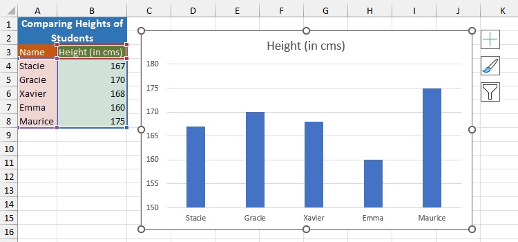
Column charts are clustered, stacked, 100% stacked, and 3-D column charts. These charts (except 3-D column charts) can be formatted to show values in 2-D or 3-D.
Line Chart
A line chart is used to show trends over a specific interval. When data increases, the line flows vertically upwards. Similarly, if the progress declines, it moves down the chart.
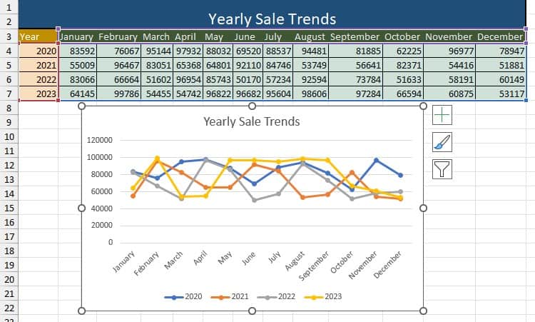
Excel offers line charts, stacked line charts, 100% line charts, and 3-D line charts. You can insert markers representing the data value specified on your data set.
Pie Chart
A pie chart illustrates the total composition of an object or a task. If you need to break the pie chart further down, insert either a pie of pie or a bar of pie chart instead of a pie chart.
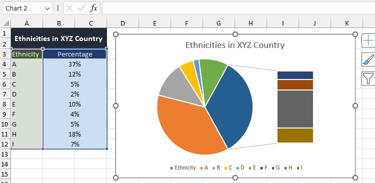
Excel allows you to format these charts in both 2-D and 3-D format.
Doughnut Charts
A doughnut chart is similar to a pie chart, except it can also be used to display negative values in the chart. The data value in a doughnut chart is represented in percentages that sum up to 100%
Bar Chart
Data values in a bar graph are represented as horizontal bars. The bar stretching the farthest is the greatest value, while the bar closest to the Y axis is the smallest value.
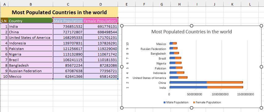
You have the option to insert bar charts as clustered, stacked, or 100% stacked.
Area Chart
An Area chart looks quite similar to a line chart. While they both display trends, an area below the plotted lines in an area chart is filled with a color. This makes data analysis easier when there are multiple trends to follow.
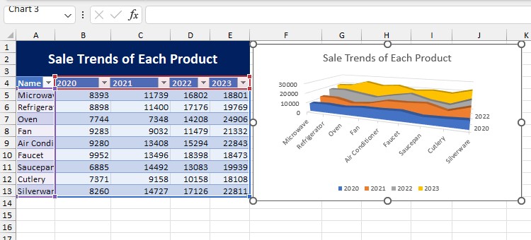
Area charts are of three types: Area chart, stacked area chart, and 100% stacked area chart. Excel offers all three area charts in 2-D and 3-D formatting.
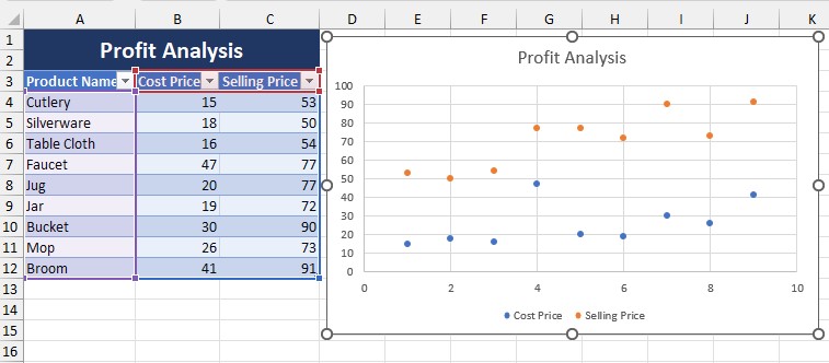
Scatter and Bubble Chart
Scatter and Bubble charts establish a relationship between two data sets. If you’re trying to visualize the cost of making and the total profit made on a product, creating such plots is the correct way to go.
Create scatter charts with just the markers, smooth lines, or both—smooth lines and markers. Similarly, you have the option to insert scatter lines with straight lines or straight lines with markers.
For bubble charts, formatting is available in 2-D and 3-D effects.
Stock Chart
As the name gives it away, the stock chart is handy when it comes to monitoring the rise and fall of stocks.
If you’ve scrapped such data from the web, create a stock chart to visualize how the stock you’ve invested in is performing in the market.
A stock chart is also useful in tracking geographical data such as temperature rise and annual precipitation.
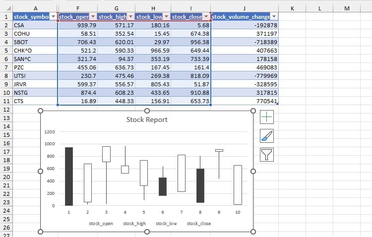
There are multiple types of stock charts depending on the number of your data series in Excel. These types include High-low-close, Open-high-low-close, Volume-high-low-close, and Volume-open-high-low-close.
For Excel to identify your data, always label and arrange them according to the chart type.
Surface Chart
Surface charts are mostly used by engineers and geologists to determine the elevation of an area. Surface charts use three variables when plotting data, making it a 3-D chart.
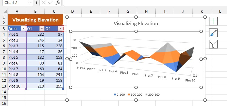
Surface charts are of four types in Excel consisting of 3-D surface, wireframe 3-D surface, contour, and wireframe contour chart.
Radar Chart
Radar charts, also referred to as spider charts, are used to compare items on a specific characteristic.
If you’re quantitatively comparing the qualities of products, use radar charts to spot which feature a certain product stands out the most.
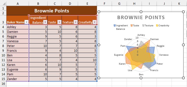
You can insert markers with markers or even fill them up with colors in Excel.
Other Charts (Available for Excel 2016 and Later)
The above-mentioned charts are available in all versions of Excel. However, if you’re on Excel 2016 or later, you have the option to insert other charts including:
- Treemap chart
- Sunburst chart
- Histogram charts
- Box and Whisker charts
- Waterfall charts
- Funnel charts
- Combo charts
- Map chart
Heat Maps
A heat map is a visualization technique where you color-code numbers according to their values. Heat maps are excellent for when you’re analyzing weather reports, profit-loss, and even a mark sheet.
Excel offers six 3-color and 2-color scales to create heat maps. Additionally, you have the option to customize the color palette to create a heat map.
You can create heat maps on Excel range, tables, and even PivotTables.
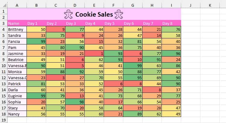
Let’s create a Green-Yellow-Red color scale heat map in the sales sheet below:
- Select range B4:I18.
- From the Home tab, select Conditional Formatting from the Styles section.
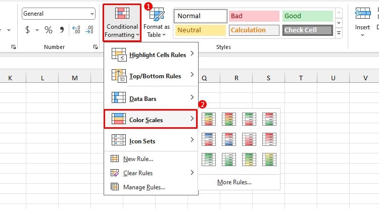
- Click Color Scales > Green-Yellow-Red color scale.
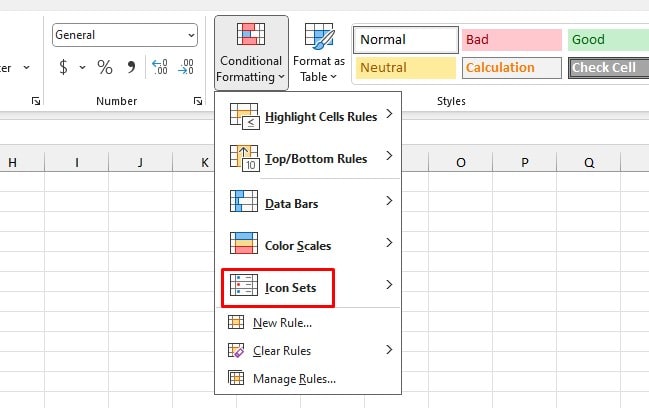
Icon Sets
Icon sets are a part of the conditional formatting utility. You can insert icons on your data set based on a hierarchy or a custom rule.
There are four types of icons—Directional, Shapes, Indicators, and Ratings.
Directional
Directional icons show if the values have increased, increased, or remained constant in the form of arrows.
Excel allows you to choose from seven sets of arrows when inserting directional icons. Use directional icons when analyzing financial data such as a sales report.
Let’s enter directional icons to compare the sales made by Julie in twenty days:
- Select range B4:B23.
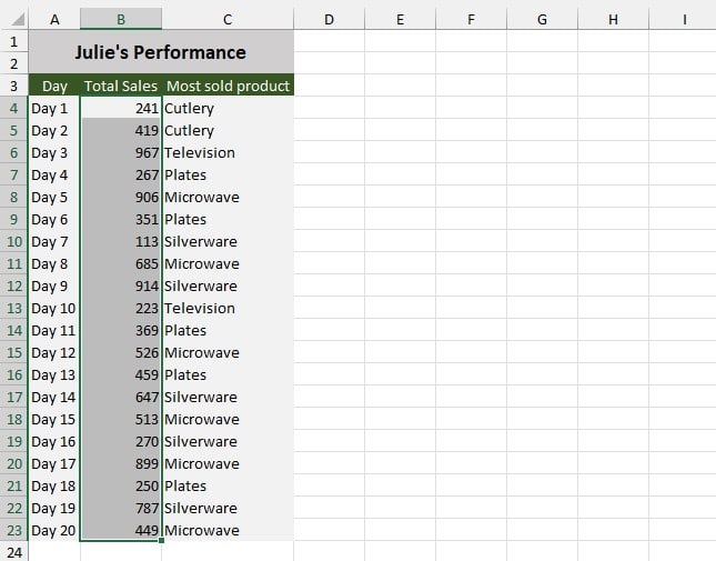
- Go to Home > Conditional Formatting > Icon Sets.
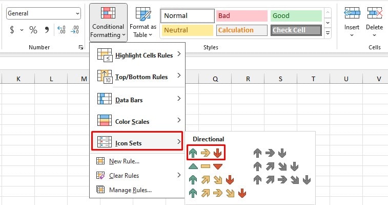
- Select the 3 Arrows Icon.
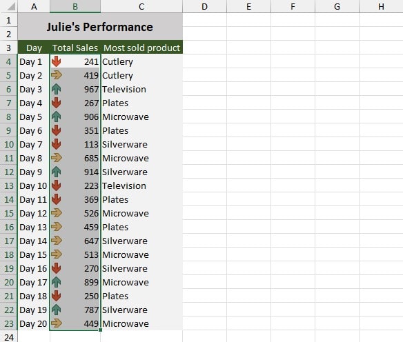
According to the results, Julie’s performance is not that great.
Shapes and Indicators
As Shapes and Indicators are more or less the same, I’ve grouped them under the same category.
Let’s review my expenses for the past six months as an example. I’ve set a budget of $50-$100 for each category. However, I’ve gone over budget in a few areas.
We’ll be inserting shapes to make this visualization:
- Select range B2:G13
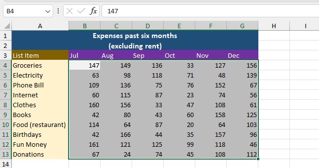
- Go to Home > Conditional Formatting > Icon Sets.
- Click More Rules.
- Select the Reverse Icon Order button.
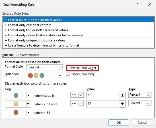
- Click on the fly-out under Type and change them to number.
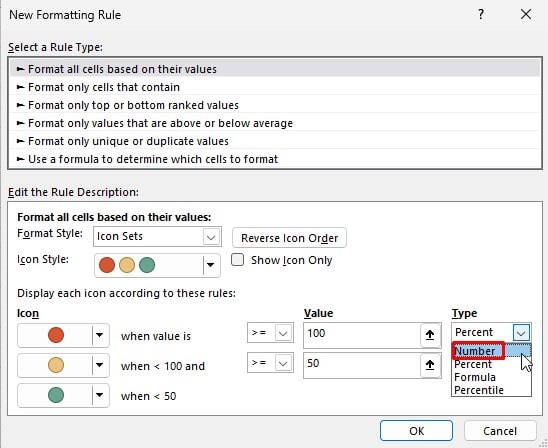
- Next to the red icon, enter 100 and enter 50 below.
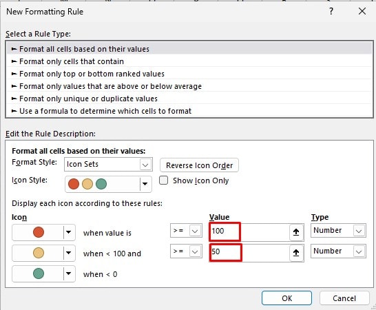
- Select OK.
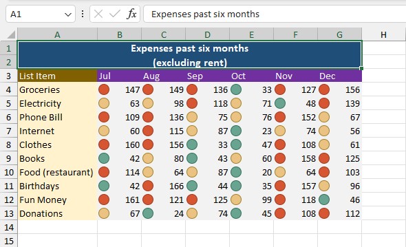
As the data illustrates, I have gone over my budget every month except October. This might be my sign to start budgeting more seriously!
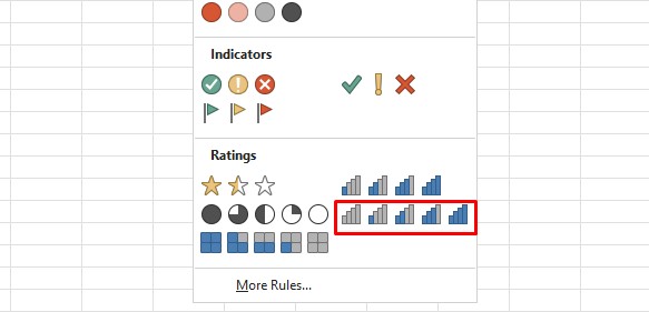
Ratings
Excel offers five types of rating icons. You can represent your ratings in the form of 3 stars, 5 quarters, 4 boxes, 4 ratings, and 5 ratings.
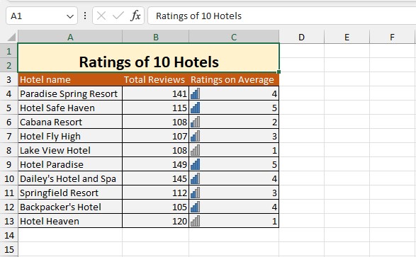
In this table, I have the total rating of 10 different hotels on a scale of 1-5. Let’s enter the 5 ratings icons to represent these icons.
- Select range C4:C13.
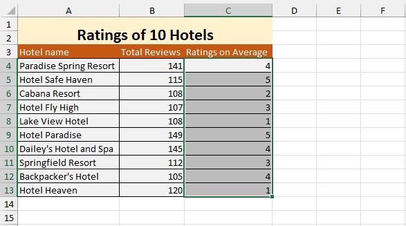
- Go to Home > Conditional Formatting > Icon Sets.
- Under Ratings, select 5 Ratings.
According to the illustration, Hotel Safe Haven and Hotel Paradise have the highest ranges. Whereas, Hotel Heaven and Lake View Hotel have the lowest ratings on average.
Use Analyze Data in Excel (Excel 365)
If you’re on Excel 365, use Excel’s Analyze Data feature to visualize your data set.
Excel uses its smart AI in the Analyze Data tool to generate meaningful visuals, mainly charts and PivotTables.
In this sheet, we have a stock report. Let’s analyze this data using the Analyze Data tool.
- Select range A4:J13.
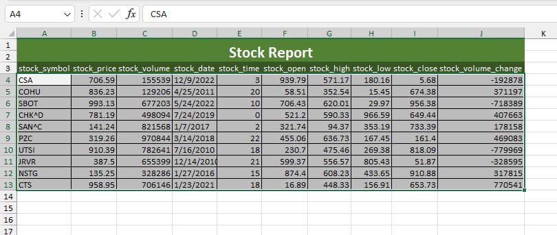
- From the Home tab, select Analyze Data.
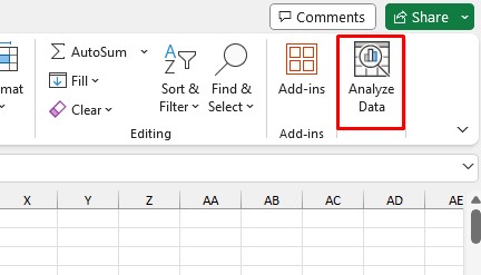
- Look for appropriate charts and tables under Discover Insights.
- Select Insert Chart.

Visualize Excel Data via Power BI
If you frequently need to visualize data, load your Excel sheet to Power BI.
Power BI is a Microsoft 365 E5 package and is a powerful visualization utility. Using Power BI, build visuals using all sorts of charts, graphs, and data tables.