Whenever you edit your chart data source, Excel does not update the changes in charts automatically. So, you’ll find the need to refresh Excel charts every now and then. For this, most beginners tend to recreate charts from scratch or re-format them.
But, what if I tell you there’s a trick to auto-update charts that’ll help you gain your momentum?
Well, you can create a Dynamic chart so that the values you change in the data immediately reflect in the charts.
Auto-Update Existing Chart
The simplest and easiest way to update charts is by using the Table. One of the best functionalities of Excel tables is that it instantly include the extra values you’ve added. If you need to make your existing charts dynamic, here’s how you do it.
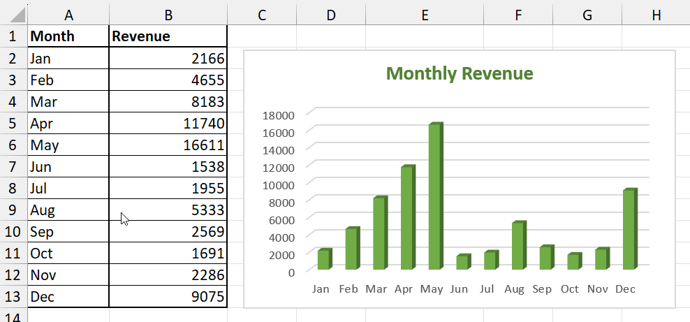
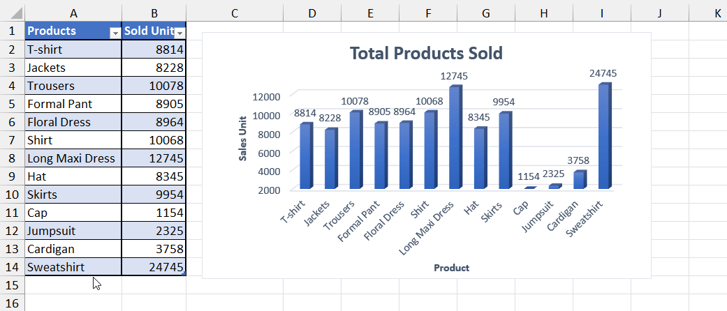
Example: Take, for instance, I need to update the Products and Sold Units in the chart.
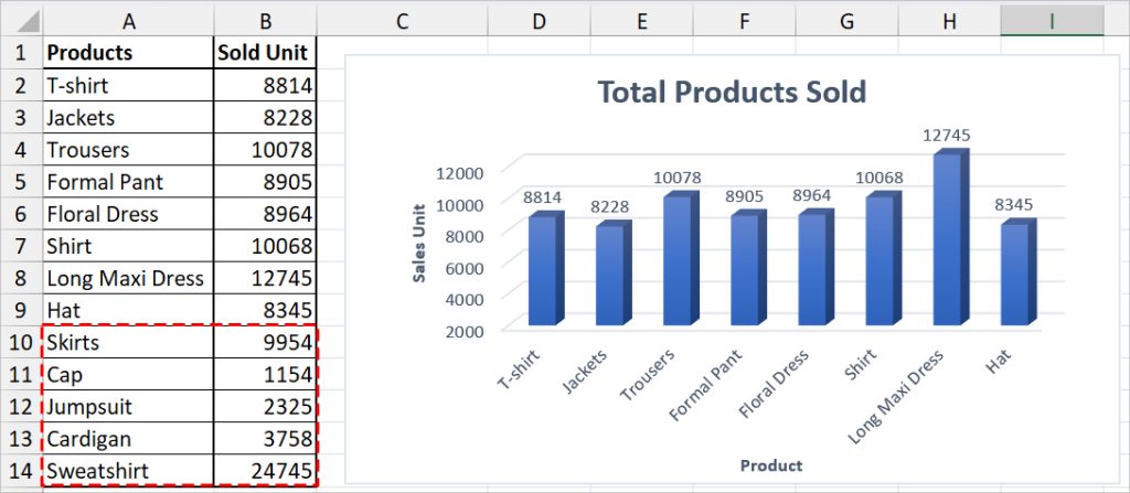
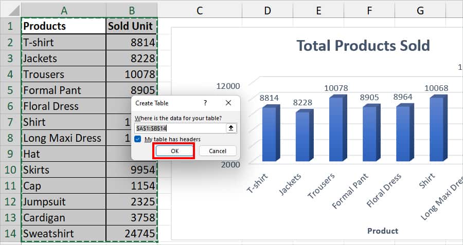
- On Excel, select your Data range and press the Ctrl + T shortcut key to convert it into a table.
- On the prompt box, tick on My table has headers. Then, click OK.
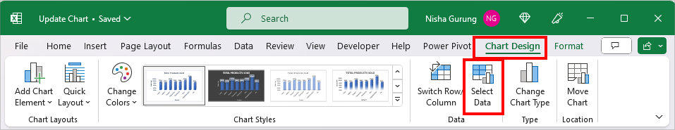
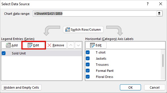
- Now, click on your Chart and head to the Chart Design Tab. In the Data group, click Select Data.
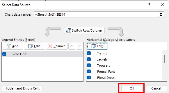
- On the Select Data Source window, click Edit below the Legend Entries.
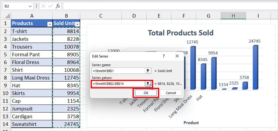
- On Series values, click the Collapse icon and select the Table range on your sheet. Click OK.
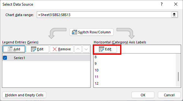
- Again, on the Select Data Source window, click Edit below the Horizontal (Category) Axis Labels.
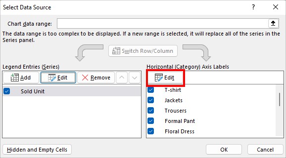
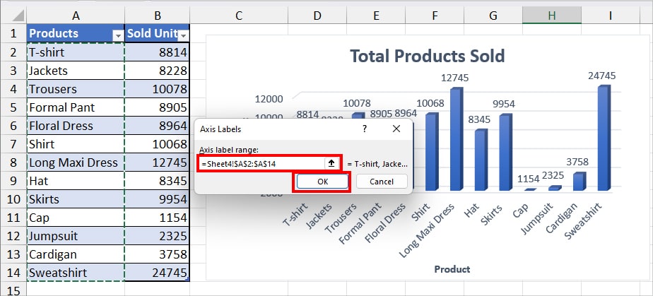
- On the Axis label range, use the collapse icon and select all ranges. Hit OK.
- Again, click OK.
Now, once you add a new item to the Table, Excel will auto-update them in the charts.
Create a New Dynamic Chart with Table
If you haven’t inserted the chart yet, you can create a dynamic chart. Here, we will apply a table format and create a Pivot Chart so that you can simply use the Refresh button to update the additional range.
With this method, you can directly update charts without even refreshing the Pivot Table. This is my go-to method for adding any charts – especially when I need to create Dashboards.
- Select your raw data source in the sheet. Enter Ctrl + T to apply a Table. Tick the option for My Table has headers and click OK.
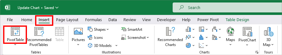
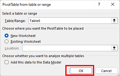
- Select your Table and navigate to the Insert Tab. In the Tables group, click on the Pivot Table.
- On the PivotTable window, hit OK. (To avoid cluttering your sheet, we will import the Pivot Table to a new sheet.)
- Now, open the Sheets that contain PivotTable.
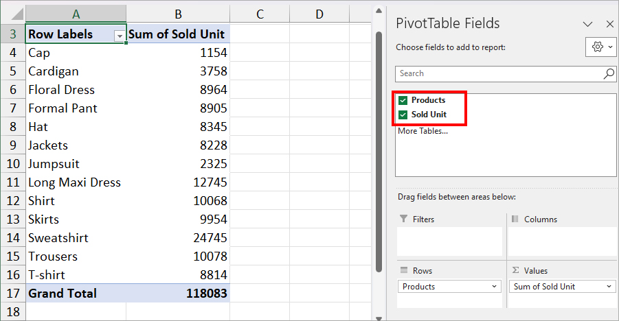
- Below the PivotTable Fields, tick the box to choose the Categories to plot in the chart.
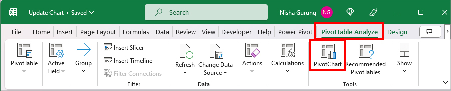
- Select the Pivot Table and go to the PivotTable Analyze tab. In the tools group, click PivotChart.
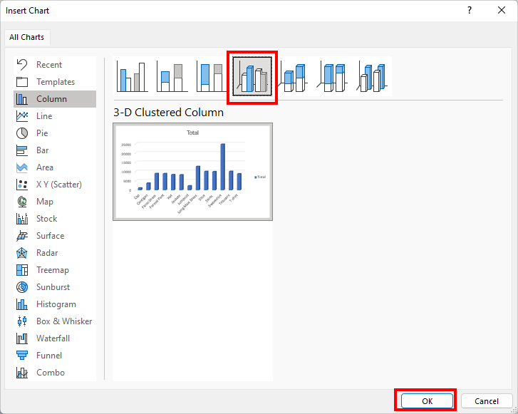
- On the Insert Chart, select a Chart. Click OK.
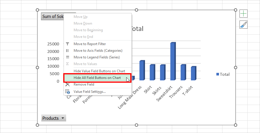
- Right-click on the Field Buttons and select Hide All Field Buttons on Chart.
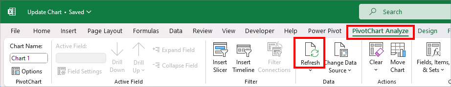
Now, whenever you want to update the chart, select the Chart. From the PivotChart Analyze group, click on Refresh.
Create a New Dynamic Chart with Formula
Another way to create a dynamic chart is by using the formula. This approach is for users who do not want a Table in their data.
Firstly, we will add Named ranges for the Data. Then, in the Named Ranges, we will be using the OFFSET and COUNTIF functions to reference and return the values. Finally, we will plot a chart with that Named Range.
Step 1: Create a Define Name
As an example, I have two columns which is why I will create two Named Ranges here.
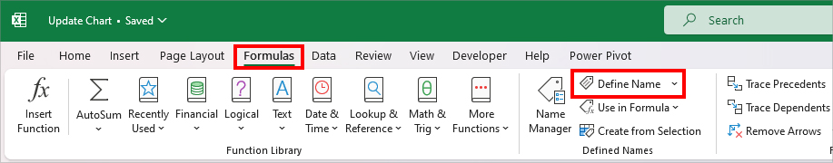
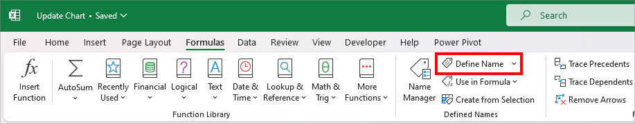
- Firstly, head to the Formulas Tab.
- From the Defined Names, click on Define Name.
- Enter a Name in the Name Field.
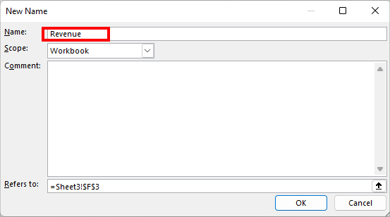
- On Refers to, type in the formula as
=OFFSET(Sheet3!$B$2,,,COUNTIF(Sheet3!$B$2:$B$13,"<>")). Click OK.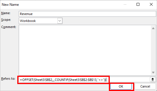
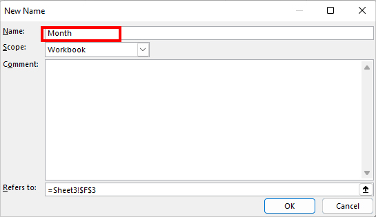
- Again, to create another, select Define Name.
- In the Name Field, type in the Name.
- On Refers to, enter this formula
=OFFSET(Sheet3!$A$2,,,COUNTIF(Sheet3!$A$2:$A$13,"<>")). Then, click OK.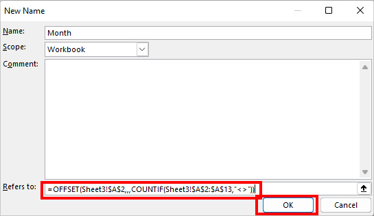
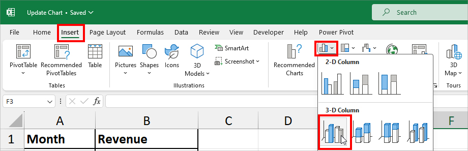
Step 2: Insert Chart
- Go to Insert Tab. Select the Chart to add to your worksheet. Here, I chose 3-D Column.
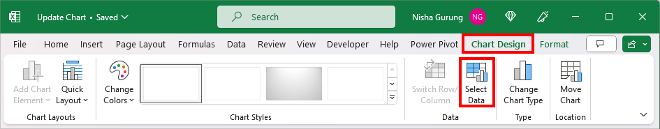
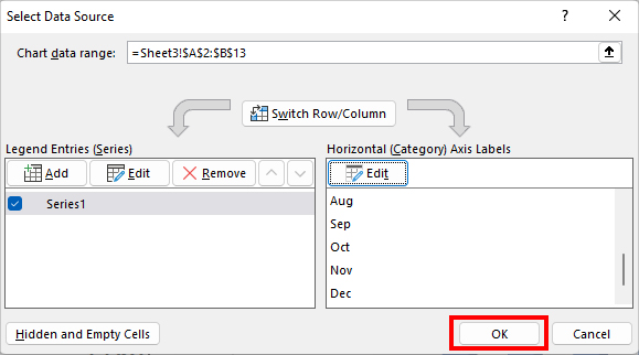
- While the chart is still selected, navigate to the Chart Design Tab and click on Select Data.
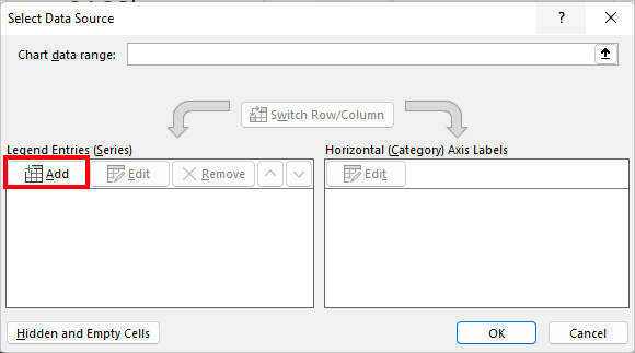
- On the Select Data Source, below the Legend Entries, click Add.
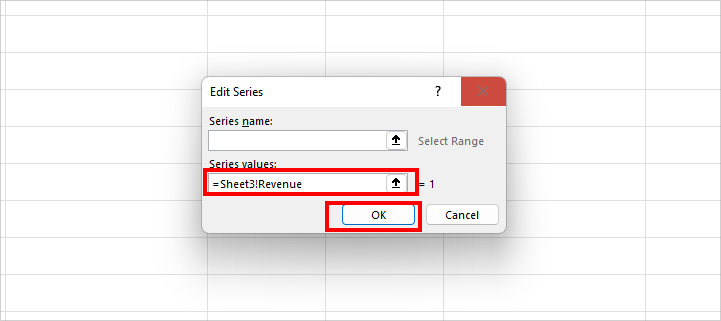
- In Series Values, enter =YourSheetName!DefineName1 and click OK.
- Again, on the Select Data Source window, click Edit below the Horizontal (Category) Axis Labels.
- Enter the
=YourSheetName!DefineName2in the Axis label range field and hit OK.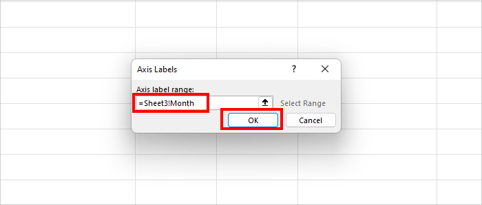
- Click OK.
That’s it! You’ll have a Dynamic chart in your sheet. When you add or delete the data series, it’ll immediately refresh the chart too.