If you want to represent the most significant value from a Pie Chart, create a Pie of Pie Chart.
As the name itself says, a Pie of Pie Chart contains two Pie charts. Here, the secondary Pie represents the detailed visualization of the Main Chart’s slice. It is best to use when you have a lot of data but wish to focus only on one part.
As an example, I will create the Pie of Pie Chart for the percentage of Language spoken. If your data source is ready, let’s quickly get right into it.
Step 1: Add Pie of Pie Chart
- Select the Values in the Cell range.
- From the Insert Tab, choose Insert Pie or Doughnut Chart. Below 2-D Pie, pick the Pie of Pie.
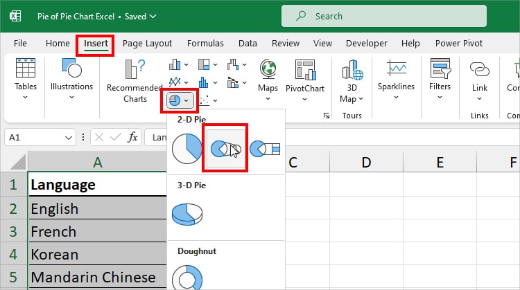
- You’ll have a Pie of Pie Chart on your Sheet.
Step 2: Add/Edit Chart Elements
By default, you may only have the Chart Title and Legend options in the new Pie of Pie Chart. So, now, let us add and edit the Chart Elements to make it more descriptive.
Chart Title
Chart Titles are the most important element in any graph. It gives the idea of what the Chart is trying to represent at a glance.
Since you’ll have the same Title as the Column Heading or a Placeholder by default, you can edit it if needed.
For that, hover over the Chart Title and Double-click on it. Select the current text and start typing the Name.
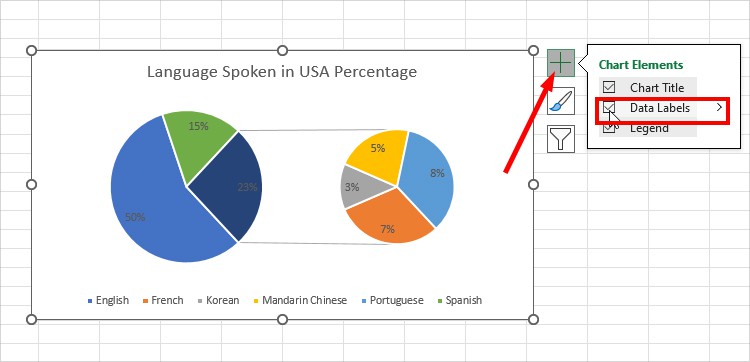
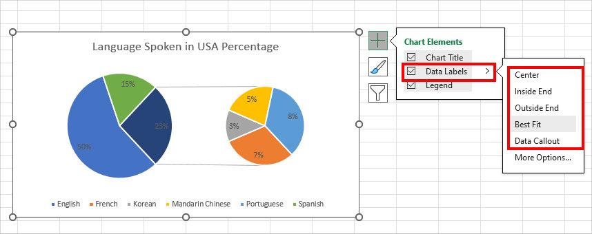
Data Labels
On a newly constructed Pie of Pie Chart, you’ll notice that the Data Labels are missing. Due to this, it can be hard to identify and analyze the exact proportion of that variable.
So, to add labels, select the Chart and expand the + icon (Chart Elements). Checkmark the box for Data Labels.
Now, you can see the values at the center of each slice on both the main and secondary Pie.
In case you want to showcase the labels in different positions, expand the Data Labels menu. Then, pick any One Location.
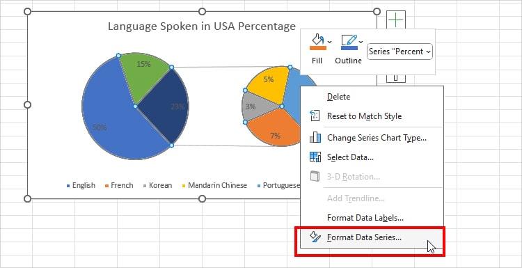
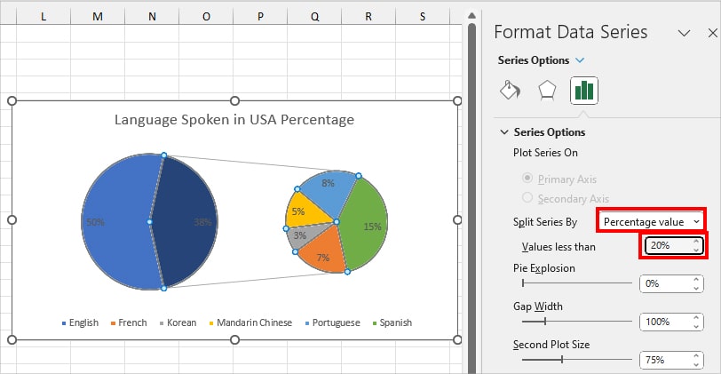
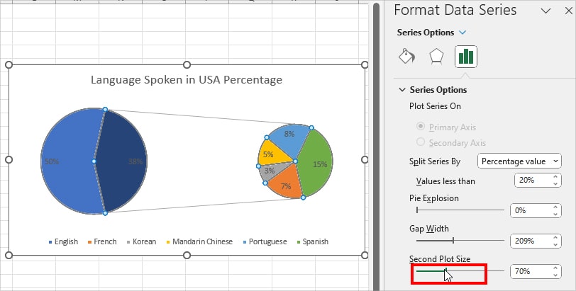
Step 3: Format Data Series
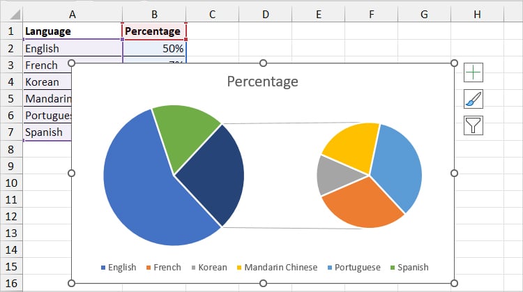
By default, Excel proportions the bigger percentage or values in the Main Pie Chart.
It combines all the smaller values from the first chart and shows them separately in the secondary Pie chart.
But, you can format data series and choose how you want to Split the Pie Chart, specify the number of slices to show in the Secondary Chart, and so on.
In my chart, the Pie Chart is split by the Percentage Value. So, I have 3 big slices in the First Pie and 4 mini slices in the Second Pie.
Let’s modify the data series and illustrate the Pie of Pie Chart differently.
- On your chart, right-click on any Slice in Pie. Then, pick Format Data Series.
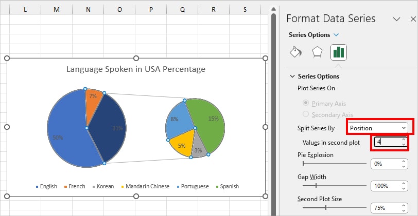
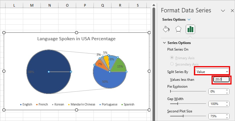
- In the Format Data Series, expand the drop-down menu for Split Series by. Then, pick one option.
- Position: Split Pie Chart based on the Value order in your Data column. You can specify the number of Values/Slices you want to show in the secondary chart.
- Value: Plot the Pie Chart based on less than Value. You can choose to assign the Point to the First Plot or the Second Plot. For example, Plot the Second Pie less than 20.
- Percentage Value: Split the Second PIot based on less than the percentage value. For Example, form a secondary pie chart with only values below 20% percentage.
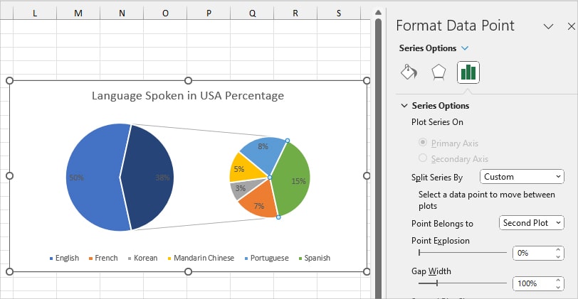
- Custom: Pick a Value to move between plots.
- Position: Split Pie Chart based on the Value order in your Data column. You can specify the number of Values/Slices you want to show in the secondary chart.
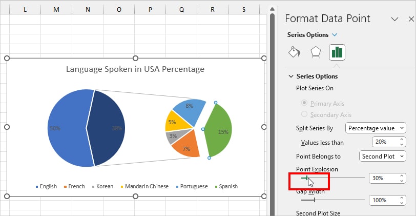
- Now, on Pie Explosion, select a Slice and increase the Percentage Number to explode it.
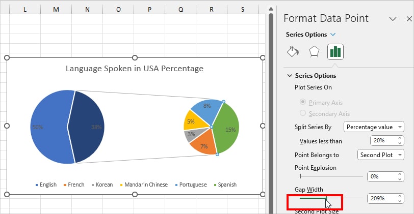
- In the Gap Width, increase or decrease the Percentage slider to adjust the distance between the Main Pie and Second Pie.
- Finally, in the Second Plot Size menu, change the Percentage to expand or decrease the secondary Pie Size.
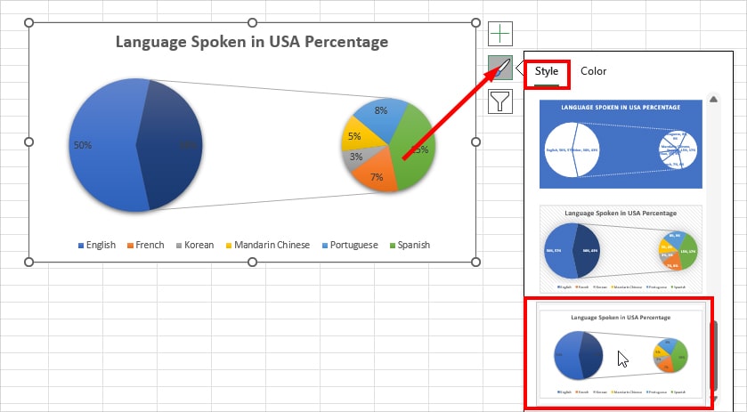
Step 4: Format Styles
Once you’re done with the Data Formatting, now, we’ll format the Chart Styles, Designs, and Colours to make them more visually appealing.
To quickly change the Style, select the Chart and click the Chart Style. On the Style tab, scroll down to explore more designs and pick any one.
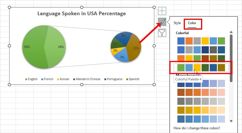
Similarly, for color, head to the Color tab in the Chart styles and choose a Theme.
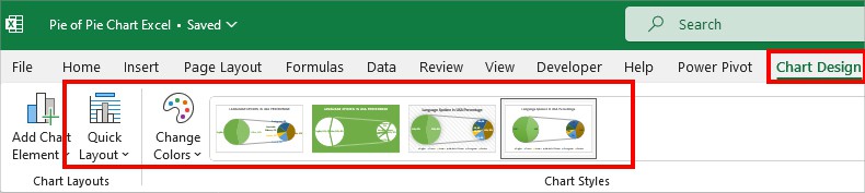
However, if you want more variation, while the Chart is still selected, go to the Chart Design Tab. Then, explore Quick Layout, Change Colors, Chart Styles menu one by one.
Pie of Pie Chart or Pie of Bar Chart?
In Excel, both Pie of Pie Charts and Pie of Bar Charts have the same functionality. Both charts illustrate a whole proportion of values segmented into two graphs.
The only difference is the secondary graph. In the Pie of Pie, there’s another Pie in the secondary chart. Similarly, in the Pie of Bar, you’ll have the Stacked Column Bar.
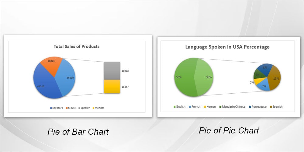
I recommend you use Pie of Pie to plot the degree or percentage values. Similarly, opt for the Pie of Bar when you have numbered data.