To analyze the data trend of a period, you would definitely look for the lines whether they’ve reached their peak or the lowest.
Basically, a gradual or rapid increase of the line indicates that there’s a positive trend in a chart. Similarly, a line falling downward implies a negative growth rate. And to illustrate this, Excel’s Line Graph is the best.
In this article, I’ll walk you through the steps to create a dynamic Line graph, choosing right Line Chart type for your dataset, tips to make your graph stand out, examples, and many more. So, Keep Reading!
Types of Line Graphs
Simple Line Graph
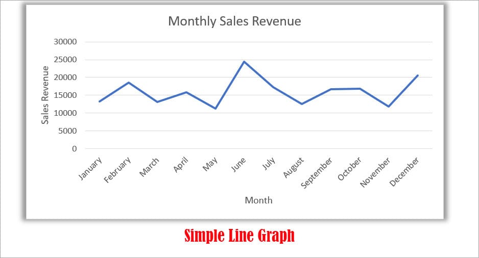
A Simple Line Graph also known as Linear Graph has only one variable and a single line in the Charts. It is one of the most commonly used Line graphs. In the majority, this type of line graph illustrates the changes of a variable over a period of time to analyze the trends. For example, the monthly sales revenue of Product A.
Excel Charts Used: 2-D Line graph, Line Graph with MarkersMultiple Line Graph
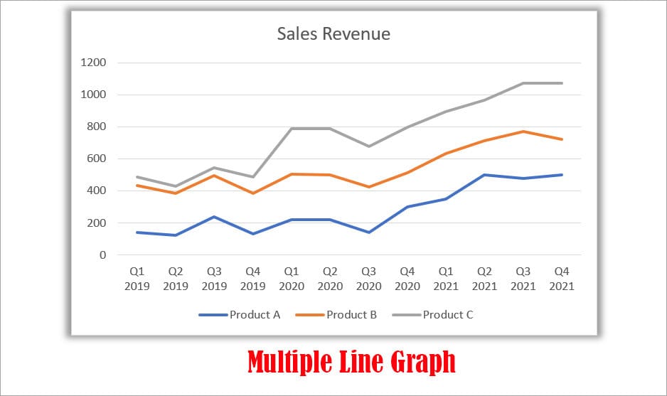
If the Line graph has number of variables or lines in the chart, it’s called a Multiple Line Graph. You can use this to compare the trend or pattern between the different variables. For example, a chart with the Quarterly sales revenue of Product A, Product B, and Product C.
Excel Charts Used: 2-D Line Graph, Stacked Line Graph, 100% Stacked Line Graph, Line Markers, Stacked Line with Markers, 100% Stacked Line with MarkersCompound Line Graph
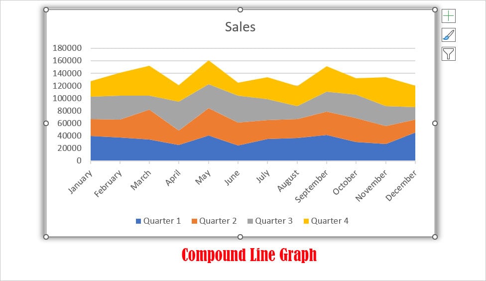
A compound Line Graph is also a Multiple Line graph. But, here multiple lines are stacked on the top. In addition to the connection between variables, it also illustrates the overall differences.
Excel Charts Used: 2-D Stacked Area, 2-D 100% Stacked Area, 3-D Area, 3-D Stacked Area, 3-D 100% Stacked AreaHow to Make a Line Graph in Excel
A line graph comprises of X-axis, Y-axis, Scales, Points, Trends, etc. Before you create the chart, you need to prepare your data source. Since you can add the other elements later in the chart, you must have the variables in the columns at first.
To plot a simple line graph, you must have two columns i.e. X-axis and Y-axis. But, if you wish to create a multiple or compound line graph, you must have multiple columns with variables.
Single Line Graph
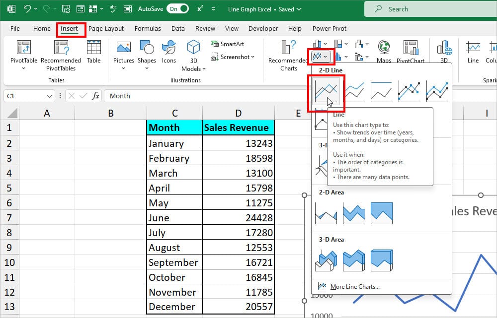
As an example, I will be creating a Single Line Graph for Monthly Sales Revenue. This is my data source.
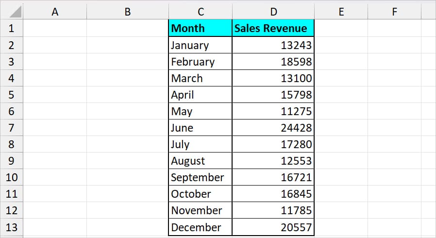
Now, select your data range. Go to the Insert tab and hover over the charts section. Click on the Line Chart and choose your option. Here, I picked a 2-D Line Chart.
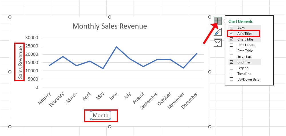
The single-line chart does not require many chart elements. So, you can just add the Axis Titles. While your chart is selected, click + menu and checkmark the option for Axis Titles. Rename the Axis Titles.
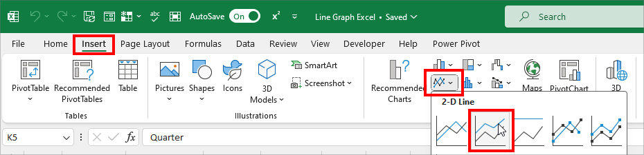
Multiple Line Graph
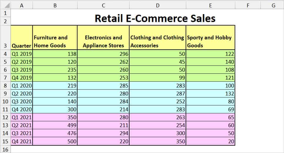
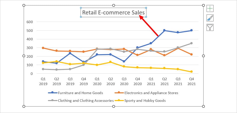
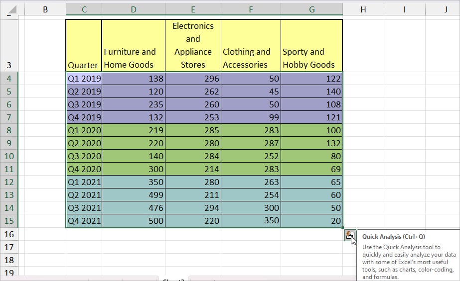
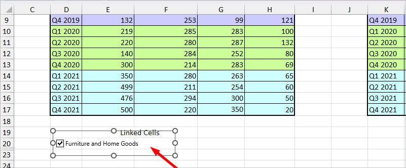
As an example, let’s assume I have a sales value of several products in the Retail E-commerce Sales of each quarter for the years 2019, 2020, and 2021. Here’s my data source.
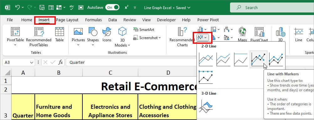
- Select the data and navigate to the Insert Tab.
- From the charts group, select any Line Chart. Here, I picked Line with Markers.
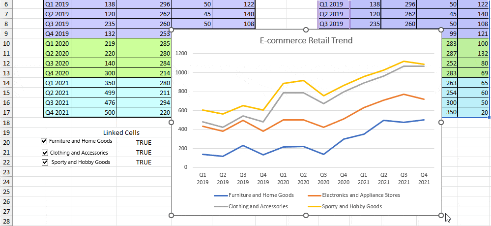
- Now, double-click on the Chart Title and rename it.
- While you’ve selected the chart, click on the Chart Elements (+ icon). Checkmark Axis Titles.
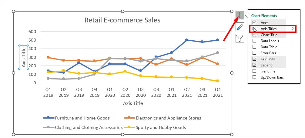
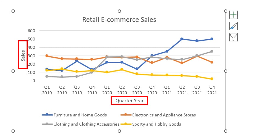
- Click on each Axis Title and rename.
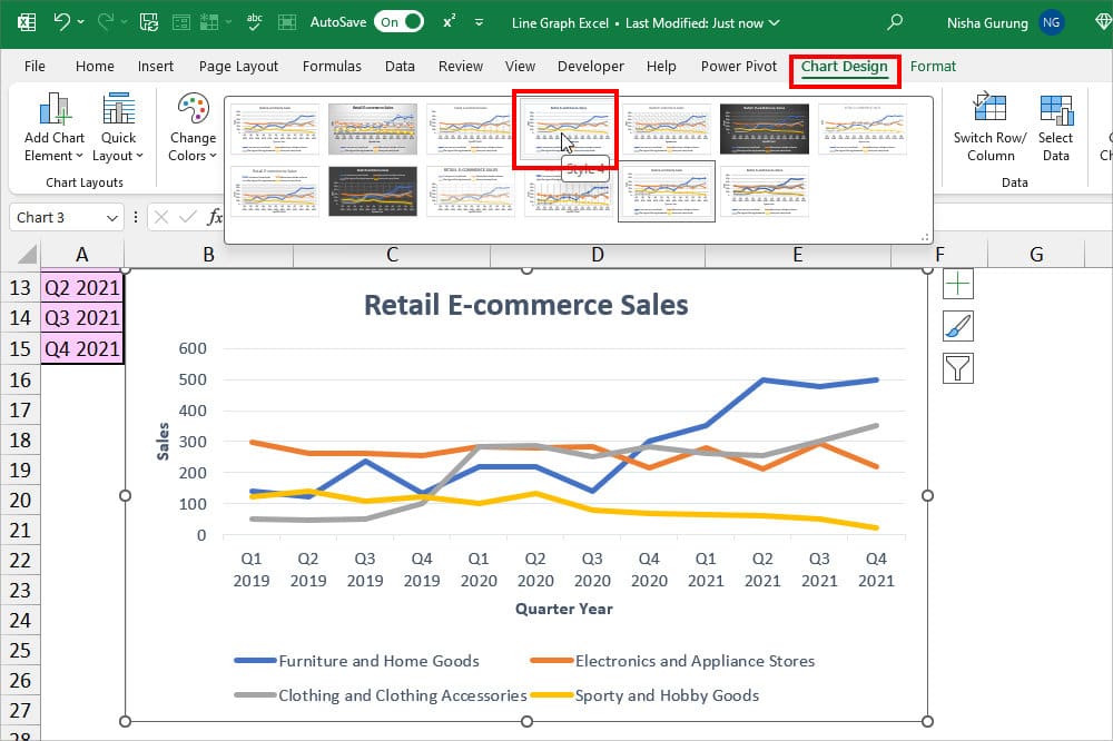
- To change the Graph Design, go to the Chart Design Tab and pick one of the Chart Styles.
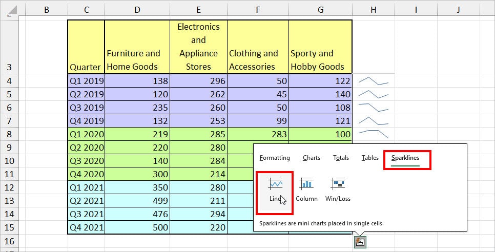
Sparklines
Sparklines are also a type of Line chart but embedded inside a cell. These lines are useful when you need to showcase the data trend for a Row.
- Select your Data range and click on the Quick Analysis icon on the bottom left.
- On the Quick Analysis tool, head to the Sparklines tab. Choose Line.
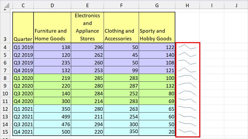
- You’ll have the Sparklines in your cell.
How to Create a Dynamic Line Graph in Excel?
To showcase your charts, just plotting the graph isn’t enough! You need to make the charts more interactive for a good presentation. So, let’s make the Line Graph more dynamic from the given steps.
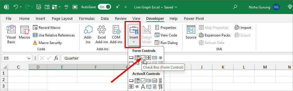
Step 1: Insert Check Box
- On your sheet, go to the Developer Tab.
- In the Controls section, click on the Check Box below the Form Controls.
- Using the cursor, draw the Checkbox and Rename it.
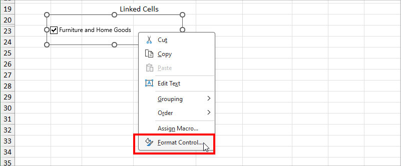
- Right-click on the Check box and pick Format Control.
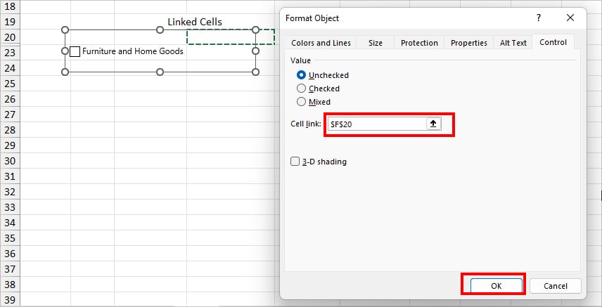
- On the cell link, click the Collapse icon and choose an Empty cell.
- Again, follow the same steps to insert and link more checkboxes. Here, I’ve created a total of 3 checkboxes. You can create checkboxes for the entire heading if you want.
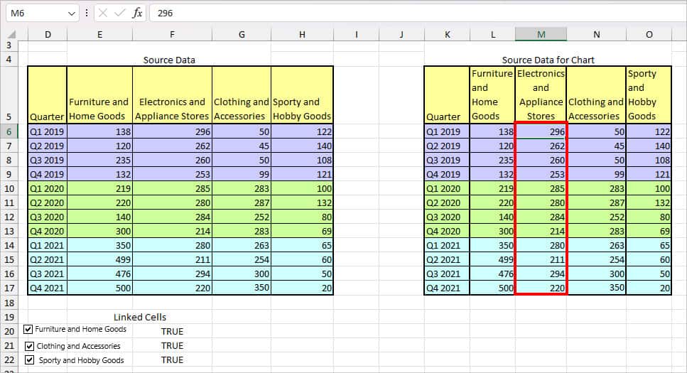
Step 2: Prepare Data Source for Chart
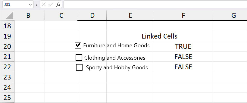
On a new area of the same sheet, we will create a new source data to plot the chart. To do so, firstly, just enter the Data heading of the same column and row size.
Then, for the information, I entered the given formula in cell L6.
=IF($F$20 = TRUE, E6, NA())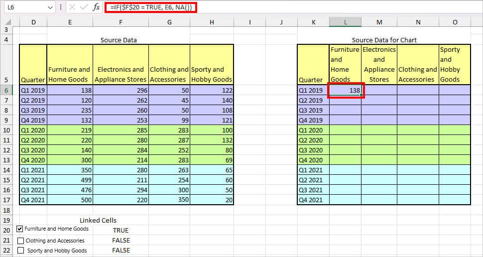
In the formula, we’ve passed down an argument for the IF function to return the value of E6 when the cell $F$20 is TRUE. We then copied the entire formula down to the other cells.
Likewise, if the value in cell $F$20 is FALSE, it’ll result in #N/A error.
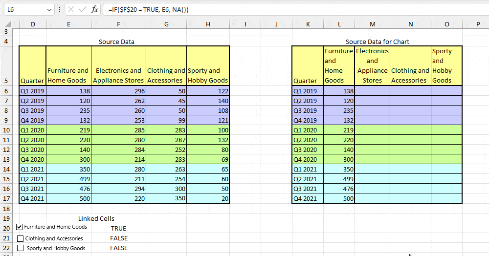
I used the same formula for the Clothing and Accessories and used the Auto-Fill handle.
=IF($F$21 =TRUE, G6, NA())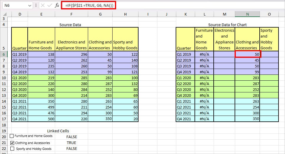
For Sporty and Hobby Goods, I typed in this formula and extended the Auto-fill.
=IF($F$22 = TRUE, H6, NA())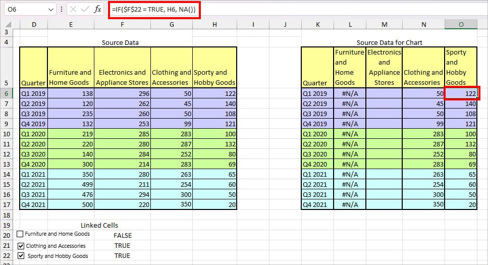
Since I want the values for Electronics and Appliance Stores to remain constant, I just copied and pasted the numbers from the original data source.
Step 3: Insert Line Chart
Now, that your source data for the Chart is ready, select the Data. From the Insert Tab, click on Line Chart and pick any one option to add.
Now, to display only the charts you wish, check or uncheck the boxes as shown.
Tips to Make Your Line Graph Stand Out
- If your Line Graph area looks small or cluttered, you can change the horizontal and vertical axis range.
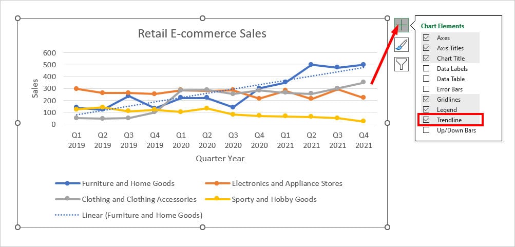
- You can make your data analysis even more easier by adding a Trendline to the Graph. For this, simply head to the Chart Elements icon and tick the box for Trendline.
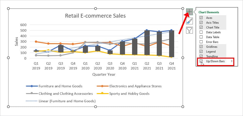
- For more detailed representation, you can add Up/Down Bars in your Line graph. In the Chart Elements Icon, check the box for Up/Down Bars.
- For Multiple Line Series graphs, I highly recommend you add Legends.
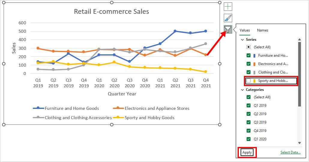
- If you wish to Hide the Lines from the Chart, click the Chart Filters icon. Below Series, untick the option for any one category and hit Apply.
Scatter Charts Vs. Line Charts – What’s the Difference?
In terms of appearance and chart plots, both the Scatter Charts and the Line Charts look almost the same. In addition to that, these Charts have an X-axis and a Y-axis with the marker plots.
But, in actuality, Scatter and Line are two different types of charts used for their own respective purposes. Here are the differences between them so that you do not mix up one with another.
| Categories | Scatter Chart | Line Chart |
| Dot Plot | It plots data using the dots. | Line Charts also have a dot plot in the graph. But, there’s a line connecting these dots. |
| Horizontal Axis | The axis range could be even or uneven depending on the data type. | Even or constant Axis Range. |
| Uses | Mostly used to illustrate Statistical, Engineering, or Scientific Data. | Used to show the data trends over time. |
| Values | In the majority, Scatter Charts only have number values in axes. | You can find text string in the X-axis range of the Line Graph. |