As the name implies, “Trendlines” are the lines that show the clear pattern of constructed data over a certain time.
By looking at the Trendline, you can instantly know whether there’s an increase, decrease, or fluctuations in your values.
For example, a financial analyst could study the Trendline to analyze past stock behavior, forecast future movements, and make decisions.
If you also want to make your data visualization more insightful, add Trendlines to your chart.
First, let’s see how you can add a trendline in your Excel chart and then I will discuss several trendlines available in Excel.
How to Add Trendline in Excel Chart?
Before you start, check out the table to see if you can insert Trendline into your chart. In case your chart does not support it, you won’t see the Trendline option at all.
| Supports Trendline | Does not Support Trendline |
| Scatter | Pie Chart |
| Bubble | Doughnut |
| 2-D Line, 2-D Area, 2-D Column, 2-D Bar | 3-D Line, 3-D Area, 3-D Column, 3-D Bar |
| Clustered Column | Stacked Column, Stacked Bar |
| Histogram, Whisker and Box Plot |
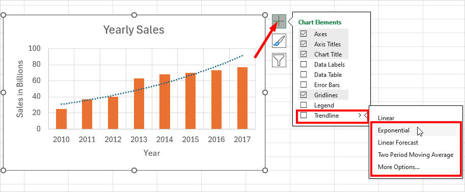
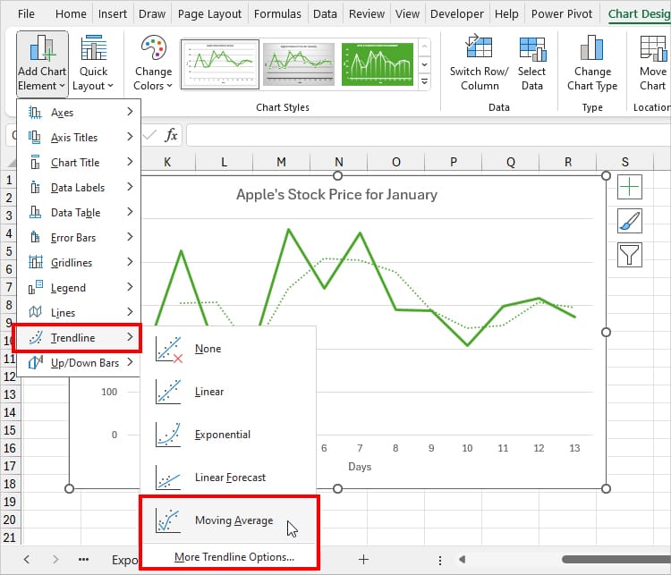
From Chart Elements
Inserting trendlines in an Excel Chart is easy as you can do it from the Chart Elements itself.
Select your Chart. Click on the Plus icon and tick the Trendline box.
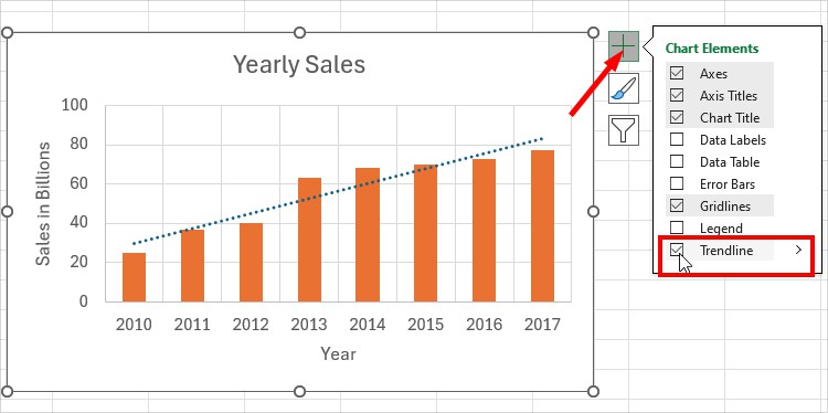
By default, Excel inserts Linear type. To change, again, in Chart Elements, expand Trendline and pick your options.
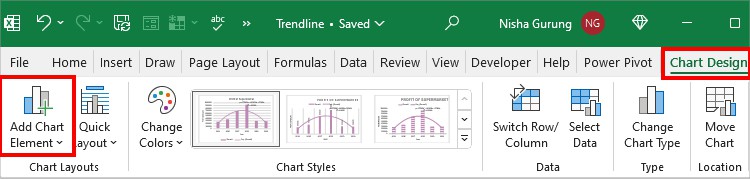
From Chart Design Tab
The next way to add trendlines to your graph is from the Chart Design Tab.
- Click on your Chart and go to the Chart Design Tab.
- From Chart Layouts section, expand Add Chart Element menu.
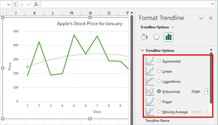
- Hover your cursor over the Trendline. Pick any one Trendline or select More Trendline Options.
- If you select More Trendline Options, you will see the Format Trendline panel on the right. It displays all 6 types. Select any one.
Insert Multiple Trendlines
Do you know that Excel allows you to add different Trendlines in one chart?
For Example, you can have Linear and Moving Averages at the same time. To insert more Trendlines, repeat any of the above steps.
As you can see I already have the Moving Averages Trendline in the chart. Now, to add Linear, click on Chart Elements > Trendline > Linear.
Format Trendline
To make your Trendline more informative and comprehensive, let’s learn the ways you could format it.
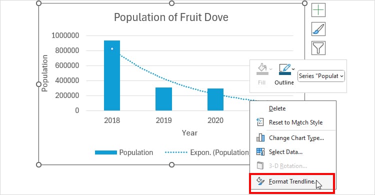
Right-click on the Trendline and pick Format Trendline.
Now, on the Format Trendline box, explore each menu and edit as needed.
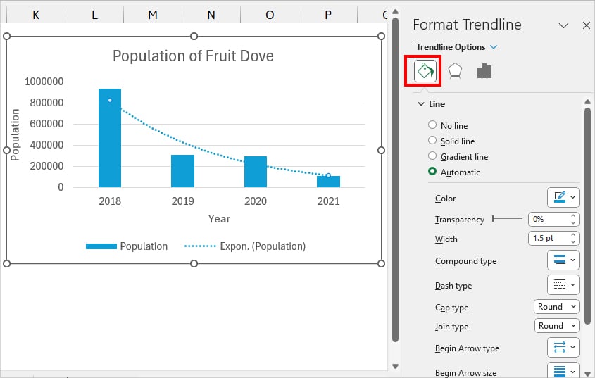
- Fill & Line: Customize how you want to display your Trendline. Specify your Line type, color, width, transparency, and dash design.
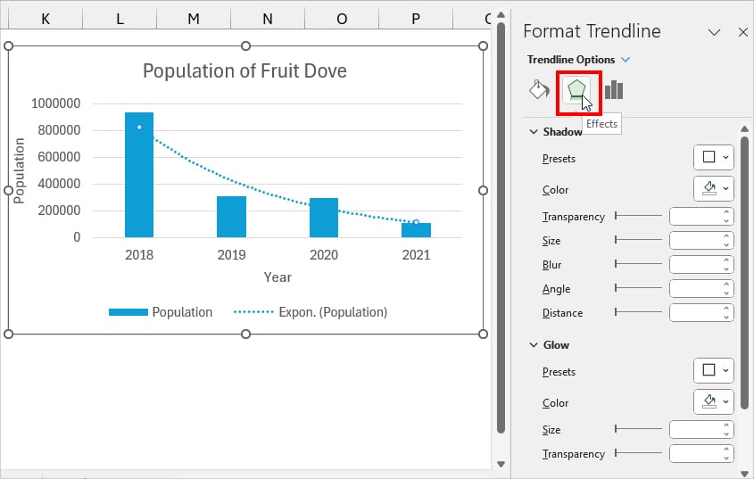
- Effects: Apply Shadow, Glow, and Soft Edge effects to the line.
- Trendline Options: Choose the type and information you want to show.
- Trendline Options: Here, you’ll see lists of Trendline types. Pick a different option to change your Trendline.
- Trendline Name: By default it is Automatic. If you want, select Custom and Enter your preferred name.
- Forecast: Enter the number in the Forward or Backward menu to forecast. For Example, if I type 2 in Forward, I’ll have a trendline pattern for the next 2 years.
- Set Intercept: Checkmark and input number to define the Intercept point in Trendline.
- Display Equation on chart: Show the trendline equation in the Chart. You’ll get different equations for each type.
- Display R-squared value on chart: Tick the box to show the R2 point in your trendline.
In case you do not want the Trendline anymore on your Chart, select the Line and press Del key.
Types of Trendline in Excel
You can insert all 6 types of Trendlines in the Excel Chart. But, you need to be cautious when choosing one.
If you want an accurate forecast and data analysis, first identify the most suitable Trendline for your data type.
Here’s a detailed summary of what each Trendline represents.
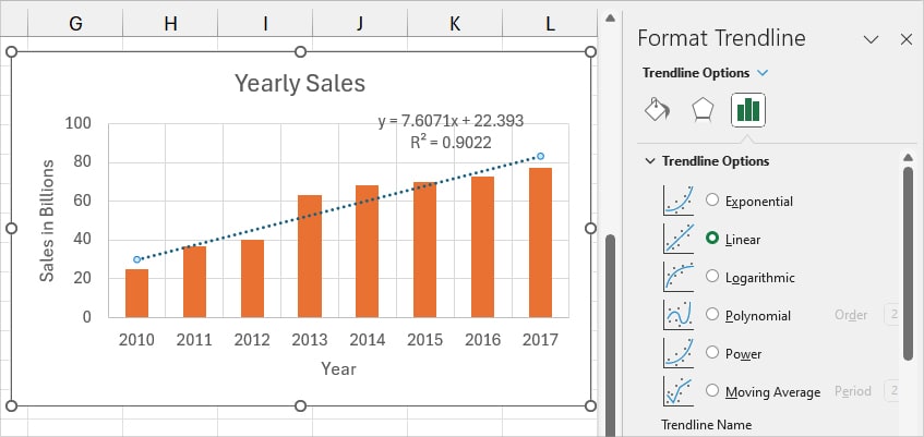
Linear Trendline
These are straight lines used to illustrate the gradual increase or decrease figure. Here, the data could be either rising or declining at a steady pace without any fluctuations over time.
Example:
The Sales Bar Graph from the year 2010-2017 illustrates the increased trendline.
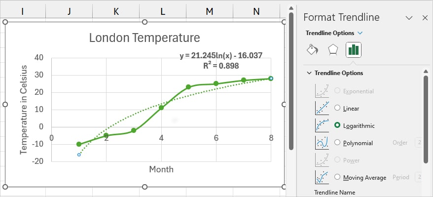
Logarithmic Trendline
If you need to show rapid growth or downfall of data that stabilizes later, use the Logarithmic Trendline.
For Instance, a figure where the data point increases in speed, reaches its peak and remains steady. In this trendline, the line is curved. Here, you could plot the negative or positive numbers.
Example:
See this Scatter Diagram that showcases the Temperature for 8 months. In the first few months, the temperature is at (-) degrees, rapidly increasing over a month, and levels out from the 7th month.
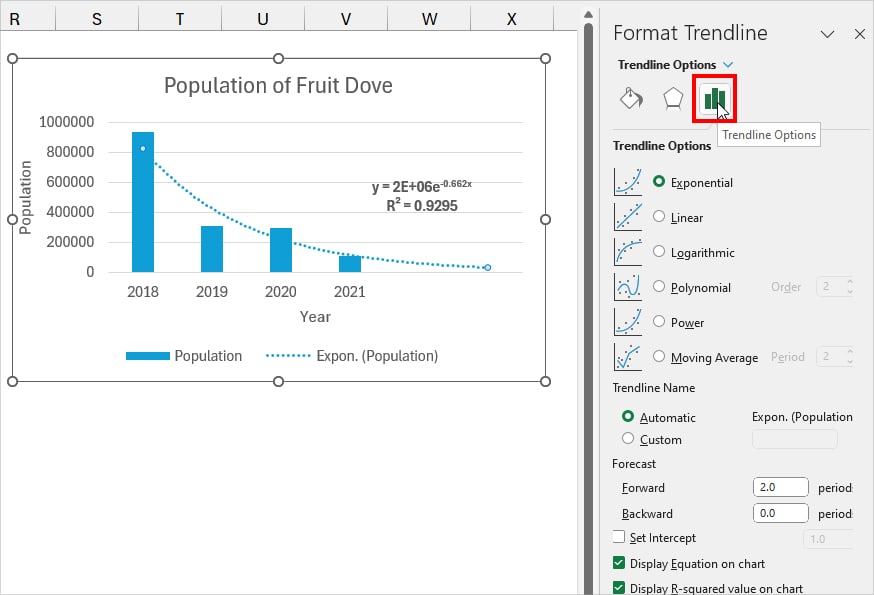
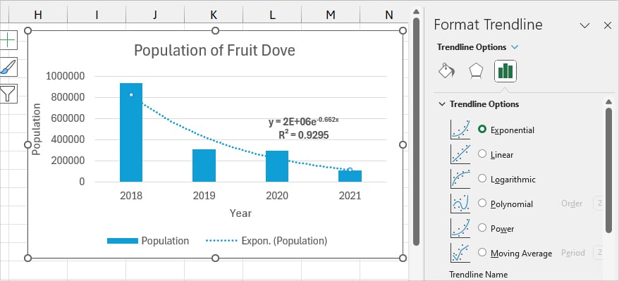
Exponential Trendline
Exponential Trendline is somewhat similar to the Logarithmic Trendline which illustrates the dramatic escalation or decrease of values. Except, here, the data point does not level out. So, the curve line is more arched and falls on one side.
These types of Trendlines do not work with 0 or negative figures. So, make sure you have only a positive number to insert the Exponential Trendline.
Example:
In this chart, you can see that the population of Fruit Dove birds is declining at a fast pace.
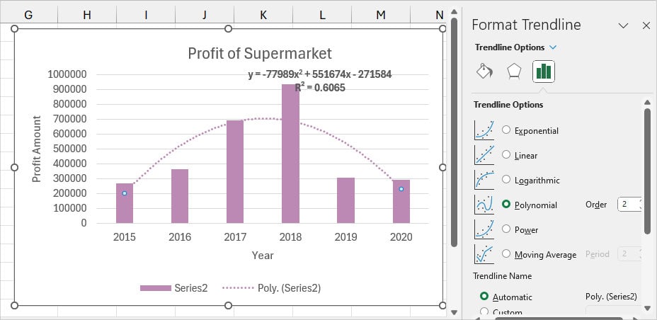
Polynomial Trendline
Suppose you have data that has fluctuations over a period of time. To represent that information, a polynomial trendline is the best fit for your chart.
In the Polynomial Trendline, the curve line creates a hill shape for the rise/downfall of data. The number of hill shapes determines your Polynomial order such as
- Quadratic Polynomial: 1 Hill or Bend
- Cubic Polynomial: Either 1 or 2 Hills
- Quartic Polynomial: 1-3 Bends
Since the trendline demonstrates the up and down pattern, you could use it for large datasets to assess the Profit/Losses of companies.
Example:
Here’s, a 6 year Profit figure of a supermarket company.
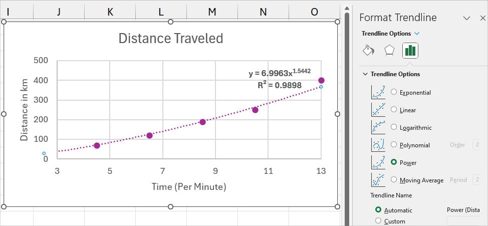
Power Trendline
Next, if your figure is growing or downgrading at a certain pace, insert the Power Trendline on your graph.
It is in fact kind of identical to an Exponential trendline where you have a curve lying on one end. However, the difference is that there’s a specified measure of increase/decrease between each plot.
Since it does not work with minus numbers or zero values, use only the positive figures to add the trendline.
Example:
Here, the distance traveled is measured every 2 minutes interval.
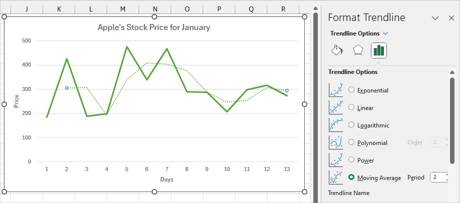
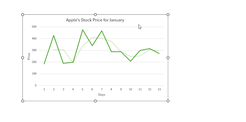
Moving Average Trendline
Moving Average is used to showcase the dramatic fluctuations of figures in a clear picture.
For Instance, you can mostly find them in the financial sector to measure the performance of Stock prices.
Example:
This is a monthly figure of Apple’s Stock Price.