It can be a tedious to analyze a bigger data set in Excel. To make this take a bit less complicated, Excel has the Quick Analysis feature.
The Quick Analysis feature takes your data and creates a visualization based on your values.
You can access the Quick Analysis right after you select your data. Once you make the selection, you will notice that an icon appears at the bottom edge of the selection box.
You can select the icon to open the Quick Analysis menu. Alternatively, you can select a cell from a range and use the Ctrl + Q shortcut to select and activate the Quick Analysis menu.
What is in Quick Analysis
Let’s take a look at what Excel offers as a part of Quick Analysis. Excel will typically only show you the options that suit your data type. However, here’s a complete list of options in the Quick Analysis menu:
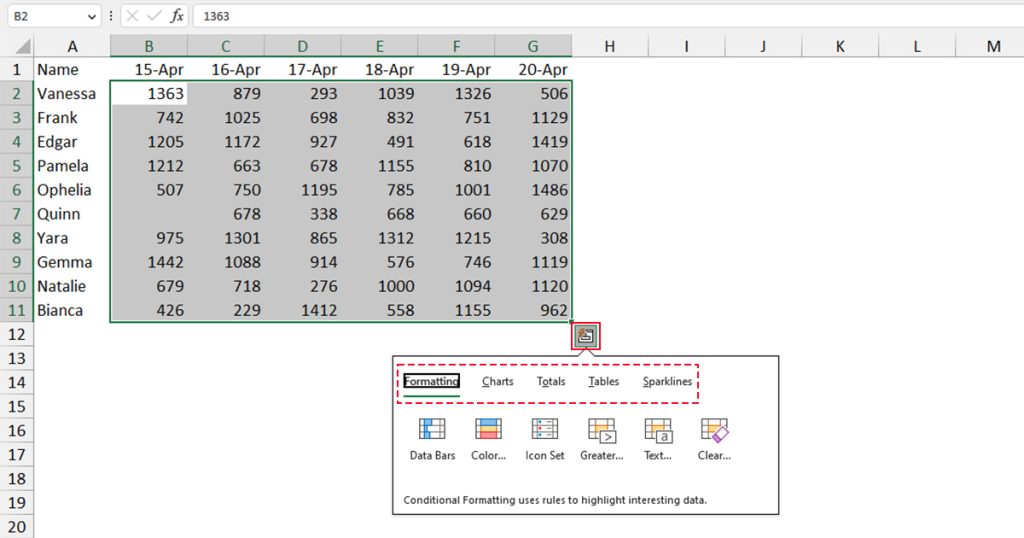
- Formatting: Conditionally format your cells according to greater and lesser values.
- Charts: Insert a chart with the selected data set as the source.
- Totals: Create a data analysis with total values.
- Tables: Insert Pivot Tables with the selected range as the source.
- Sparklines: Create a chart inside the cell.
How to Use Quick Analysis
One thing I love when I use Quick Analysis is that I can preview each option by simply hovering over them. I suggest you preview each option by doing so before clicking on an option to insert them on your spreadsheet.
To further explain how the Quick Analysis feature works, let’s look into each option in the menu bar.
Formatting
The Formatting tab in the Quick Analysis menu contains six formatting tools. Here is an explanation of each tool:
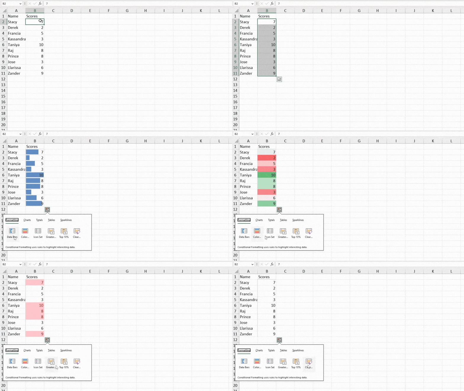
- Data Bars: When you select this option, Excel will format each cell from the range with a bar based on each of your values. For example, in this data set, we have used the Data Bars tool. The highest value, 10 has the highest height, and the lowest value, 2 has the lowest height.
- Color: The Color tool will fill the cell color based on the greatest and lowest numbers. The lowest number is filled with deep red, while the highest is represented by dark green. The numbers that fall under the range, are represented by similar colors. For example, cell B8 with the number 8 is filled with lighter green and cell B4 has lighter red.
- Icon Set: You can also quickly insert an icon set using the Quick Analysis feature. Excel will insert arrows pointing in different directions based on the order of your numbers. The higher values are denoted with green-up arrows, the middle with yellow-right arrows, and the least with down-red arrows.
- Greater: You can set a condition to format the cells that include values greater than a set value. After you select this option, a pop-up will appear where you can configure criterion value, and how you wish to format your cell.
- Top 10%: This option will format the cells that hold the top 10% of your data set. Exxcel will use a light red color to fill the cells that hold these numbers.
- Clear: If you no longer wish to have the set formatting applied to your range, you can use this tool to clear all applied formats.
Charts
Now the options available on your Charts window is highly influenced by your selected data set. Therefore, if any of the options I’ve discussed here do not appear on your sheet, there’s nothing wrong with your Excel program. Excel simply didn’t recommend the option to you based on your data.
However, if you still want to access the chart, click on More.
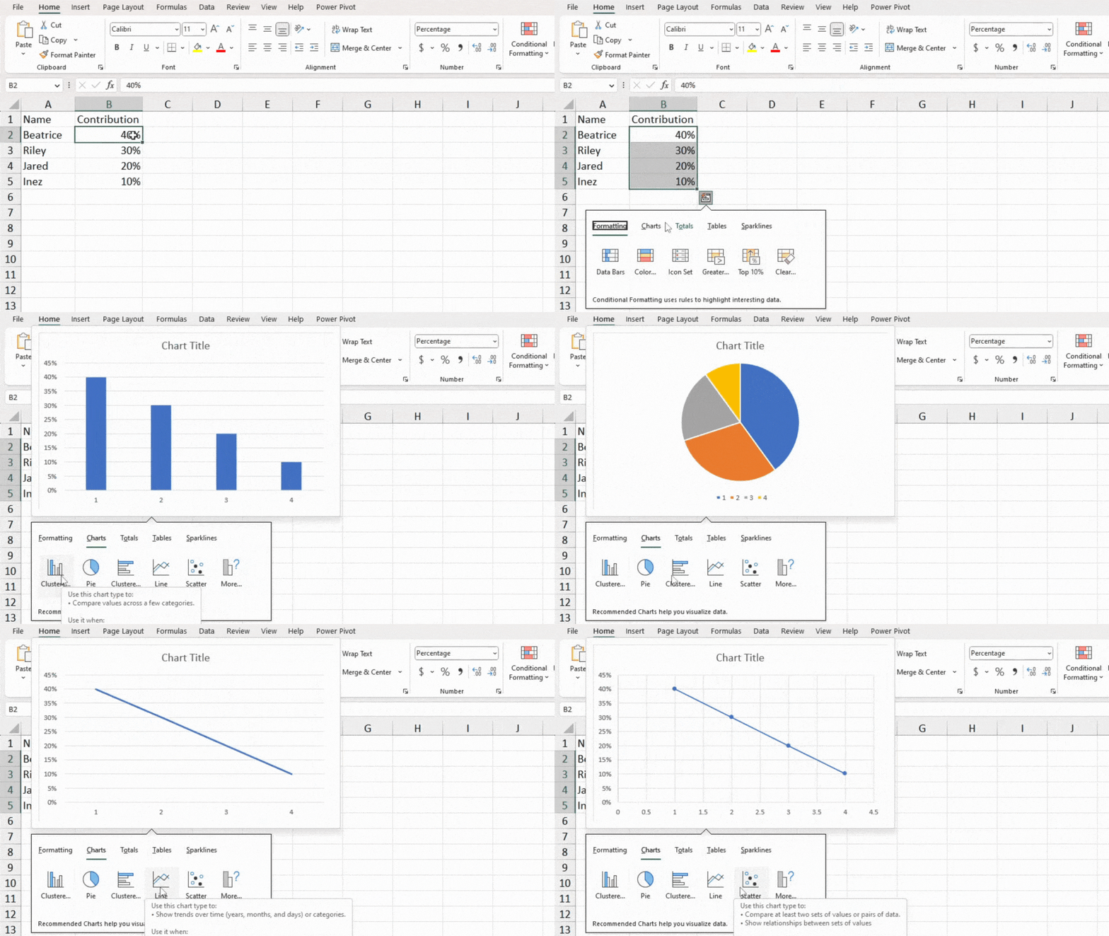
- Clustered: Inserts a vertical clustered chart. If you have multiple data items in a single row, this chat will cluster the data together under the same category. Excel advises using this chart when you have fewer data items with no set hierarchy.
- Pie: This option inserts a pie chart with the selected data as the source. It is best to use pie charts when you’re dealing with percentile values that sum up to 100%. Similarly, use pie charts only when you have fewer values, or you’ll have to explode the chart to draw attention to the slices that take up less space.
- Clustered: This option is the same as the first option, only with a horizontal alignment instead of the vertical one. You can use this option if you have a longer category name, or simply if you like this alignment better.
- Scatter: This option creates a scatter graph using your selected range. Use this chart if you have two or more sets in your data source that you wish to create a visual comparison for.
Totals
This option is my favorite from the Quick Analysis tool. When I’m dealing with financial data, like my monthly budget, I have to deal with a lot of totals. This option covers all calculations I need to perform with my data. You can total data with respect to either the row or column of the data.
If you wish to calculate data according to the row, you will have to select the option that has blue-filled cells at the bottom of the icon. Similarly, to total numbers in rows, select the option with the yellow-filled cell on the right of the icon. Except for the data source, these options calculate the same way.
Take a look at all the calculation options Totals offers.
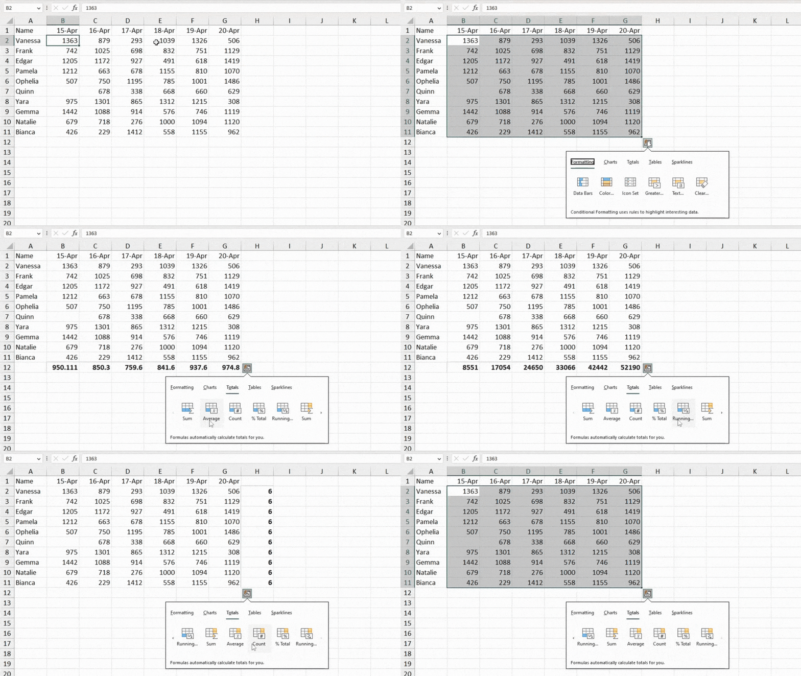
- Sum: This option will sum up the vertical values in the range. For example, this option will sum up values from the range
B2:B11. If I have the entire range, that is,B2:G11selected, this option will sum up all values from individual columns like in the first instance. - Average: Produces an average value by using the vertical values in the row/column as a reference.
- Count: Returns the number of non-empty cells in your row/column. This is a great option to use if you have a few cells empty in your column. However, remember that this option also considers texts and hidden objects while making the count. So make sure your cells are truly empty before you use this tool.
- % Total: This option calculates a percentage value using data from each column as the source. The calculated percentile values sum up to 100%. This is a great tool to use when you’re trying to compare data in each column.
- Running: This is an excellent tool to use if you’re creating a sales sheet or something similar. When you choose this option, Excel will sum up the first row/column and insert the sum in the cell adjacent to the last alignment. When totaling the next entry, it will add the sum of the last row/column to the sum of the current alignment.
This way, the cell adjacent to the last cell of the last column will hold the summed-up values of the entire range.
Tables
The Tables section is dedicated to helping you sort through your data by converting them into a data table, or a Pivot Table. Depending on your data set, this option may offer you more than one variation of a Pivot Table.
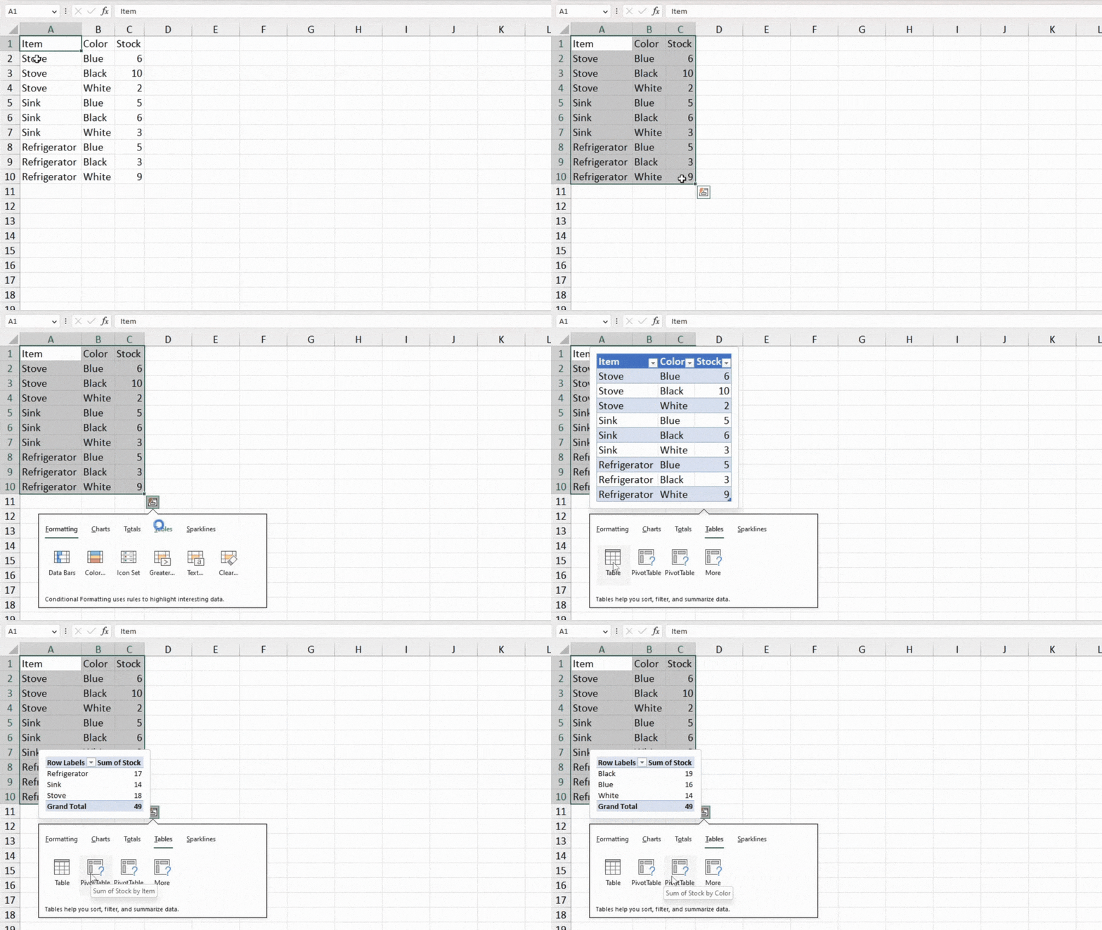
- Table: Changes the selected range into a regular Excel table.
- PivotTable: Uses the current selection as the source to create a Pivot Table. Hover over the option to see how the tool will arrange your data while creating the Pivot Table.
Sparklines
The last option in the Quick Analysis menu is to insert Sparklines. You can insert charts inside the cells of the column adjacent to the last column of your data range.
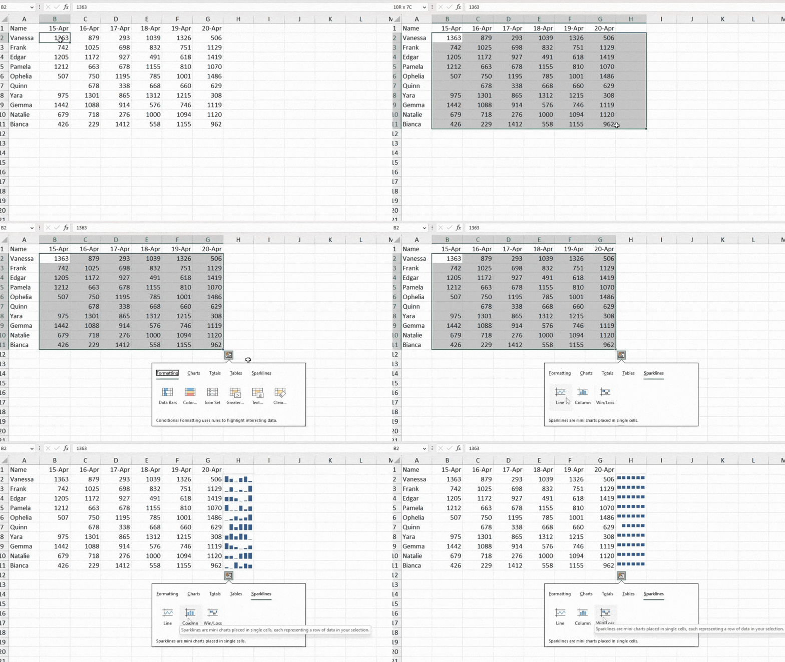
- Line: This will create a line graph on the adjacent cell. The higher values are represented by an incline while as the values decrease, the line declines.
- Column: The following option creates a bar for each cell value on your row. Higher values have greater heights while the lower values have lesser heights.
- Win/Loss: This option will insert the Win/Loss chart inside the adjacent cell based on the selected value as the source.