Pie Charts are circular graphs used to illustrate the data figures such as percentages and degrees. Apart from just a graphical representation, these charts are best for comparing the information on a Quarterly or a Total basis. As for me, I have been using Pie Charts to showcase the survey results in percentages and analyze the findings.
In Excel, there are five different types of pre-built Pie charts. While adding one of them is very easy, most user fails to represent Pie Charts in the best way possible. This is because it is equally important to know how to format them to make them informative. So, here’s a step-by-step guide.
Know Your Pie Chart Type
In Excel, if you expand the Pie Chart group, you’ll see various types of charts. Basically, each Piechart is used to illustrate a specific kind of value. So, first, know the right Pie Chart type to represent your data.
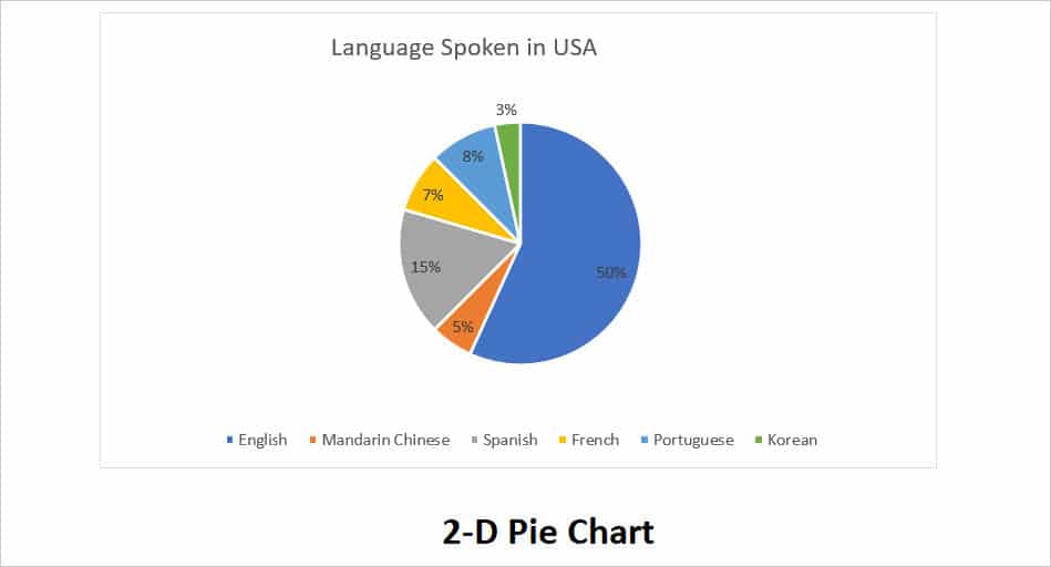
- 2-D Pie Chart: These are pretty common and popularly used Pie Charts. It has just a basic circle graph with slices. Although there are no effects, you can apply various Chart Styles from the Chart Design Tab. Most users insert a 2-D Pie Chart when they need to print them.
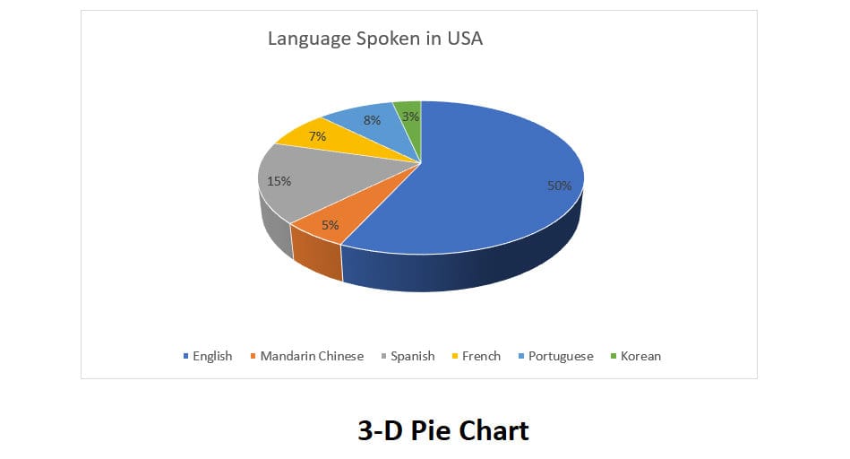
- 3-D pie chart: As the name itself says, these Pie Chart types have a 3-D effect. You can use this Pie Chart for aesthetic purposes.
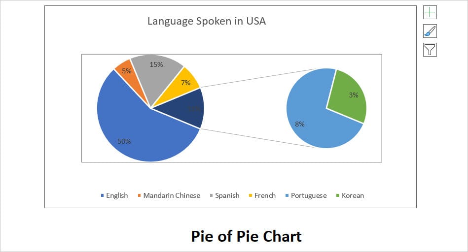
- Pie of Pie Chart: This type of chart is a bit different from the normal pie chart. This is because here, you can find two pie charts. One is the main pie chart and the other is a small extra pie chart that represents the slice information from the main pie.
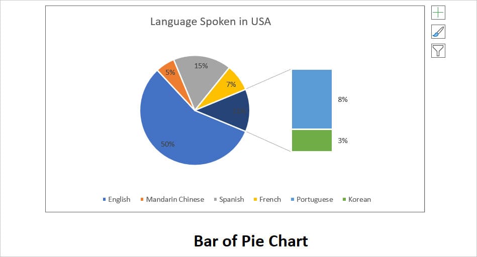
- Bar of Pie Chart: Just like the Pie of Pie Chart, this type of Pie Chart has an additional bar graph that shows the part of the slice data from the main pie.
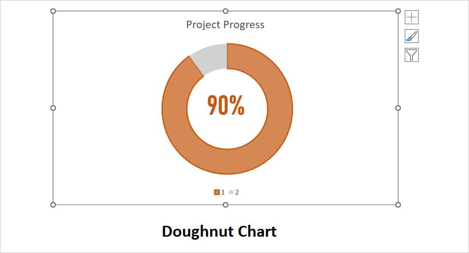
- Doughnut Chart: These charts are actually shaped like Doughnuts that have a hole in the middle of the circle. It’s best to illustrate the progress reports.
Step 1: Prepare Source Data
Firstly, you must have source data to plot a Pie Chart. The data value could be either a degree or a percentage. You cannot use real numbers for the PieChart. When preparing the data, these are some of the things you should note.
- If you have Real numbers, consider converting them into the degree or percentage values first.
- If you’re using the degree, the sum of all values must be a total of 360 degrees. Likewise, for a percentage, the total must be always 100%.
- Unlike Box Plots or any other charts, Pie Charts do not support more than data series. So, if you have multiple data series, you’d have to create a separate category and plot them one by one.
- Make sure there are no blank cells in the data range.
- Try to limit your data categories to 8 or 9. If you have too many categories, the pie slices will shrink and look cluttered.
Step 2: Add a Pie Chart
After your data is ready, follow these steps to insert a Pie Chart. Remember as an example, we will be adding a 3-D Chart.
- On the Excel worksheet, select your data.
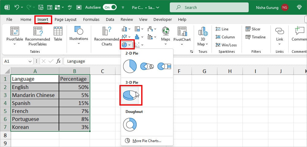
- Go to the Insert Tab. On the Charts group, click on the Pie–Chart icon and choose one of the Pie–Chart. Here, I selected a 3-D chart.
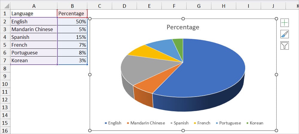
- You’ll have a Pie Chart on your Sheet.
Step 3: Add and Edit Pie Chart Elements
There are three important Chart Elements used in the Pie Chart. If you see a newly constructed PieChart, you’ll just see there’s a Chart Title and Legend by default. To make your Pie Chart more informative, add all of the elements and edit the existing ones.
Chart Title
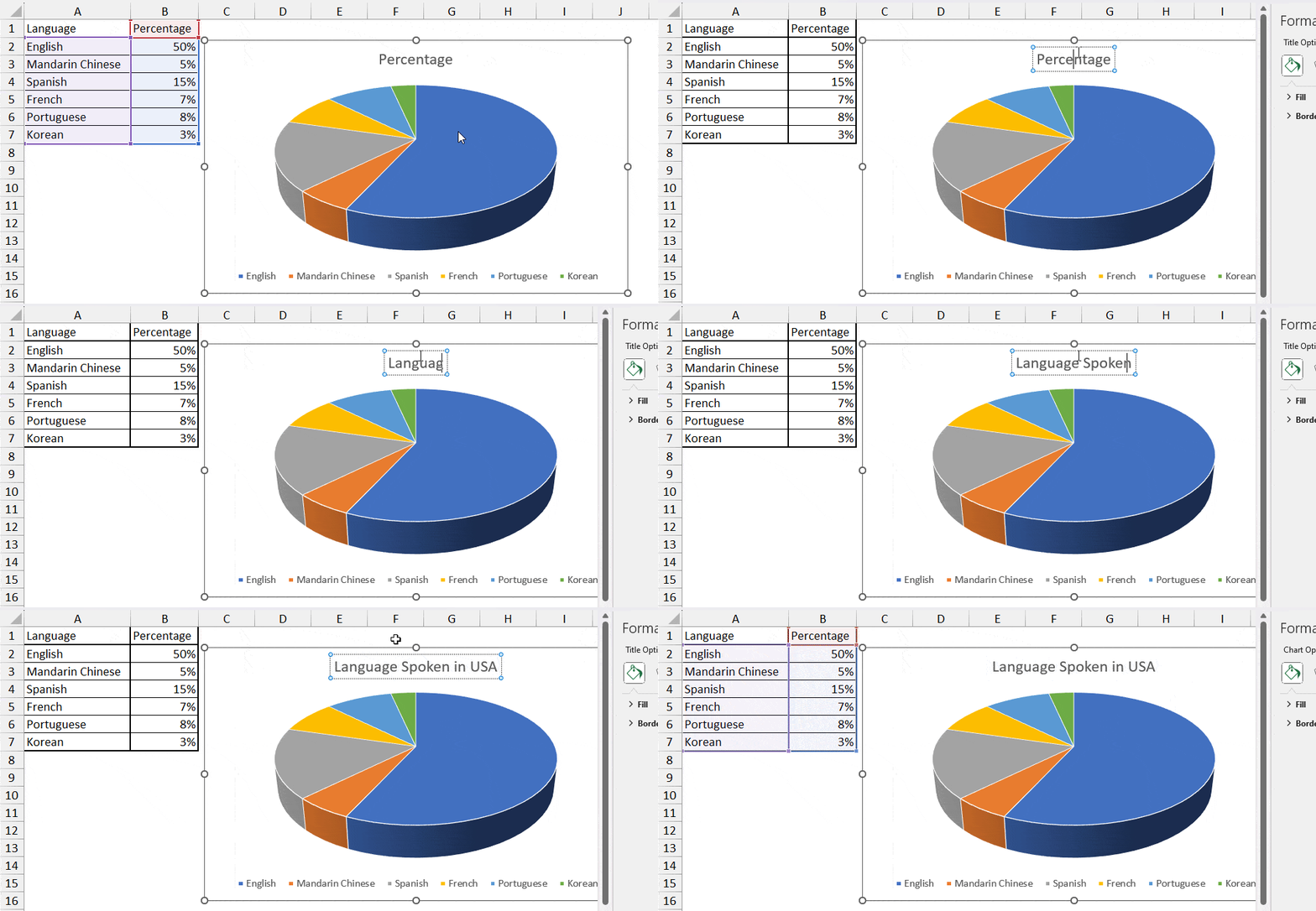
Firstly, to represent what your Pie Chart is about, it’s important to add a meaningful and accurate Chart Title. In most cases, you’ll either have a Chart Title placeholder or the Column Heading Name at the top of the Pie graph.
Nonetheless, to edit it, double-click on the Chart Title Box. Select the Text and enter a new Title Name.
Data Labels
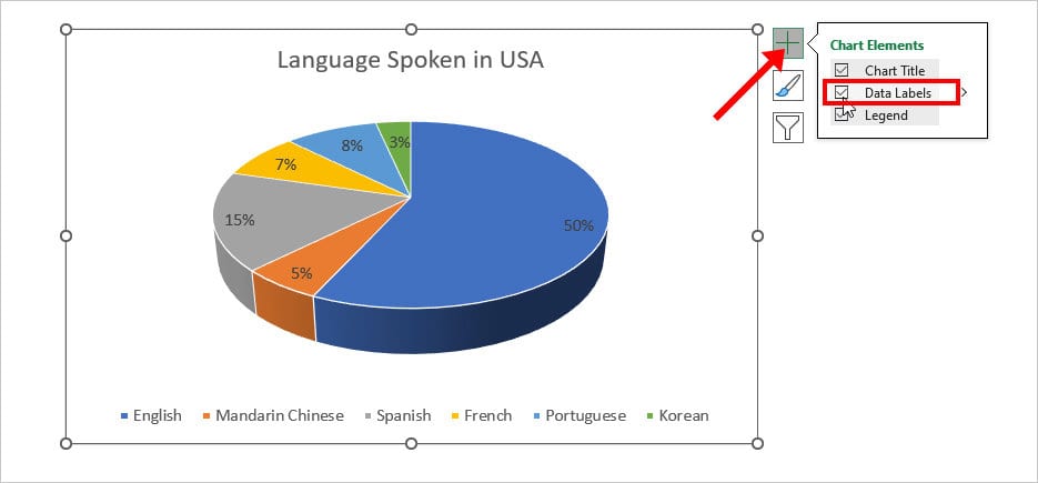
As you can see, you can barely distinguish the total portion that each slice takes. So, add the data labels to show the percentage or degree for separate slices. It’ll also help you to compare the one slice with another.
For this, click on the Chart area and hit the + icon in the upper-right corner. Under Chart Elements, tick the box for Data Labels. By default, Excel will insert Data Labels in the Best Fit.
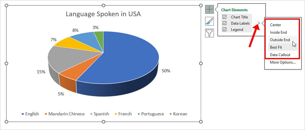
However, if you want more variations, click the More icon next to Data Labels. Then, pick any one option.
Step 4: Format Pie Chart Design
By default, your Pie Chart color will be the same as your Workbook Theme Colour. But, if you want a more unique and different design, you can customize them as per your preference.
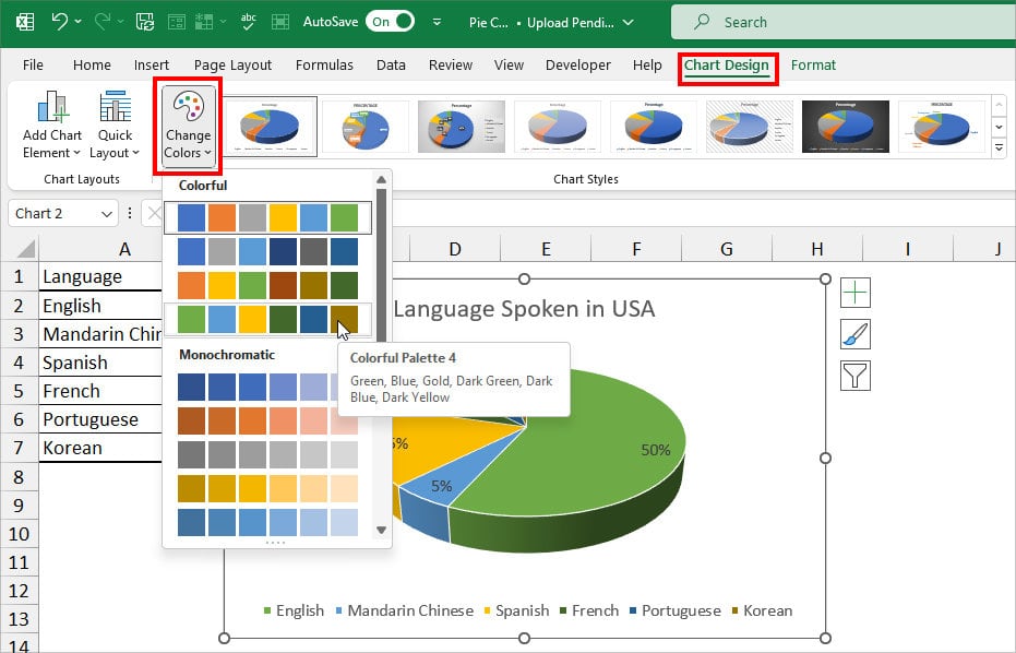
To do so, select the Pie Chart and go to the Chart Design Tab. Then do one of the following.
- Change Colors: Hover over the Chart Styles group and click on Change Colors. From the Colorful and Monochromatic lists, choose your preferred color.
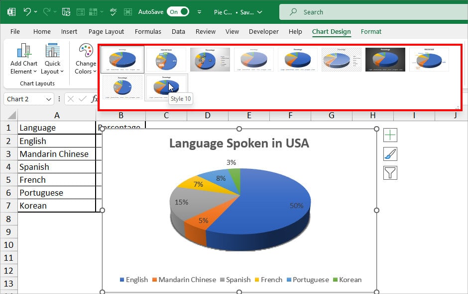
- Chart Styles: Next to the Change Colors, you’ll see various default Pie Chart styles. Expand the drop-down menu and click on any one. Before you apply, I suggest you hover over each chart style to see a preview first. Some styles might have a negative effect like displaying too much information and cluttering the chart area.
- Change Chart Type: If you’re not happy with the current Pie Chart Type, you can always switch to a new one. Navigate to the Type group and click on the Change Chart Type option. From the Pie Chart lists, choose any one and hit OK.
