Histograms represent the spread of data over a set interval. If you have a larger distribution of data, you can use a histogram to summarize them in an interval scale.
In Excel, you have not just one, but multiple ways to create histograms. You can use either of these methods to create histograms. After you insert your graph, you can format the bins to change the intervals or their appearance.
How to Make Histograms in Excel?
You can insert histograms as charts, or use the Data Analysis tool to enter your data, and then make a histogram. While you can use the Chart tool to create your histogram for the first method, you may have to first enable the Analyse ToolPak Add-in from Excel Options.
Insert Histogram As Chart
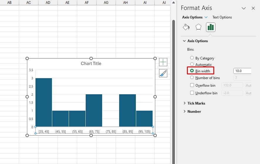
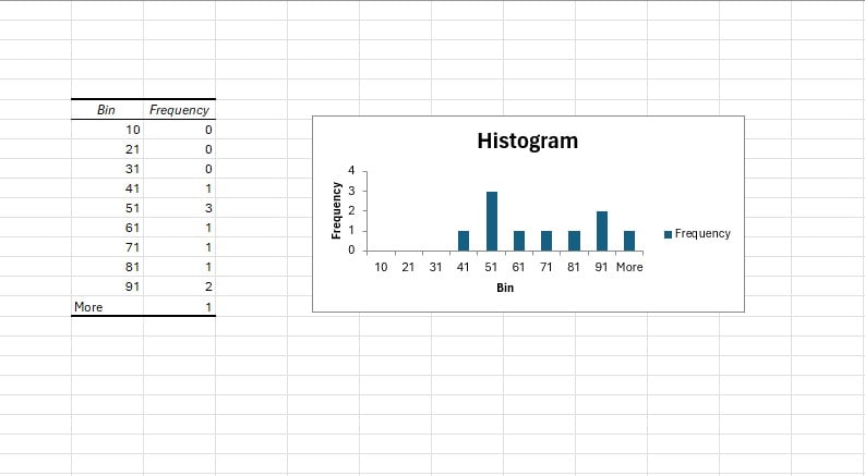
You can insert histograms from the Charts section in Excel. If you wish to change the intervals of your data, you can change the Bin width and the number of bins from the Format Axis option.
Step 1: Add Histogram
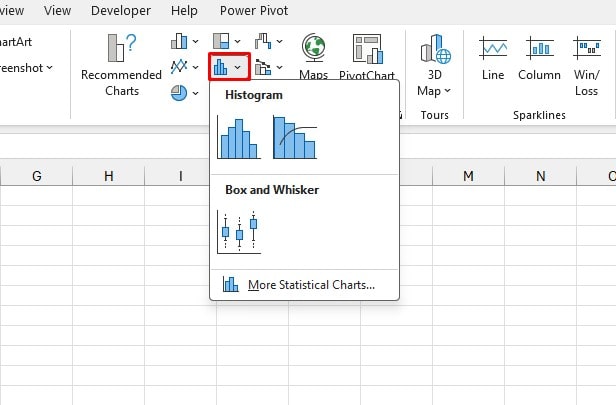
- Select your data range.
- Go to the Insert tab.
- From the Charts section, select Histogram.
- Choose an illustration.
Step 2: Change the Bin Width
- Right-click on your chart.
- Select Format Axis.
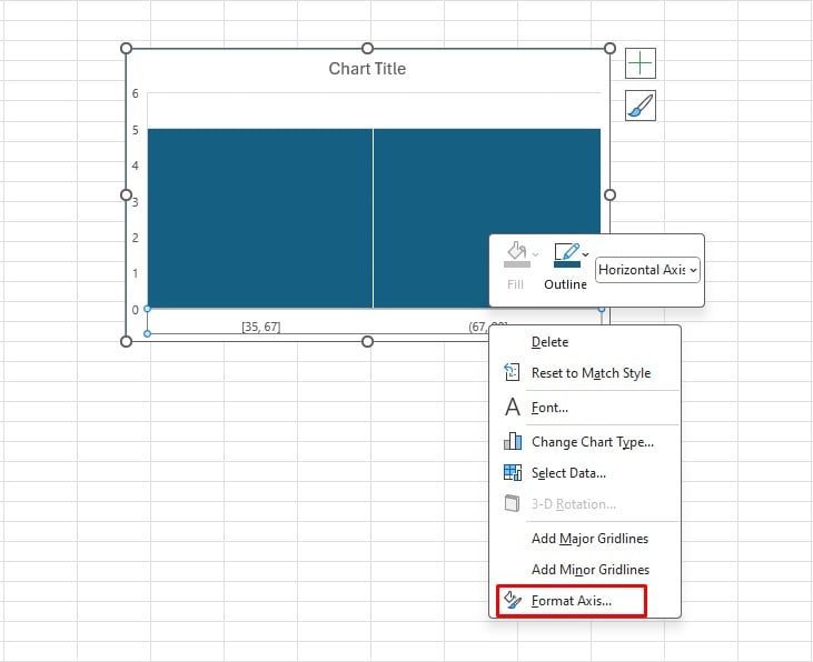
- From the sidebar, expand Axis Options.
- Under Bins, select the option next to Bin width and enter your desired interval next to the box.
Use the Analyse ToolPak Add-in
You can also use the Analyse ToolPak add-in to insert histograms through the Data Analysis tool. Go to the Data tab and look for the “Analysis” section. If you see no such group in the Data ribbon, it means the add-in is disabled from your Excel Options.
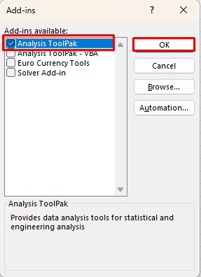
Step 1: Enable Analyse ToolPak Add-in
If the Data Analysis tool is available on the Data tab, you can skip this step.
- Go to File > Options.
- In the sidebar, select Add-ins.
- Next to Manage, select Excel Add-ins > Go.
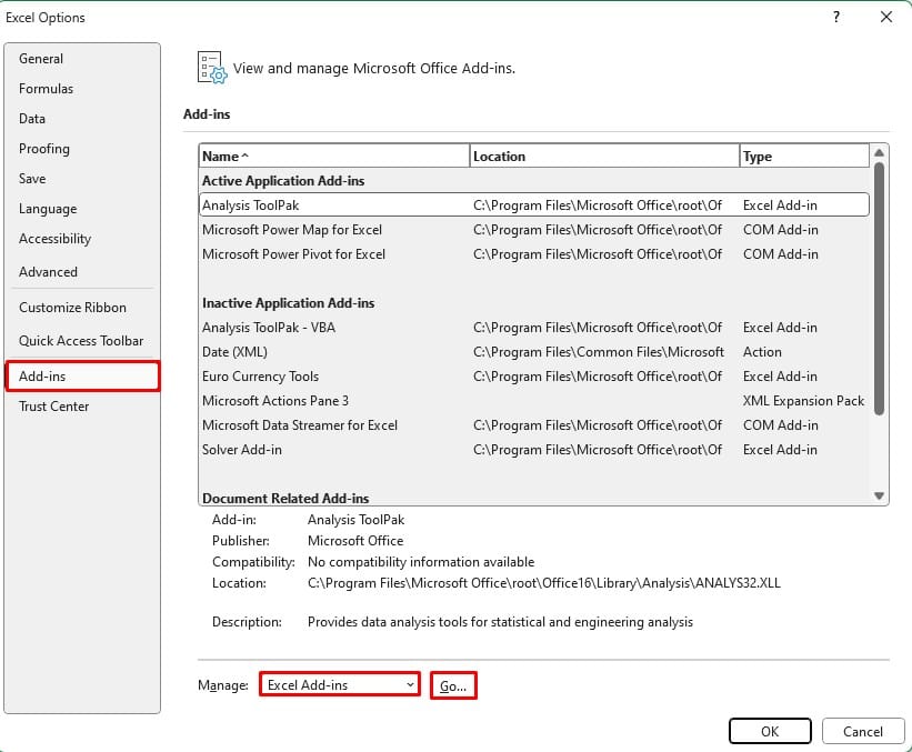
- Select the box next to Analyse ToolPak and click OK.
Step 2: Enter Data and Bin Intervals
You will have to reference the data and the bin intervals in the Data Analysis tool. So, make sure you’ve entered these data in your spreadsheet before you use this tool to insert your histogram.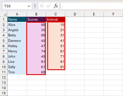
Step 3: Create Histogram
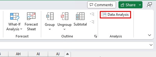
- Go to the Data tab.
- From the Analysis section, click on the Data Analysis tool.
- Next to Input Range, reference the cells with your data.
- Reference your interval values next to the Bin Range.
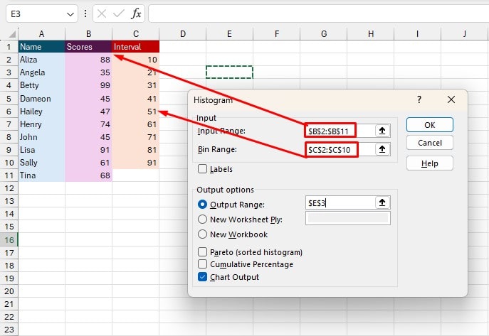
- If you want to place the histogram within the sheet, select the option next to Output Range.
- Reference a location within the cell next to the Output Range option.
- Check the box next to Chart Output.
- Click OK.
Format Histograms in Excel
When you’re done creating your histogram, you may want to format or tweak something within the chart. Even after you’re done creating your chart, you can edit the chart title, legends or values by simply changing the
Usually histograms are tightly placed together in the chart. However, when you create histograms using the Data Analysis tool, they are spaced out from each other. Along with this formatting, you can change the color, borders, and style of your histogram.
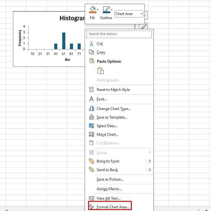
- Select your histogram and right-click on it.
- Select Format Chart Area.
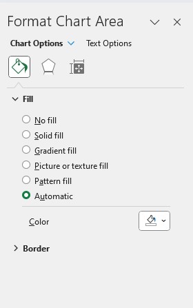
Change Fill & Line
- Make sure you’re in the Fill & Line section.
- Expand the Fill section to choose the type of fill.
- Select a color next to the Color section.
- Expand the Border section and choose a border type.
- Choose the Color, Transparency, and width of your border.
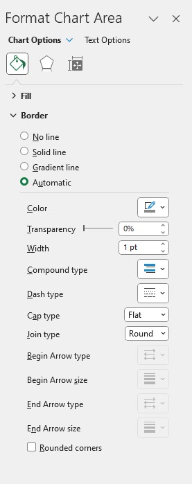
- Configure additional border settings accordingly.
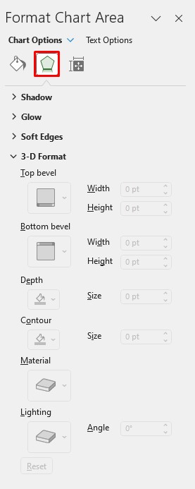
Add Effects
- Switch to the Effects tab.
- Expand the effect you wish to apply to your histogram.
- You can select a preset for Shadow, Glow, and Soft Edges and make adjustments accordingly.
- For 3-D Format, enter the size and angles you wish your histogram to be beveled from.
Size & Properties
- Head to the Size & Properties tab.
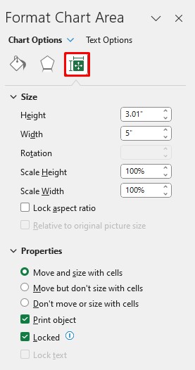
- Expand the Size option.
- Set the Height and width along with additional adjustments you wish to make to the histogram.
- Expand the Properties tab.
- If you wish to enable a certain property, simply select the box next to it.