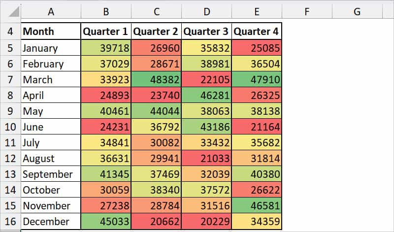
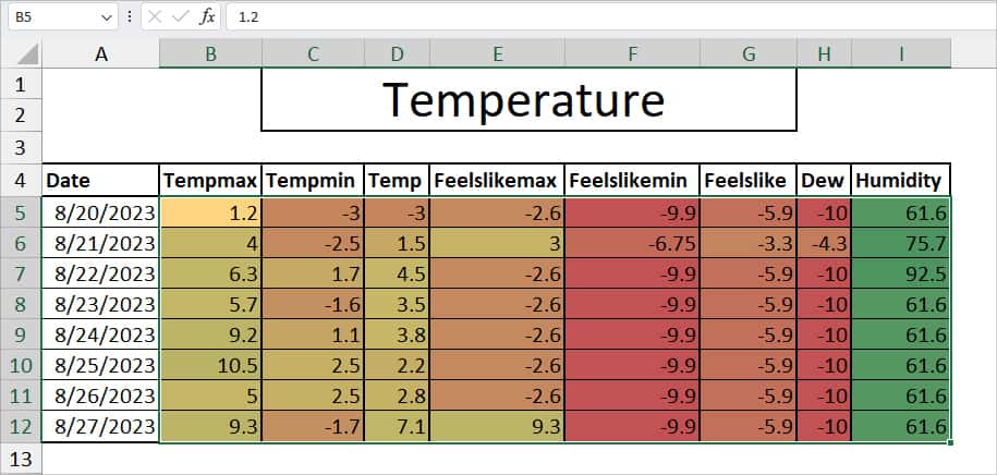
If you’ve seen data with colors like this in Excel, it’s a Heat Map. While it is mostly used in geographical world maps, nowadays it has been a popular tool for data analysis in websites, businesses, temperatures, and risk management sectors.
Heat Map’s contrasting color codes with hue, luminance, and saturation are what make it the best tool to illustrate the metrics of data. Just by looking at those color codes, a reader can easily interpret the high, low, and mid points at a glance.
The common color palette used in Heat Map is warm to cool-toned colors like red, green, orange, yellow, blue, etc. But, of course, it’s up to you to choose the color as per your data analysis type.
Create Heat Map
When it comes to shading cells with color, Excel’s conditional formatting is the best. You can apply one of the default color scales. Or, create a custom color scale to make a Heat Map based on values.
Apply Default Color Scales
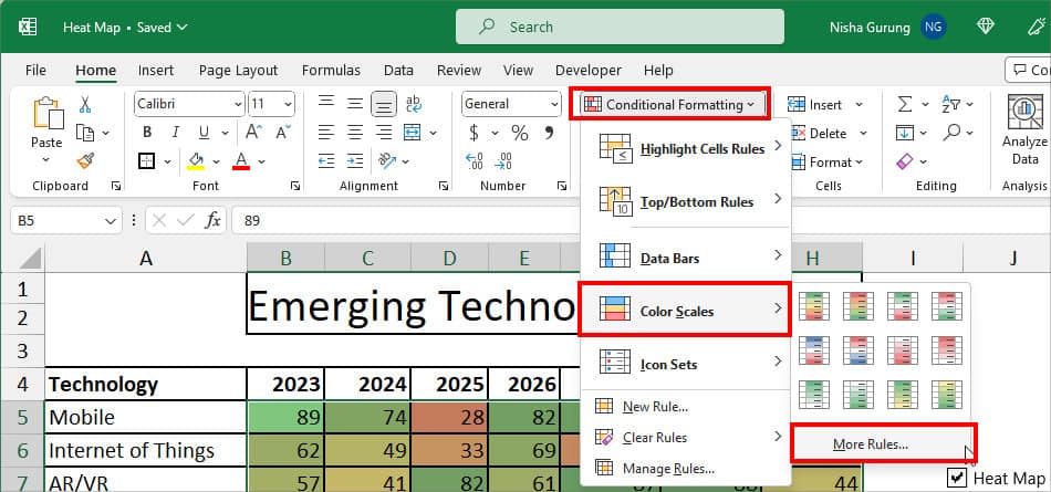
On the Excel sheet, select your data. In the Home tab, click on Conditional Formatting. Select the Color Scales and choose any one of the Colors.
Create a Custom Color Scale
Although applying the default color is easy, it does not shade the cells based on the criteria. So, you can create your own custom color scale by defining the minimum, midpoint, and maximum values.
- Select your data range.
- From the Home tab, go to Conditional Formatting. Click on Color Scales > More Rules.
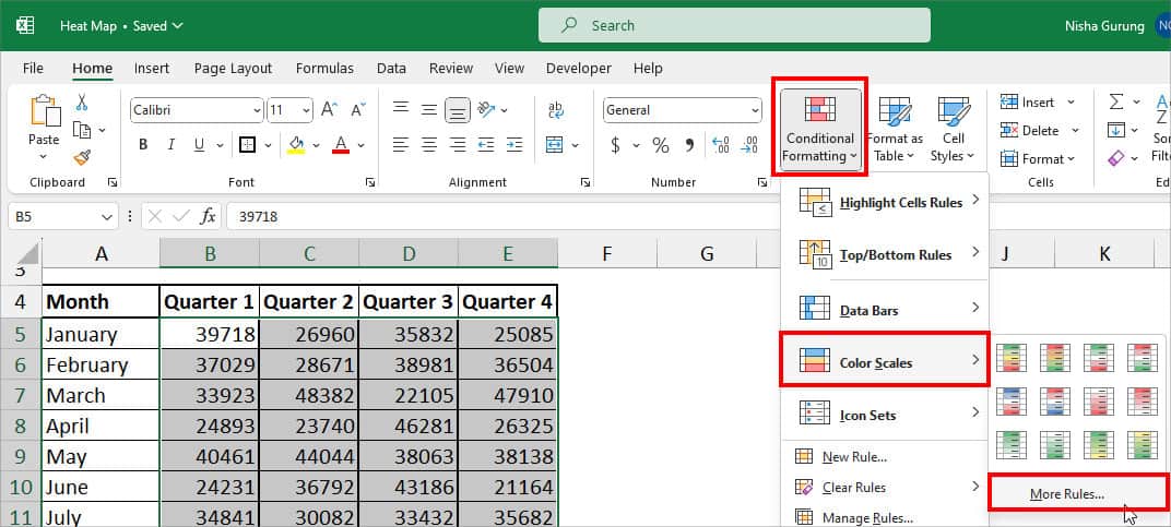
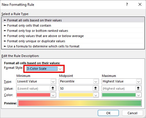
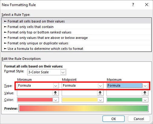
- On the New Formatting Rule dialogue box, hover over the Edit the Rule Description menu. Expand the drop-down for Format Style and select 3-Color Scale.
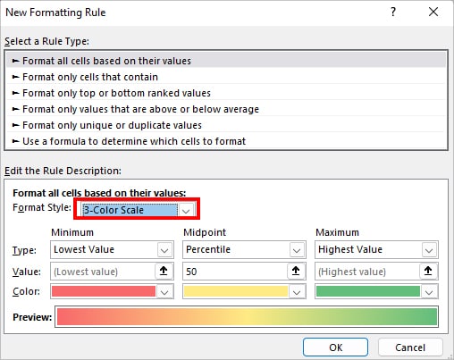
- Now, on the Minimum category, set the criteria:
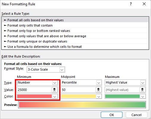
- Type: Choose a Number format.
- Value: Enter the Lowest number.
- Color: Pick a Color to specify a minimum value. This is completely optional.
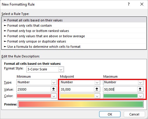
- Just like the Minimum Category, assign Type, Value, and Color for Midpoint and Maximum.
- See the Preview at the bottom to see the Heat Map color. If you’re satisfied, click OK to confirm.
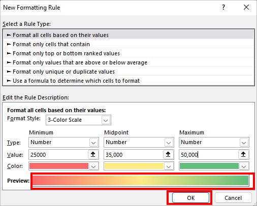
- Now, you’ll have the Heat Map Based on the criteria.
Heat Map for Pivot Table
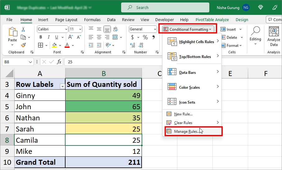
For a Normal Range on your worksheet, the Conditional Formatting applies automatically whenever you add new data. However, this isn’t the case if you are creating a heat map in the Pivot Table. The conditional Formatting does not update for additional range in the table.
So, after making a Heat Map in the Pivot Table, you need to follow extra steps to update the colors for new entries.
- Select the entire data.
- On the Home Tab, click on Conditional Formatting and choose Manage Rules.
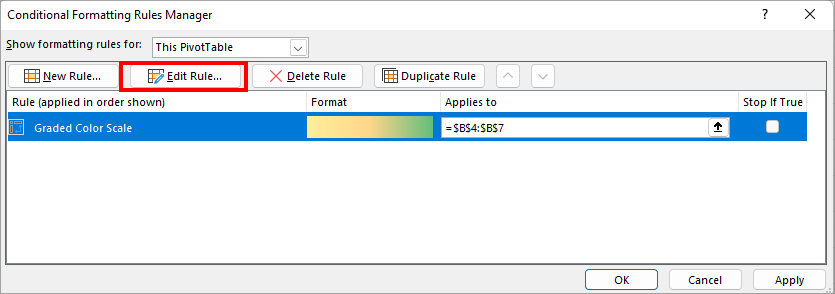
- On the Conditional Formatting Rules Manager window, select Edit Rule.
- The Edit Formatting Rule window will show up on your screen. Below the Apply Rule To, select the Third option and click OK. Here, my option is All cells showing “Sum of Quantity sold” values for “Sales Representative”
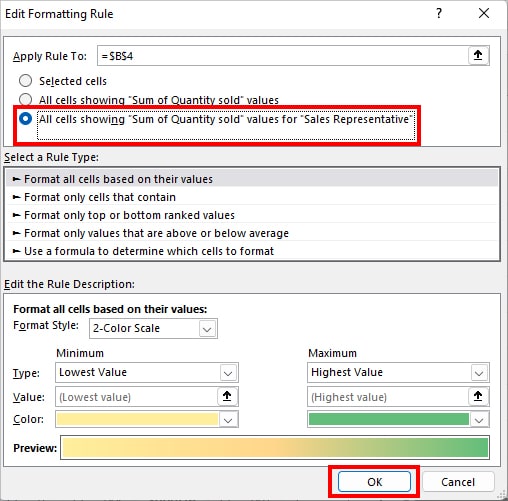
- Again, click OK.
Create a Heat Map Template
We’ve learned how to create a Heat Map based on the Values above. But, what if you want to create a Heat Map on your sheet without the numbers? For Instance, you might wish to create a template and share it with others. In that case, you can temporarily hide the numbers and display only the color codes for cells.
- Select your Heat Map data in your Excel Sheet.
- Enter Ctrl + 1 shortcut key for the Format Cells window.
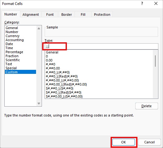
- On Format Cells, stay on Number Tab and click on Custom Category.
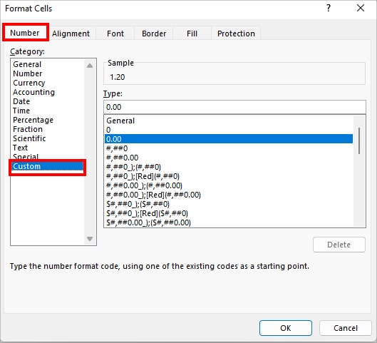
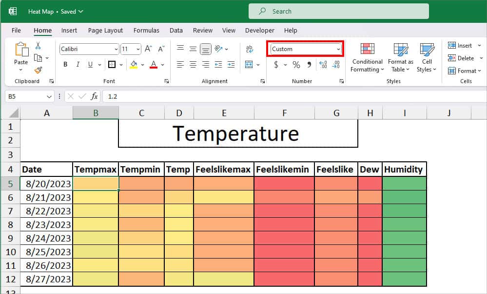
- In the Type field, enter 3 semicolons (;;;) and click OK. This custom format will hide the numbers.
- Now, you won’t have any numbers on your Heat Map.
Create a Dynamic Heat Map
Heat Maps are dynamic to some extent. Meaning, if you change the value, the color scale will update automatically with the conditional formatting. But, you still have to do it manually, isn’t it? Let’s make your Heat Map more dynamic such that you can switch between two different Heat Maps for the same data.
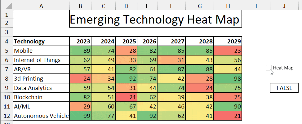
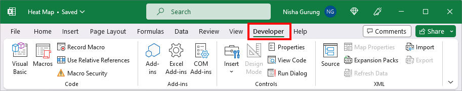
To create a Dynamic Heat Map, we will need to go to the Developer Tab. So, check the Tab in the Ribbon and add them if needed.
Step 1: Add a Check Box
- On your sheet, go to the Developer tab.
- In the Controls group, click on Insert. Below Form Controls, select Check Box.
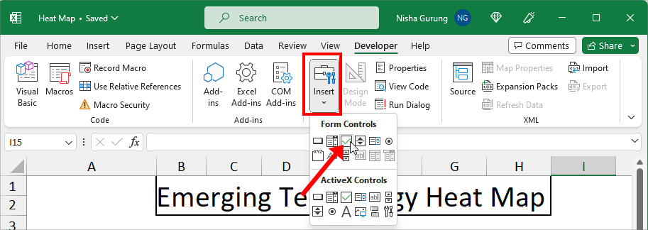
- Now, click anywhere in the sheet to add a Check Box. To rename, double-click on the Check box and enter a different Name.
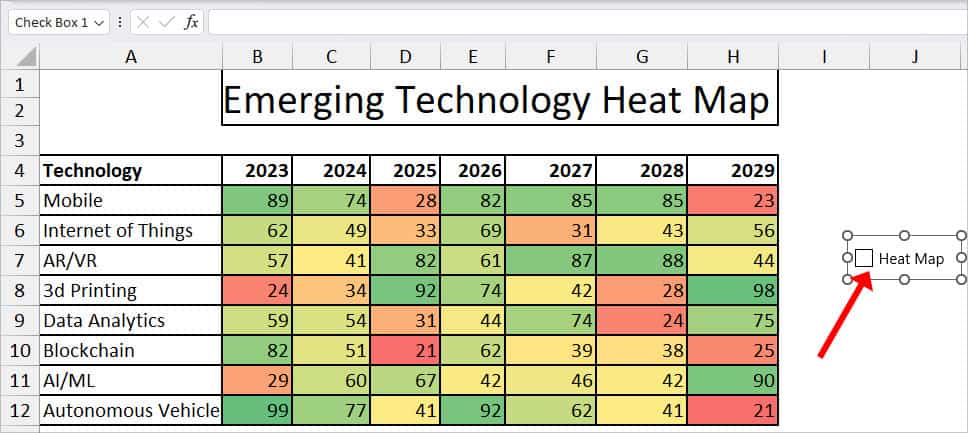
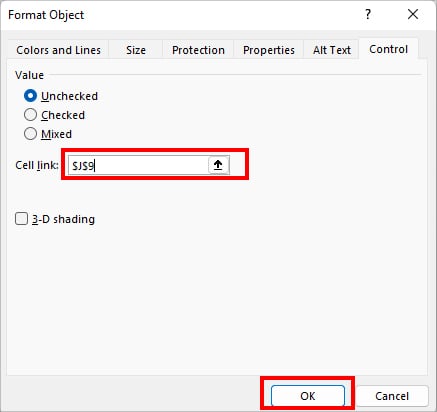
- To link the checkbox to a cell, right-click on the Check Box and pick Format Control.
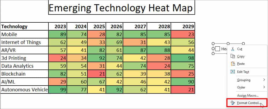
- On the Format Control window, hover over the Cell Link menu. Click the collapse icon to select a cell and hit OK. Here, we linked to $J$9 cell.
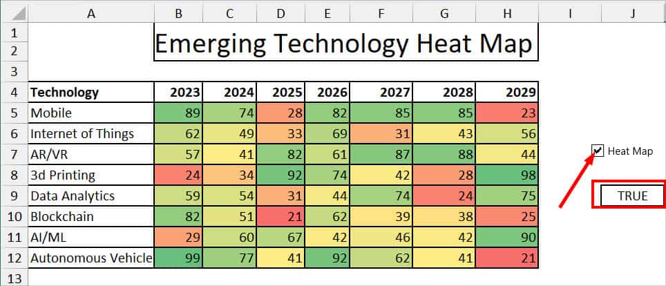
- Now, when you tick on the Check box, you’ll get TRUE in the linked cell. Similarly, if you untick, it’ll change into FALSE.
Step 2: Create a Custom Color Scale
- Select your data set.
- From the Home tab, click on Conditional Formatting. Head to Color Scales > More Rules.
- On the New Formatting Rule, set the Format Style to 3-Color Scale.
- Now, for all Minimum, Midpoint, and Maximum categories, set the type to Formula.
- Then, enter the formula for each of the following Value fields.
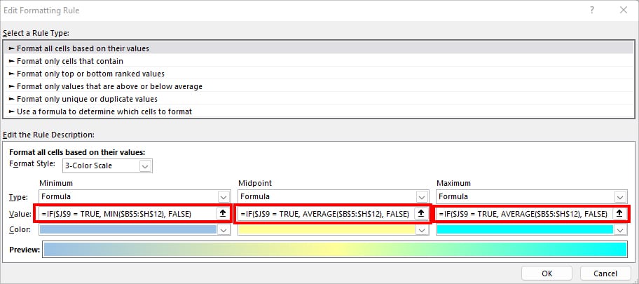
- Minimum:
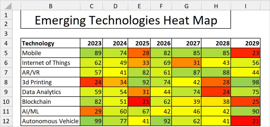
=IF($J$9 = TRUE, MIN($B$5:$H$12), FALSE) - Midpoint:
=IF($H$5 = TRUE, AVERAGE($B$5:$H$12), FALSE) - Maximum:
=IF($H$5 = TRUE, AVERAGE($B$5:$H$12), FALSE)
- Minimum:
- Choose Color for all three categories and click OK.
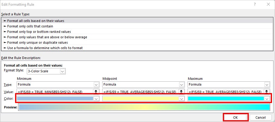
- If you tick mark on the Check Box, your data will display a second Heat Map. Similarly, when the linked cell is FALSE, you’ll have the first Heat Map.