In Google Sheets, you can create a Box and Whisker Plot to visualize your descriptive statistics data. For example, the summary of Statistical values like Median, Minimum value, Maximum Value, Lower Quartile Value (Q1), and Upper Quartile Value(Q3), etc.
The best part is Google Sheets already has a built-in Candlestick chart. So, you do not have to manually plot a Box Plot like in Excel.
Here’s a step-by-step guide on how to construct a Box and Whisker chart. In the end, I have also discussed how to interpret your findings.
Step 1: Prepare your Data
To plot the Box and Whisker Chart in Google Sheets, you must first prepare your source data.
You need to calculate 5 key elements as Median, Minimum value, Maximum Value, Lower Quartile Value (Q1), and Upper Quartile Value(Q3) from your raw data.
So, let us find these values one by one. However, if you already have them, you can skip this part and move on to Step 2.
Example:
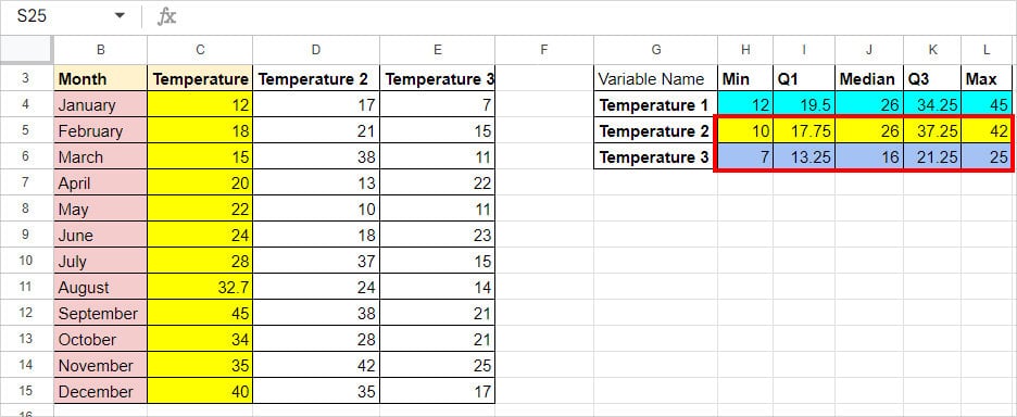
Suppose, I have lists of Months and Temperatures in the UK from cell ranges B4:B15. Check out this table to calculate the values. I will construct a Single Whisker and Box Plot.
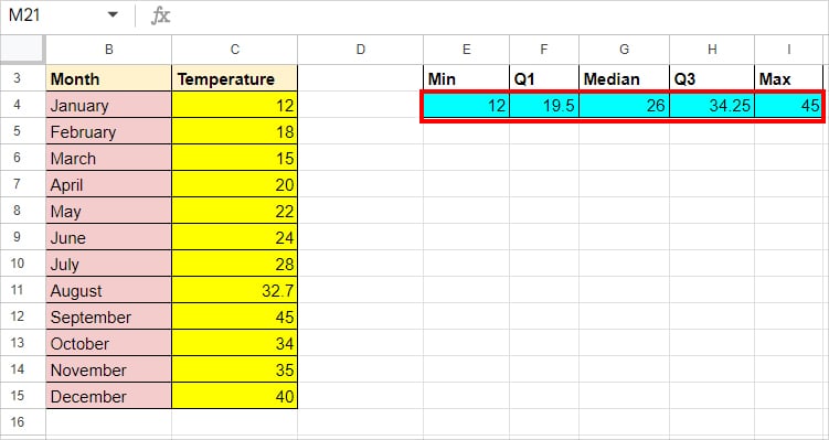
| Value | Syntax | Formula | Description |
| Minimum Value | =MIN(value1, value2, value3, ….) | =MIN(C4:C15) | The MIN function returns the lowest number from C4 through C15 which is 12. |
| Lower Quartile(Q1) | =QUARTILE(data, 1) | =QUARTILE(C4:C15, 1) | In the formula, C4:C15 is our range and 1 is quartile_number. Our Q1 is 19.5. |
| Median | =MEDIAN(value1, [value2, ….]) | =MEDIAN(C4:C15) | The MEDIAN function returned 26 as our midpoint value. |
| Upper Quartile(Q3) | =QUARTILE(data, 3) | =QUARTILE(C4:C15, 3) | The formula calculated the upper quartile value and resulted in 34.25. |
| Maximum Value | =MAX(value1, [value2,….]) | =MAX(C4:C15) | The MAX function identified and returned 45 number as the highest number. |
Step 2: Insert Chart
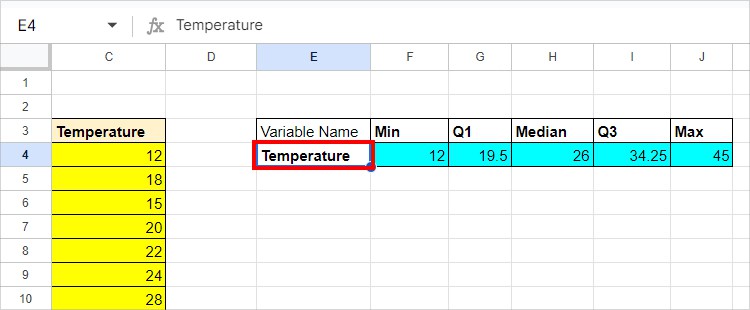
Once all your data is ready, you can plot the Box and Whisker Chart. Remember, you must have at least one text in the data.
So, insert a New Column to the left of your data. Then, enter a Variable name.
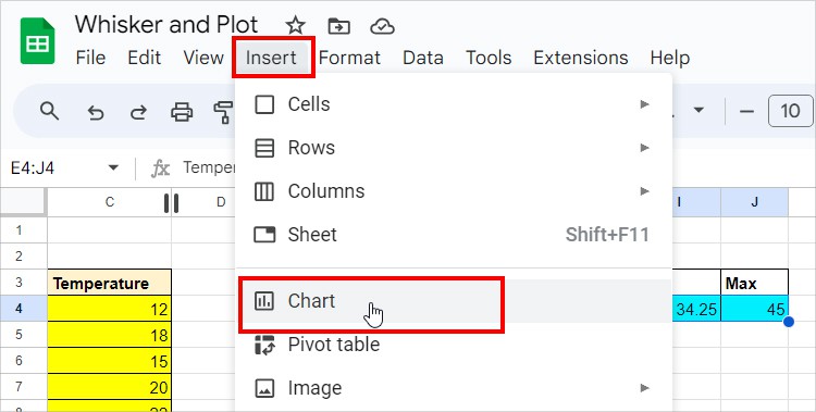
Select the Text and Numerical rows you calculated earlier. Head to the Insert tab > Chart.
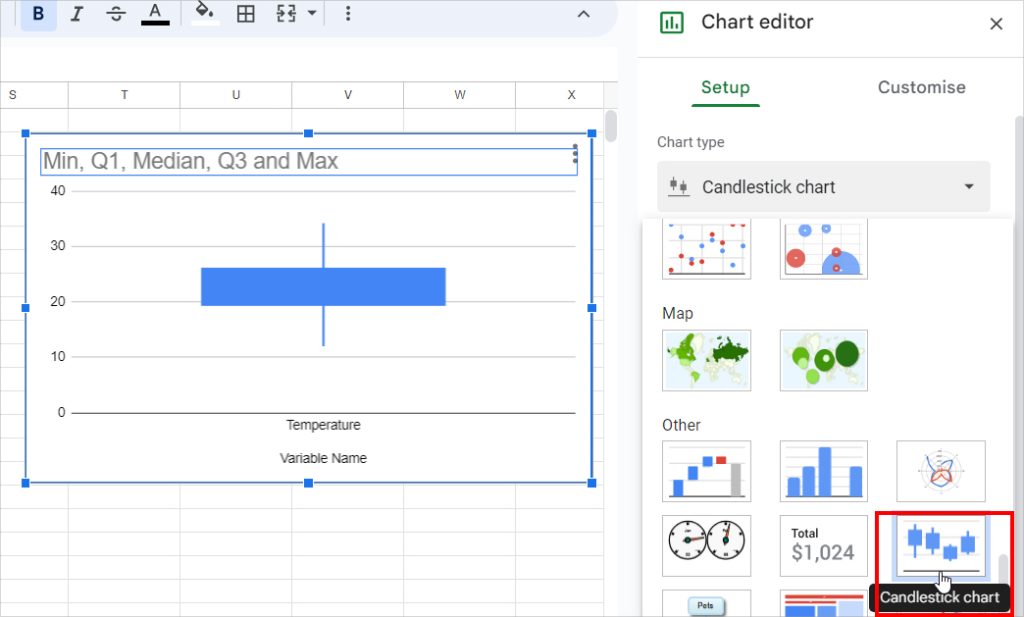
Hover over the Chart editor window. Expand the drop-down for Chart type and choose Candlestick Chart.
Step 3: Format Chart
Now, to format, double-click on the Chart and go to the Customise Tab. Then, expand each menu to edit the Chart.
Chart Style: Choose a Background color and Font for the Chart. Change Chart border color.
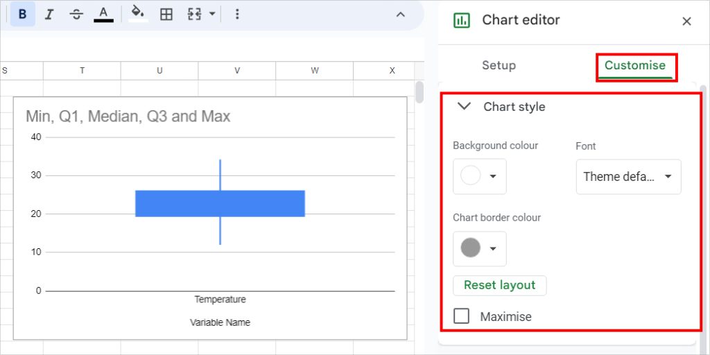
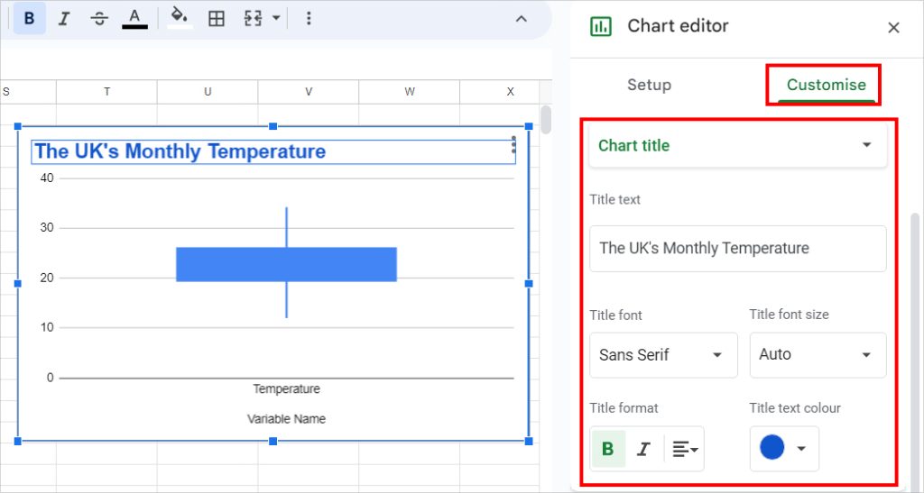
Chart Title: Pick the Chart title in the drop-down menu. Under the Title text, enter a Heading for your Chart. After that, choose the Title font, font size, format, and text color as you wish.
Construct Multiple Whisker and Box Plot
Just like the single-box plot, you can make multiple Whisker and Box plots.
All you need to do is calculate the 5 (Median, Minimum value, Maximum Value, Q1, and Q3) values for several variables. Select the data and insert the Candlestick Chart.
Here’s how the Diagram would look like with multiple box plots.
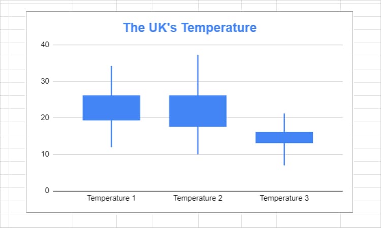
Interpreting Whisker and Plot Chart
Unlike Excel’s Box Plot, you won’t have many elements to distinguish your values in the Box Plot. So, how do you interpret the chart and conclude the findings?
Here, I have listed down the order of plots.
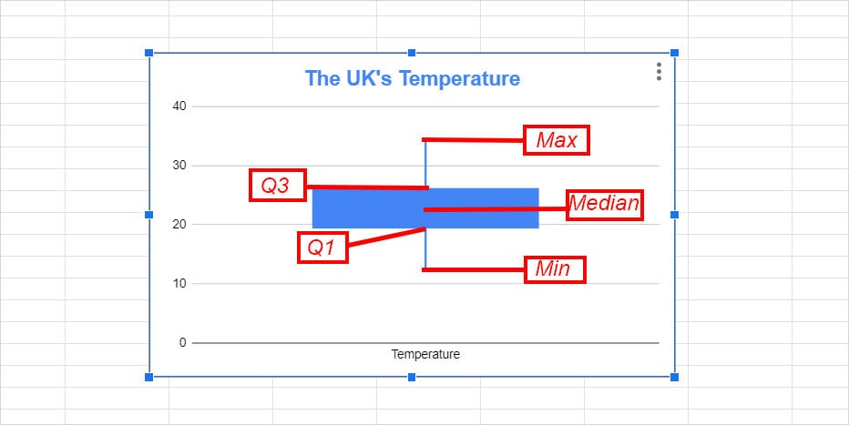
- The top part of the Line is the Maximum Value.
- Then, lies the value of Q3. It shows the distance between the Maximum Value and the Third Quartile. The Q3 is situated just at the top center of the box. You could use it to determine the outliers.
- Although there’s no exact way to measure the Median value in Whisker and Plot Charts, you can estimate that it lies in the middle of the Box.
- Next, you can find the value of Q1. While the top part of the box is Q3, the bottom part is the value of Q1 as shown in the image.
- The end of the stick at the bottom signifies the Minimum Value.