Excel Charts like Scatter Diagrams have only two axes (Y-axis and X-axis). But, sometimes, you might find the need to plot the charts with a 3 axis to illustrate multiple variables.
Since there’s no built-in chart design with multiple axis, it might be challenging for you to figure out how to do this.
But, there’s a workaround to this. You can merge two Charts together and showcase 3 Axis (2-Y Axis and 1 X-Axis). Here’s a step-by-step guide.
Step 1: Insert and Duplicate Chart
- On your sheet, select your data table and click on the Insert tab.
- From the Charts section, choose Scatter and pick a Scatter Chart.
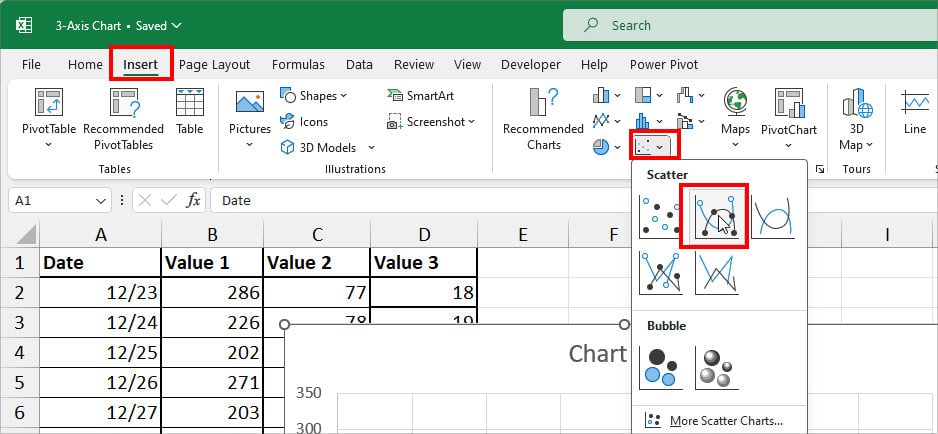
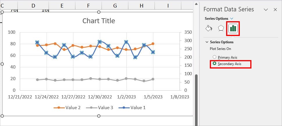
- Double-click on the First plotline for the Format Data Series menu. Click on the Series Options icon and pick the Secondary axis.
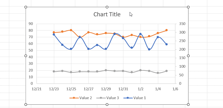
- Now, while your chart is still selected, enter Ctrl + D to duplicate the chart.
Step 2: Edit the Original Chart
- On the Chart, select the Grey Line and press Delete key to remove it.
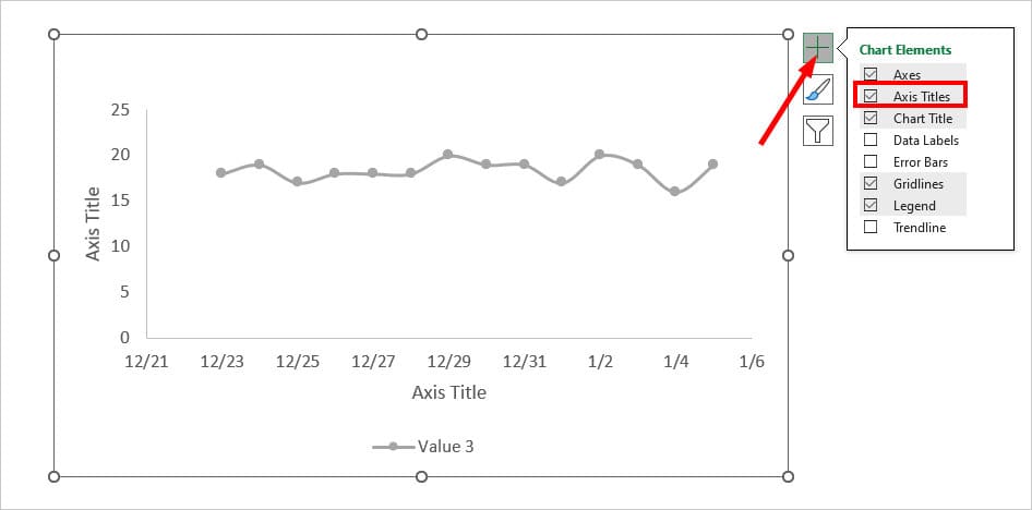
- Click the + icon and tick the box for Axis Titles.
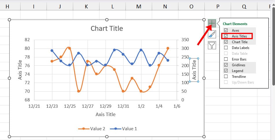
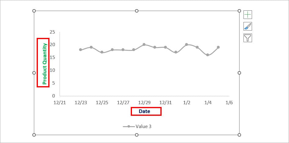
- Rename Axis Titles and set the Font color as you wish.
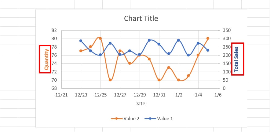
- Change the Y-Axis font color.
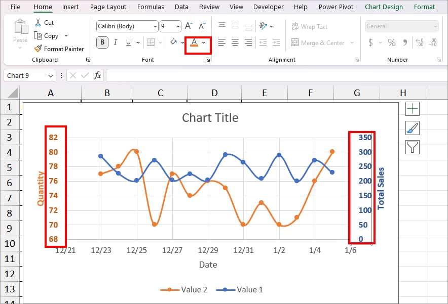
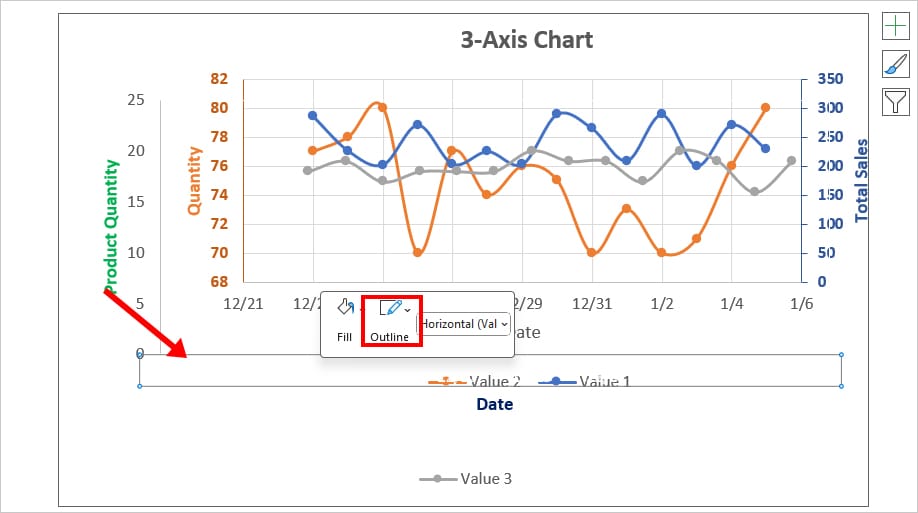
- Right-click on Axis and choose the same color as Axis Title for the Outline.
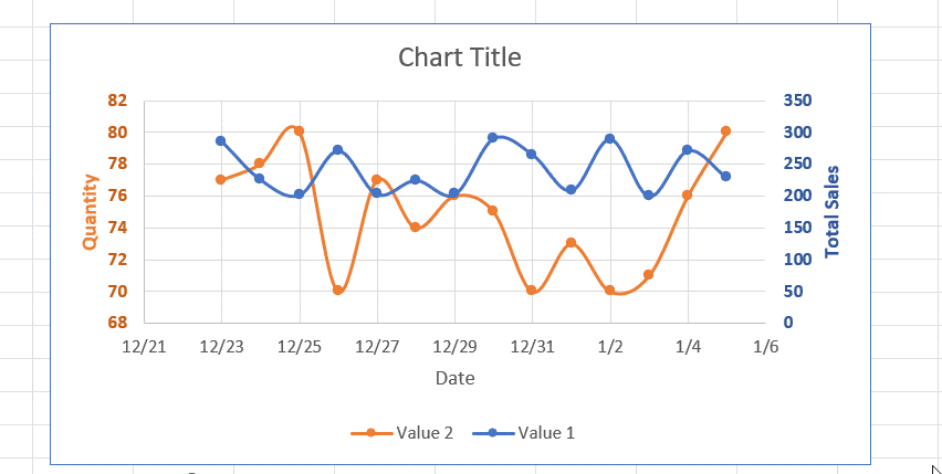
- Rename Chart Title. As an example, I’ve entered 3-Axis Chart.
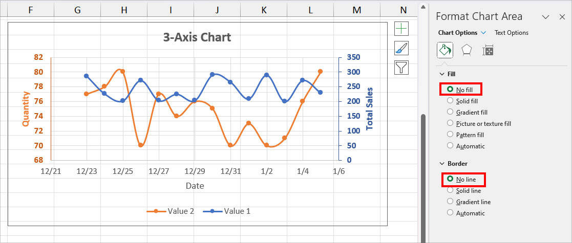
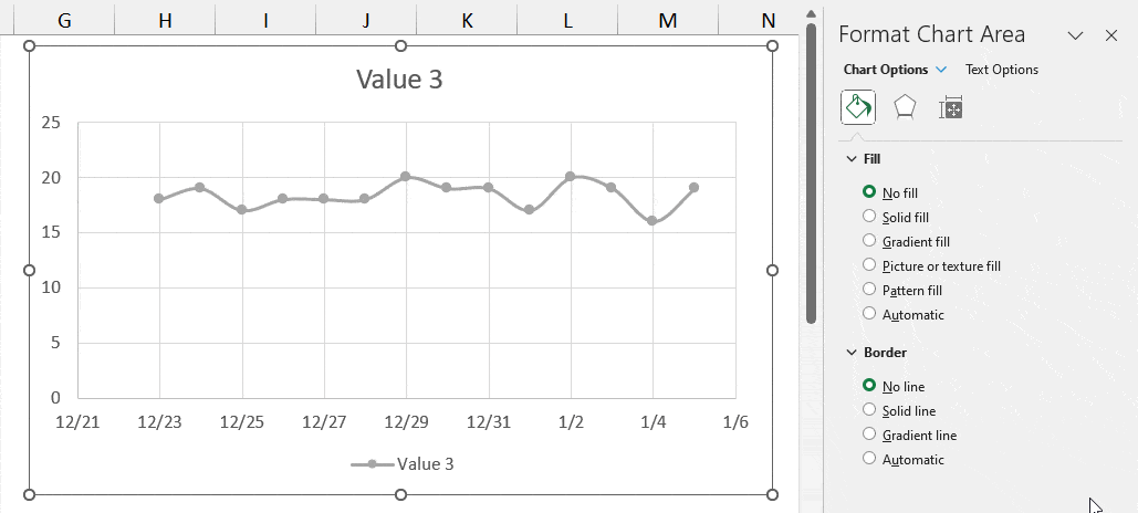
- Double-click on the Chart Area. On the Format Chart Area, pick No Fill for Fill and No line for Border.
Step 3: Edit Duplicate Chart
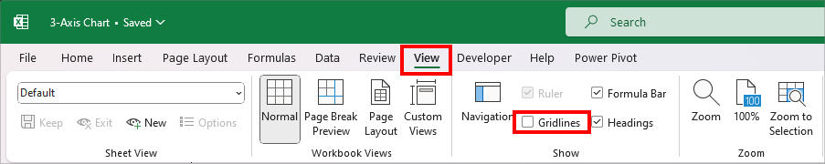
Before you edit the Duplicate charts, go to the View Tab and uncheck the box for Gridlines. Since Scatter charts have gridlines itself, they can look cluttered and confusing.
Format Chart Area
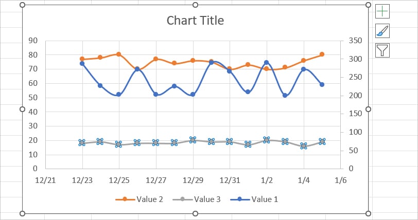
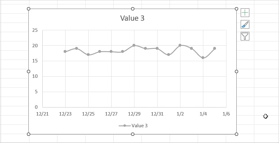
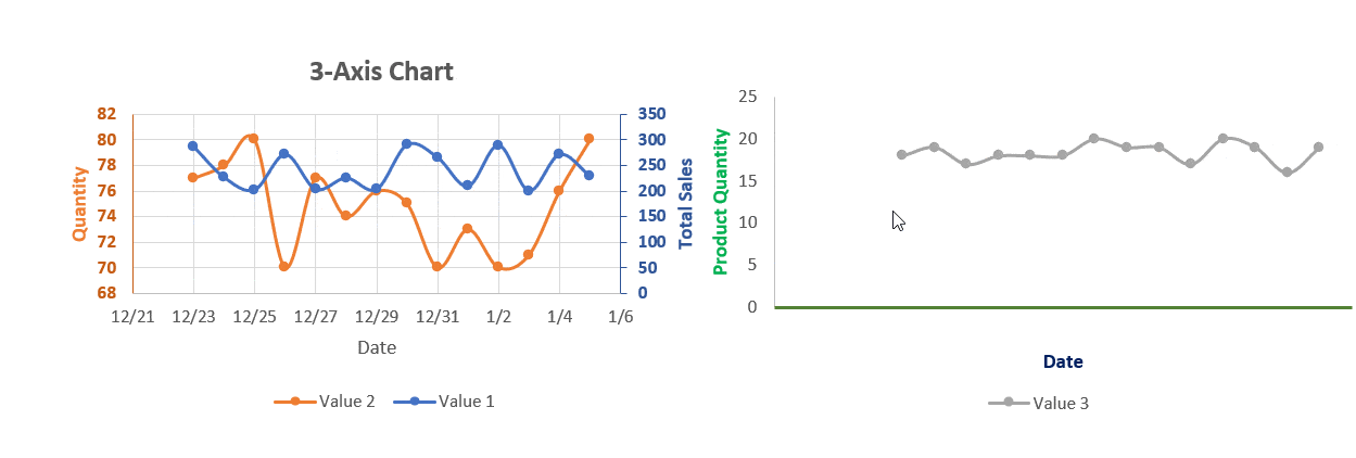
- Select the Duplicate Chart and remove Two colorful lines from the graph. Leave only the Grey Line as shown in the picture.
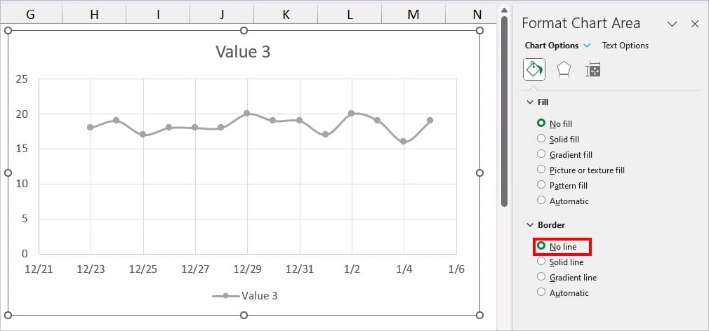
- Double-click on the chart area to bring up the Format Chart Area menu. Then, on Fill, choose No Fill.
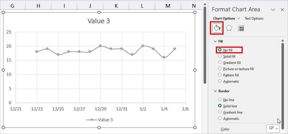
- Below Border, pick No Line.
- On your chart, click on the vertical Gridlines twice for the Format Major Gridlines and choose No line. Again, select the horizontal gridlines and set it No Line.
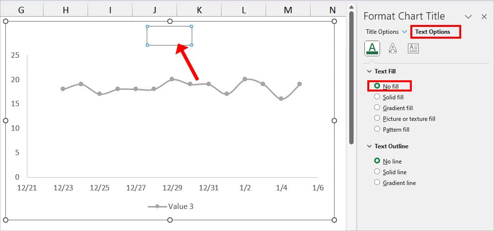
- Click on the Chart Title twice and go to the Text Options. Below Text Fill, choose No Fill.
Format Axis
- Select the Chart Area. Go to the + icon and check the box for Axis Titles.
- Rename the Axis Title and change the Font Color.
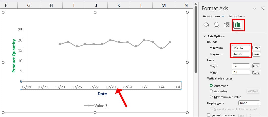
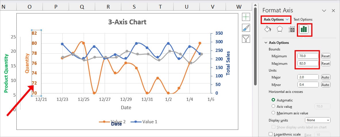
- Double-click on the X- Axis. Go to the Axis Options. Below, Bounds, decrease the value for Minimum but set the Maximum value as it the original chart.
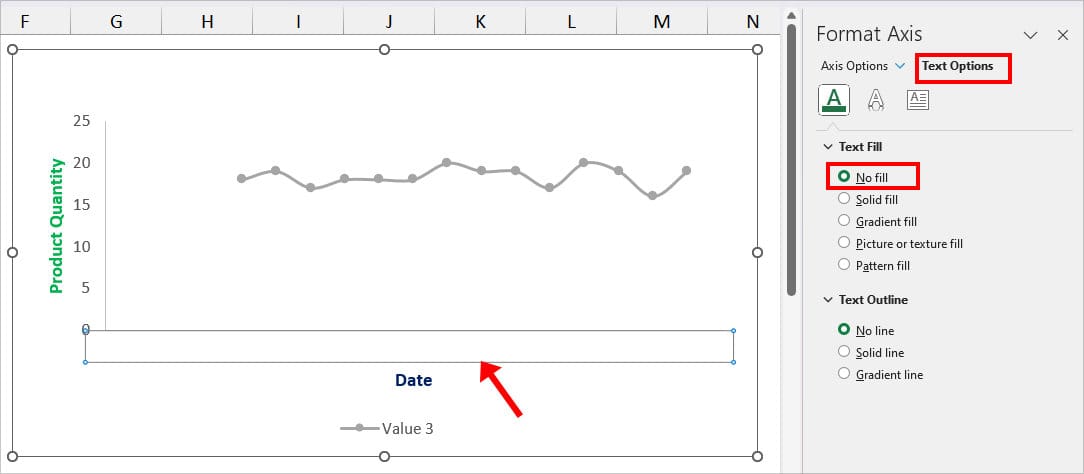
- Select the X-Axis. Go to the Text Options and choose No Fill.
- Now, go to Axis Options tab. Click the Fill & Line option. Then, do the following.
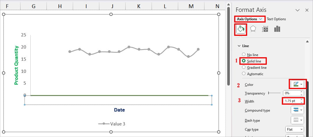
- Below Line, choose a Solid line.
- Choose a Colour for the Line.
- Increase the Line Width.
Quick Tip: To set the Maximum and Minimum Bound for dates, you could convert them to the number formatting first. These numbers are the serial format of Dates.
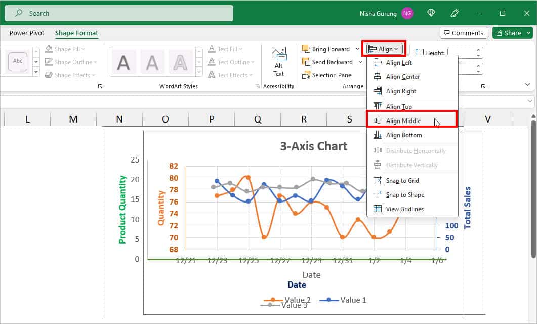
Step 4: Align Both Charts
- Now, drag and drop the second chart to overlap it with the first chart.
- While holding down the Ctrl key, select both charts. Head to the Shape Format Tab. Click on Align > Align Middle.
- Select the Duplicate chart and resize it to fit it with the original chart.
- Now, right-click on the Axis of Duplicate Chart and pick No Fill in the Outline.
- On the first chart, click on the Y-Axis Range twice. On the Format Axis menu, enter a Minimum and Maximum value for Bounds.
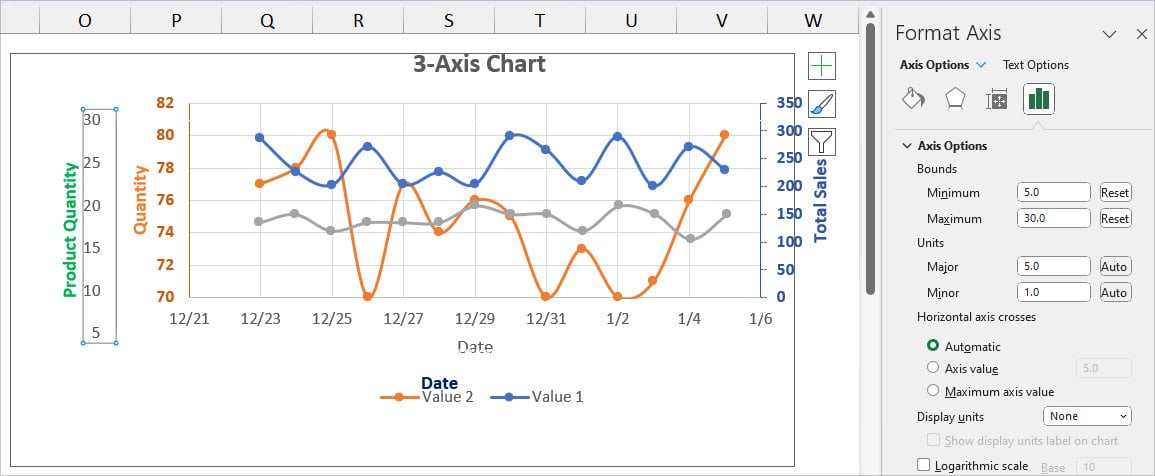
- Again, change the Y-Axis Range for the Duplicate Charts.
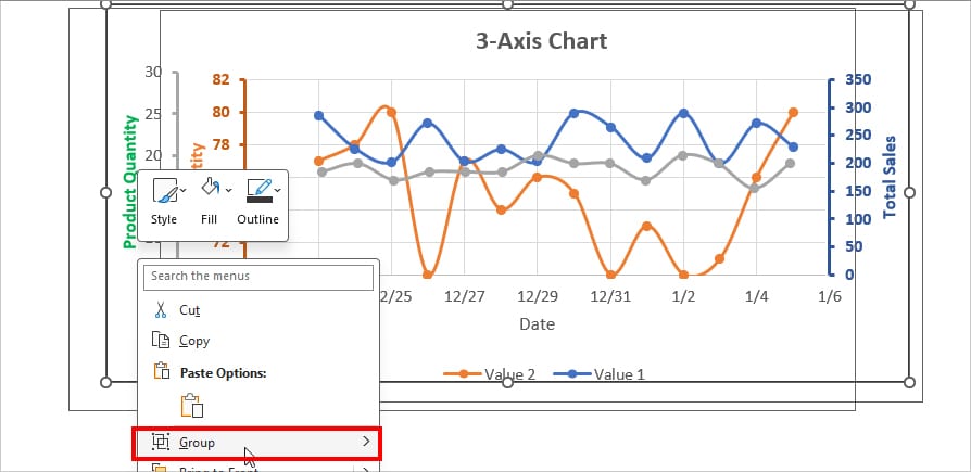
Step 5: Add a Border and Group Charts
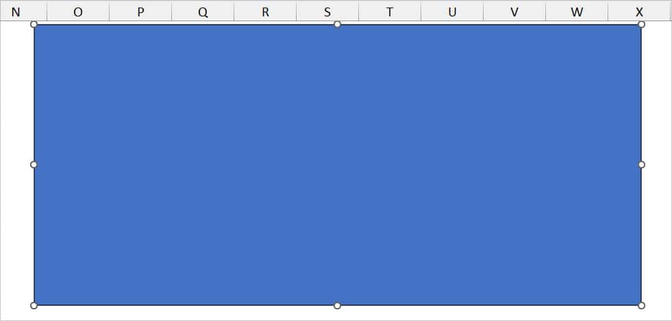
- To add a border, go to Insert Tab. Click on Shapes and pick Rectangle.
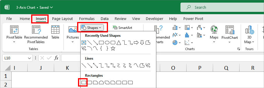
- Using the cursor, draw a Rectangular shape around the chart.
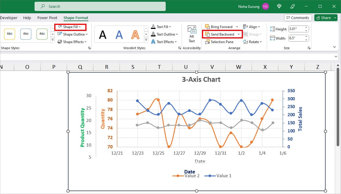
- In the Shape Format Tab, click on Send Backward twice and set the Shape Fill to No Fill.
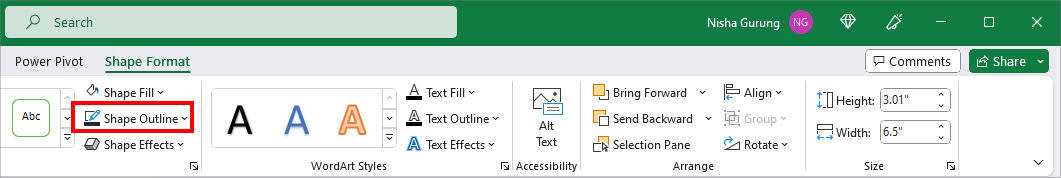
- Choose a border color from the Shape Outline.
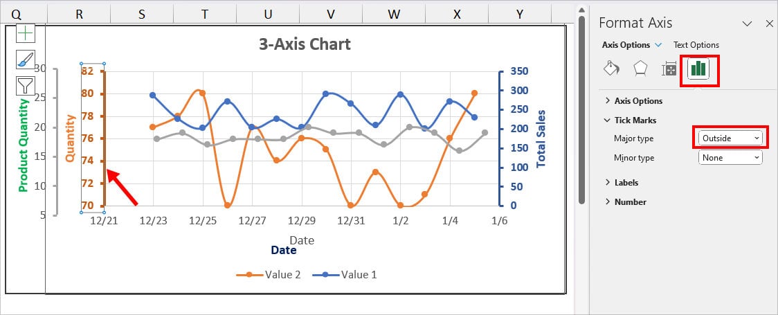
- To make your Axes more stand out, double-click on the Axis for the Format Axis menu. Go to Axis Options and set the Tick Marks to Outside. Do the same for all other axes. Here, we also increased the Axis Line Width from Fill & Line.
- Once you’re done with all editing, select all Charts and Borders. Right-click on the selected area and pick Group.
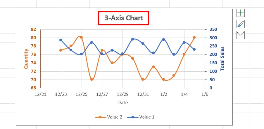
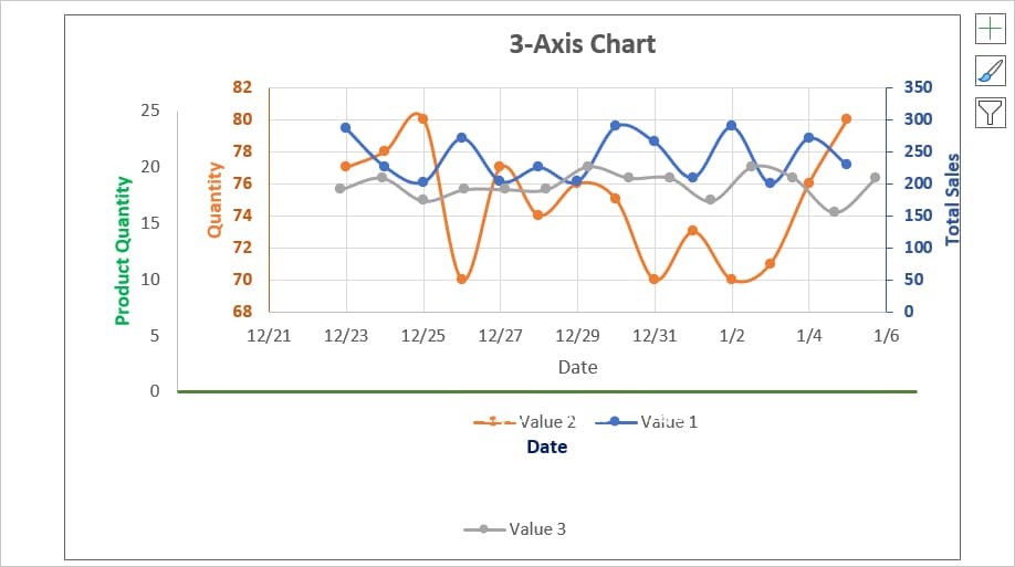
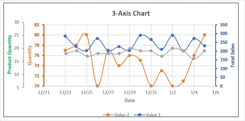
- Your final 3-axis Chart should look something like this.
QuickTip: If you wish to edit the Charts, right-click on the chart and pick Ungroup. Make necessary amends and Group the charts again.