For any project, adding progress Bars and Charts can help you to visually showcase how closer you are to the goal in one view. Be it a college project, organizational task, or your own personal goals. With these bars, you can monitor accomplishments, analyze workflow, and even increase the productivity of the task.
To create progress bars, you can find various collections of in-built charts in Excel. Some popular charts are Doughnut Charts, Clustered Column Bars, Gantt Charts, etc. As long as you pick the appropriate chart for your data, inserting progress charts is way easier than you think.
Use Data Bar
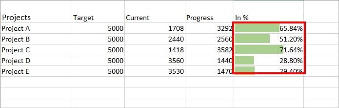
Firstly, applying conditional formatting is the best way to create progress for beginners. Use this method if you want to show the progress status in the data itself like in the given picture.
Here, we will simply add a data bar format to create a visual representation without creating any charts.
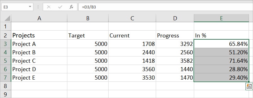
- Highlight all data on the Progress Percentage cell.
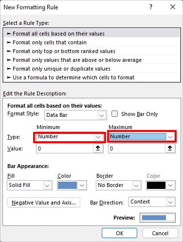
- From Home Tab, click on Conditional Formatting. Pick Data Bars > More Rules.
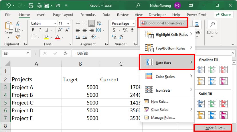
- Set the Minimum and Maximum Type to Number.
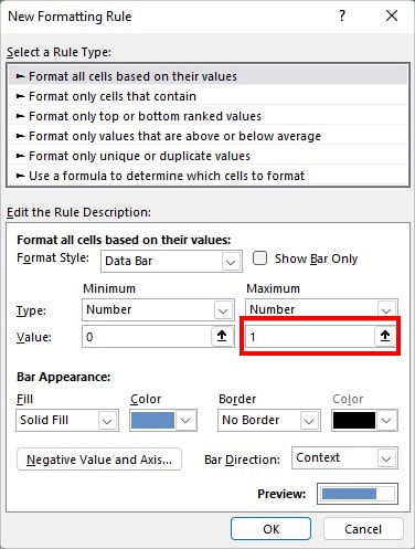
- Then, Under Maximum, enter 1 on Value.
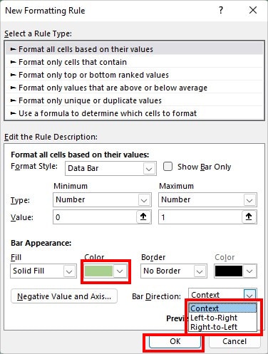
- Under Bar Appearance, choose a Color to apply. On Bar Direction, pick from the Context, Left-to-Right, or Right-to-left option for your data. Click OK.
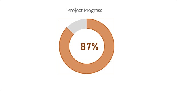
Insert Doughnut chart
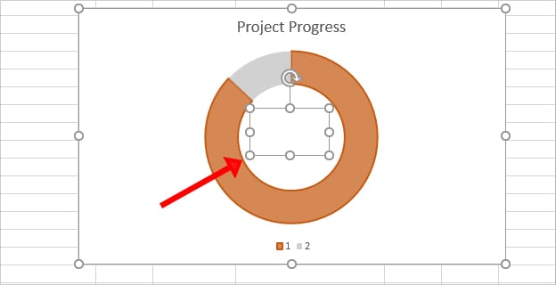
Excel’s Doughnut charts, actually shaped like doughnuts can be used to represent the progress of data. Insert this chart to give a clear picture of the total percentage completed and remaining at a glance. After adding this chart, you can also decorate your chart with several formatting.
However, this method is only for users who have two series to plot. If you have multiple data series, doughnut charts will stack up and become hard to read.
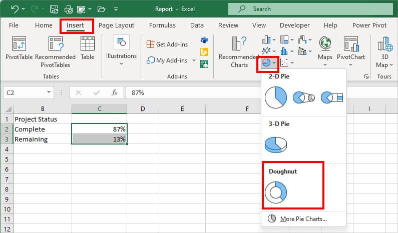
Step 1: Add a Doughnut Chart
- Select Complete and Remaining Percentage in data.
- Head to Insert Tab.
- From the Charts group, click on the Pie–chart icon and add the Doughnut chart.
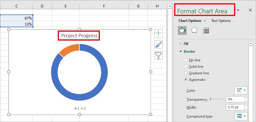
Step 2: Format Doughnut Chart
Firstly, click on the Chart Title and rename it. Then, Double-click on the Doughnut chart to bring up Format Chart Area box. Using various formatting options in this box, you can customize the progress chart as per your wish.
Change Chart Color/Border
When you add a doughnut chart, it will be in a blue and orange color by default. But, you can change these colors from the Fill menu.
To do so,
- Select any one Doughnut slice.
- Click on the Fill icon. Under Fill, pick from Solid fill, Gradient fill, Picture or texture fill, Pattern fill, or Automatic. (Ensure to tick the Vary colors by slice option.)
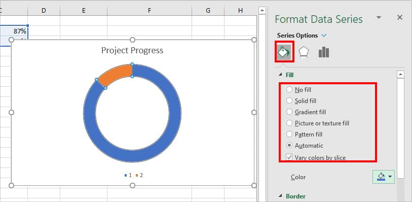
- Then, on Color, pick any Color for your chart. Also, adjust color Transparency as per your wish.
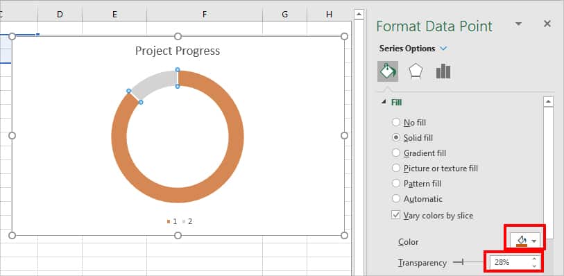
- Repeat Steps 2 and 3 for another part of the Dougnut slice.
- Now, under Border menu, choose Solid line, Gradient line, or Automatic to apply a border.
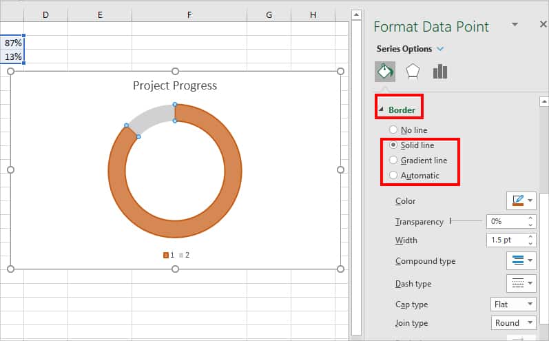
- Depending on the type of order you choose, you’ll have access to a different menu—Border colors, Lines, Width, Dash type, etc.
Apply Doughnut Chart Effects
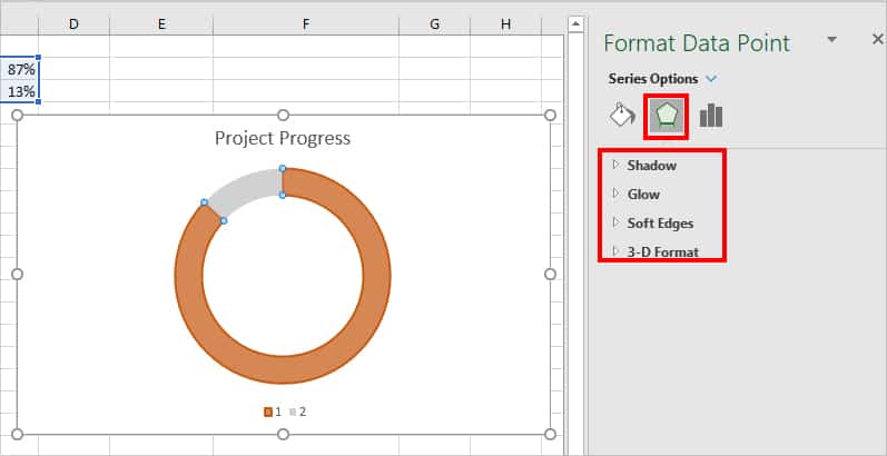
To make your chart more visually appealing, you could apply chart effects such as Shadows, Glow, Soft Edges, 3D format, etc. To do so, on the Format Data Point, click on the Effects icon. However, it is completely up to you to add effects or not.
Adjust Doughnut Chart Size
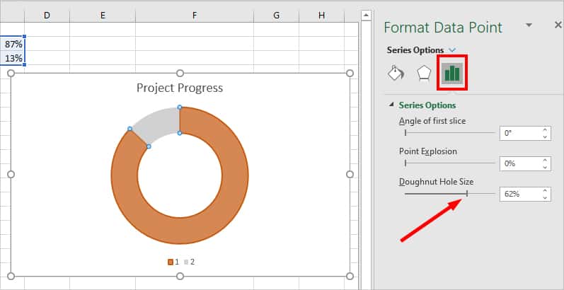
If you want to increase or decrease the Doughnut Hole Size, click on the Series Options icon. Simply, drag the slider Right or Left on the Doughnut Hole Size menu.
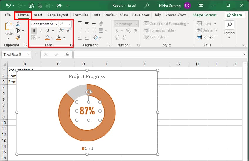
Step 3: Add the Progress Percentage to the chart
- Select the Doughnut Chart.
- Head to Format tab. On Insert Shapes, click on the Text box icon.
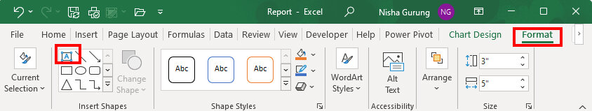
- Draw a Text box inside the Doughnut chart.
- Now, go to Formula Bar and enter = sign. Then, click on the Cell reference with the percentage to insert and hit Enter. This will move the number along with the chart.
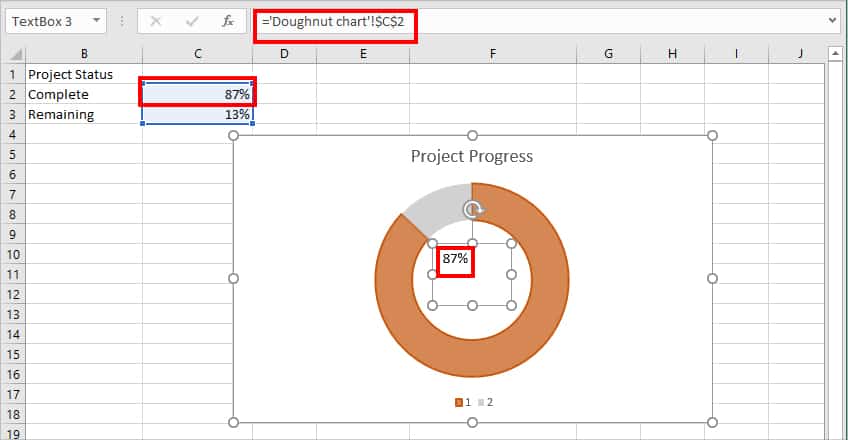
- Double-click on the Text box. Head to Home Tab and change the number Size, Color, Font, etc.
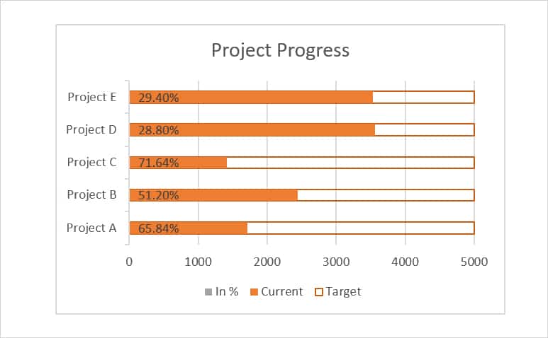
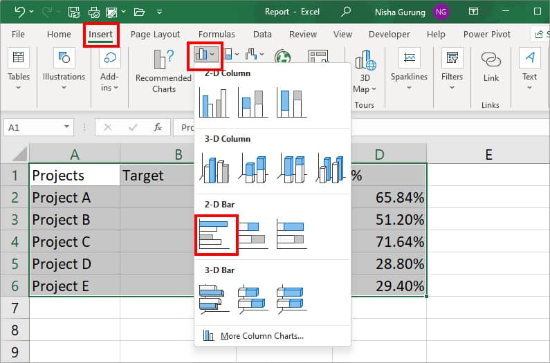
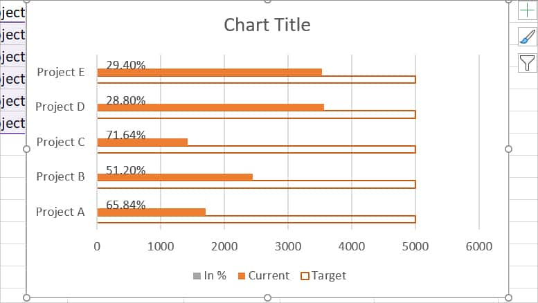
Insert Clustered Column Chart
If your data has more than two series, insert a clustered column chart to represent your progress report. Here, we will add a 2-D bar chart and overlap the series to showcase the status.
Step 1: Insert Clustered Column Chart
- Select data and navigate to Insert Tab.
- From the Charts group, click on Column Bar icon. Then, pick a 2-D Clustered Bar.
Step 2: Format Data Labels
- Click on the Chart area.
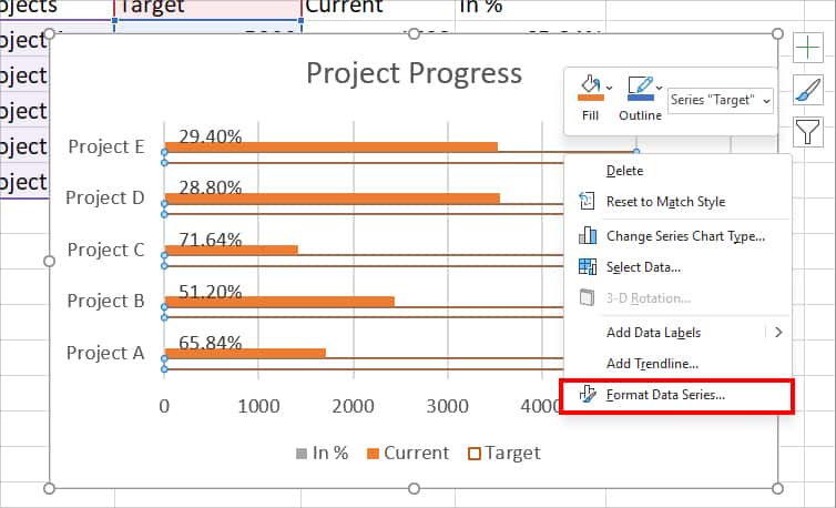
- Right-click on the Target data bar and pick Format Data Series. (See the Bar color indicator at the bottom of the chart if you cannot recognize Target bar.)
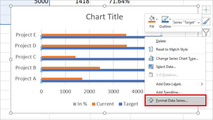
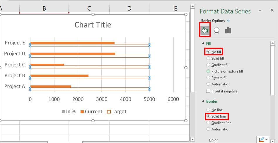
- On the Format Data Series menu at the right panel, click on Fill icon. Under Fill, choose No fill. Then, below Border, pick Solid Line and apply the border Color.
- Select the entire chart and head to Chart Design tab. From Chart Layouts group, click on Add Chart Element. Pick Data Labels > Inside Base.
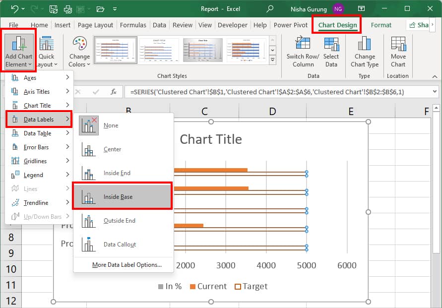
- Now, select the other Data labels and press Delete key to remove them. Keep only the Percentage value.
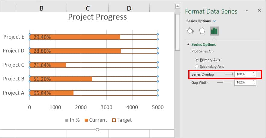
Step 3: Create a Progress Bar
- Right-click on the Target data bar and choose Format Data Series.
- Under Series Options, drag the slider for Series Overlap and set it to 100%.
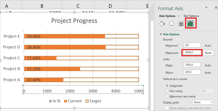
- Now, select the Chart Area. Right-click on X Axis > Format Axis.
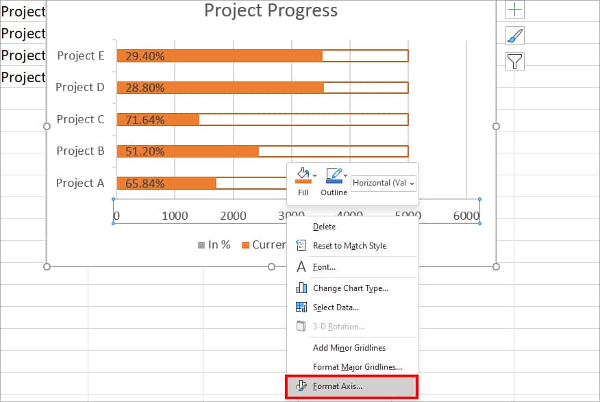
- Go to Axis Options. Under Bounds, set the Maximum to the target value. Here, we entered 5000 according to our data. This way, you’ll have the exact Target value in the end.
Insert Gantt Chart
Gantt Charts, popular among project management teams, are excellent tools to track projects from the start date to the end date. I first started creating Gantt Charts to plan and track my coursework schedules. Now, it has been my favorite and go-to chart for any project I work on.
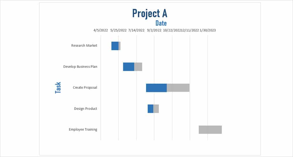
Everyone has their own way of presenting their Gantt Chart. At first, you may get a little confused. But, I will be discussing the easiest way to help you insert one.
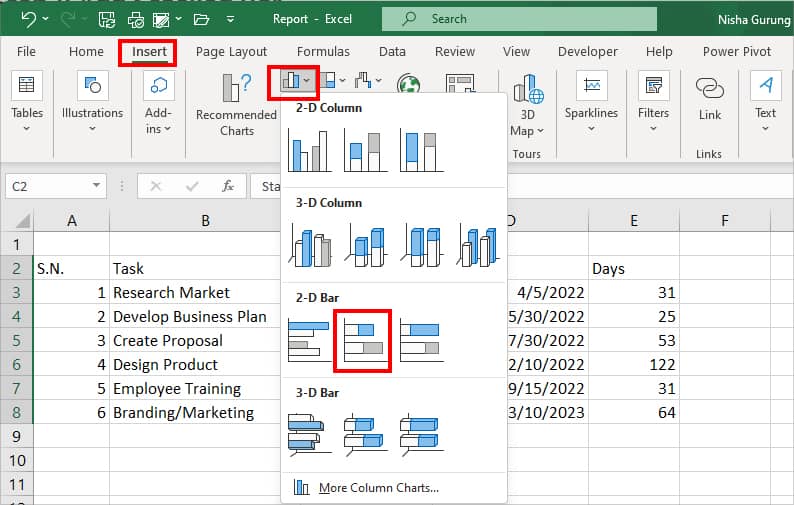
Step 1: Add Stacked Column Bar
- Highlight the Start date.
- Navigate to Insert Tab. From the Charts section, click on the Column Bar icon. Pick a horizontal 2-D Stacked Column Bar.
Step 2: Add Series
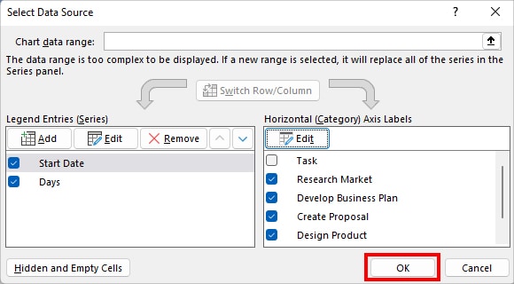
- Right-click on the Chart and pick Select Data.
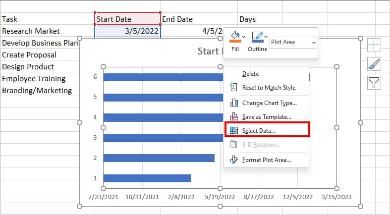
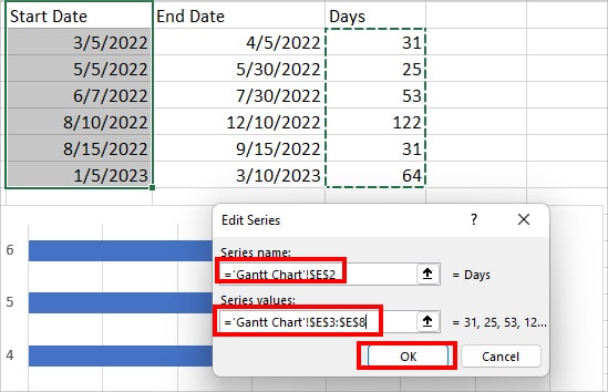
- Under Legend Entries (Series), click on Add.
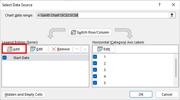
- On Series name, select Days heading using the Collapse icon. On Series Values, select the value of the Days column. Click OK.
- Now, under Horizontal (Category) Axis Labels, click Edit.
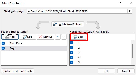
- Using the collapse icon, select the Task Column and click OK.
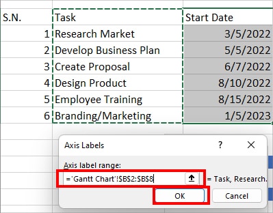
- Again, click OK.
Step 3: Format Data Series Bar
- Click on the Chart Area.
- Right-click on the Start Date bar and pick Format Data Series.
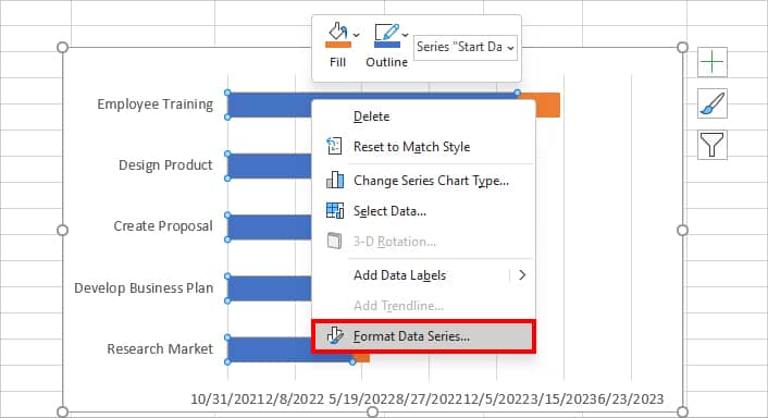
- On Format Data Series menu, click on Fill icon. Then, under fill, select No fill.
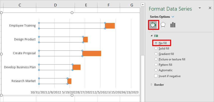
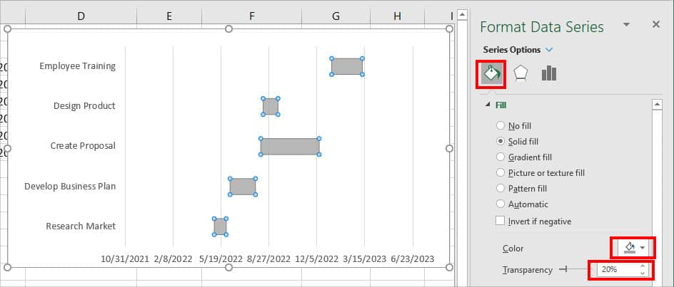
- Select the Days bar. Under Fill, pick a Lighter Color. Also, adjust color Transparency as you wish.
Step 4: Create a Progress Bar
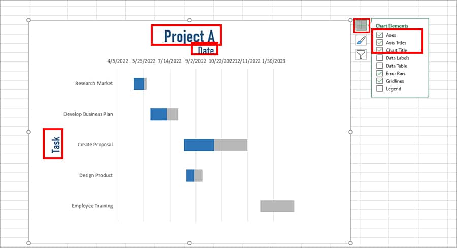
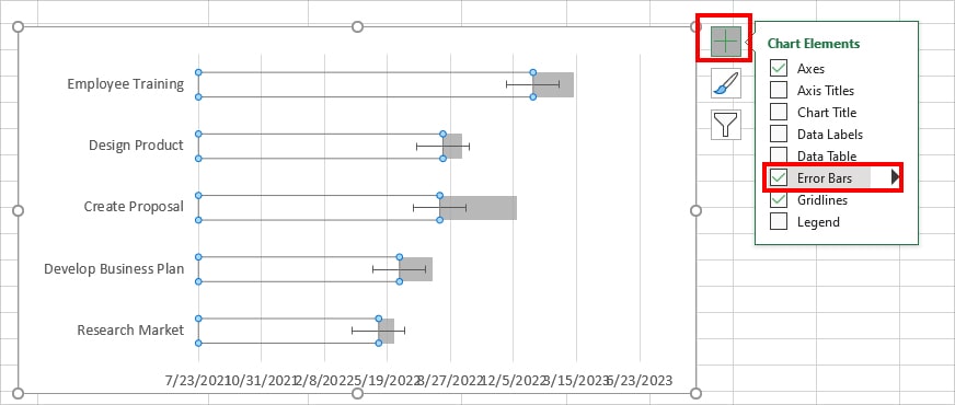
- Select the Invisible Bar and click on the + icon. Under Chart Elements, tick the box for Error Bars.
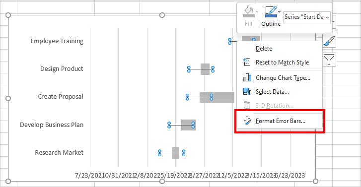
- Right-click on the Error line and choose Format Error Bars.
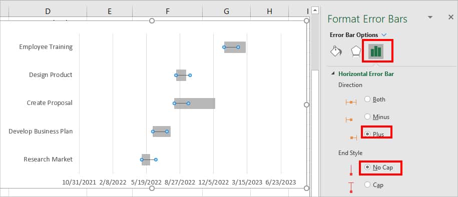
- On Error Bar options menu, hover over the Horizontal Error Bar. Under Direction, pick Plus. Below, End Style, choose No Cap.
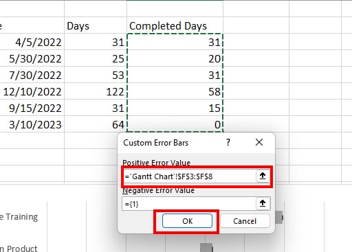
- Now, Under Error Amount, click on Custom and select Specify Value.
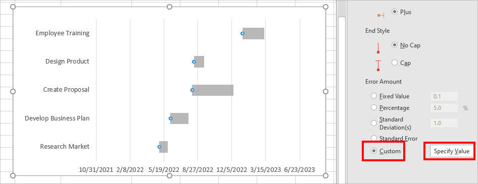
- On Positive Error Value, Highlight the value of the Completed days column and click OK.
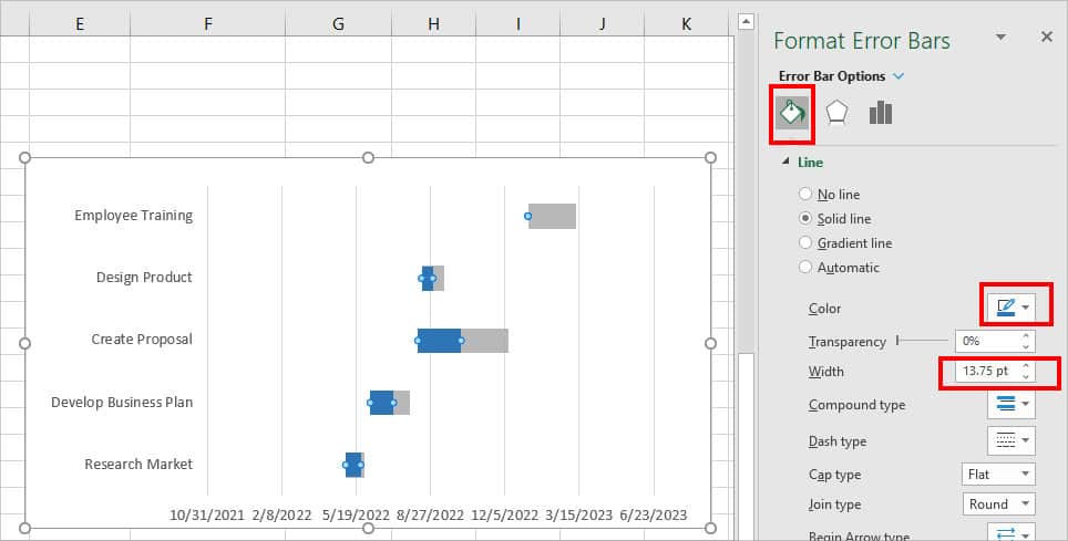
- Go to Fill Icon and change the error bar Color. Then, Increase the line Width to match the grey bars. It should now look like this.
Step 5: Format Axis
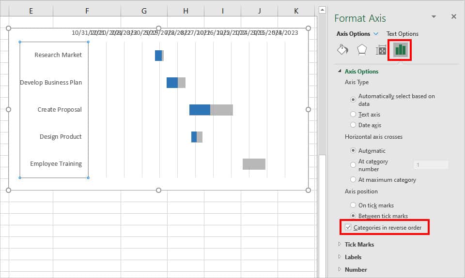
- You must have noticed the Y-Axis .i.e Tasks is in reverse order. To fix this, right-click on the Y-Axis and select Format Axis.
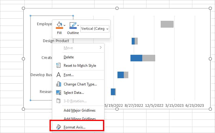
- Go to Axis Options. Then, below Axis position, check the box for Categories in reverse order.
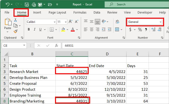
Now, when you look at the dates, it is cluttered due to the maximum and minimum axis values. To adjust this, firstly convert the First date and Last date into the General format. For this, go to the Home Tab and pick General from Number group.
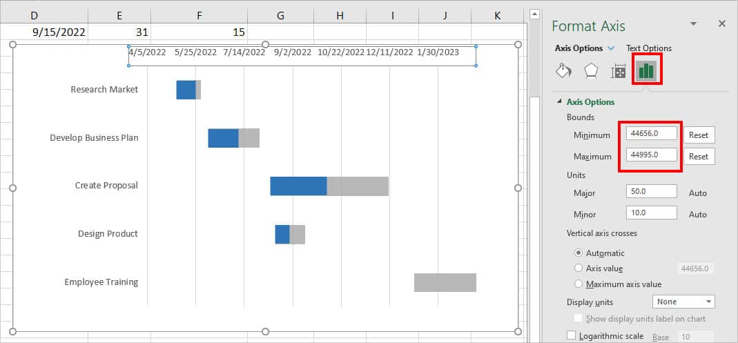
- Right-click on the date axis and pick Format Axis.
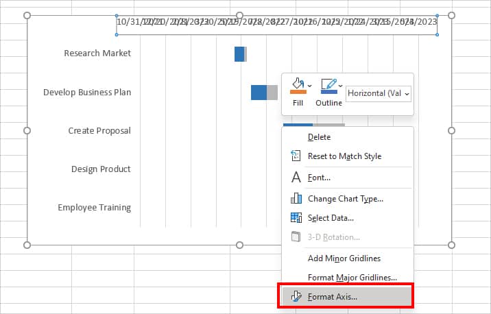
- Go to Axis Options. Under Minimum, enter the First date number. Under Maximum, enter the Last date number.
- Now, select the Chart Area and click on the + icon. Under Chart Elements, check the box for Chart Title, Axis Titles. Rename them and adjust the chart size if needed.