If you want to make your basic data more captivating and fun, add visually appealing graphs in Google Sheets.
Graphs like Scatter Plots, Bar Graphs, Line Graphs, etc can also help your audience to comprehend the analysis at a glance.
So, today, I will walk you through a detailed guide on how to make various graphs in Sheets, format chart elements, differentiate charts vs graphs, etc.
Charts Vs Graph
I know many of you might think that Charts and Graphs are the same thing. But they are not!
All Graphs are Charts but all Charts are not Graphs!
Graphs are two-dimensional mathematical diagrams that have an X-axis and a Y-axis. You can use Graphs when you need to showcase the relationship of variables in a line, dots, curves, etc.
Here is a simple example of a Line Graph.

On the other hand, Charts are more than just a mathematical diagram. It could be a visual representation of the variables in graphs, pictorials, etc. You can insert charts when you have a large number of variables and you need to showcase the pattern, trendlines, etc.
This is an example of a Pie Chart.
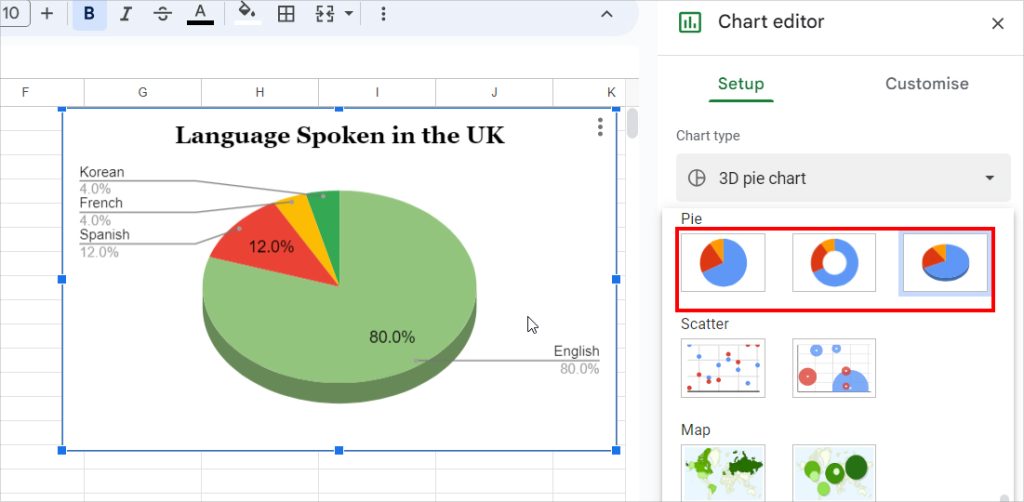
Check out this quick summary to know what diagram falls in the Graphs and Charts.
| Graphs | Charts |
| Line Graph | Pie Chart |
| Scatter Plot | Column Chart |
| Bar Graph | Area Chart |
| Stacked Bar Graph | Bubble Chart |
| Pictogram Graph | Pareto Chart |
| Dot graph or Plot | Radar Chart |
| Spline Chart | |
| Funnel Chart | |
| Waterfall Chart | |
| Mekko Chart | |
| Bullet Chart | |
| Candlestick Chart |
Know Your Graph
Before you make graphs, it’s important to identify the right diagram to represent your data in the best way possible.
Scatter Plot
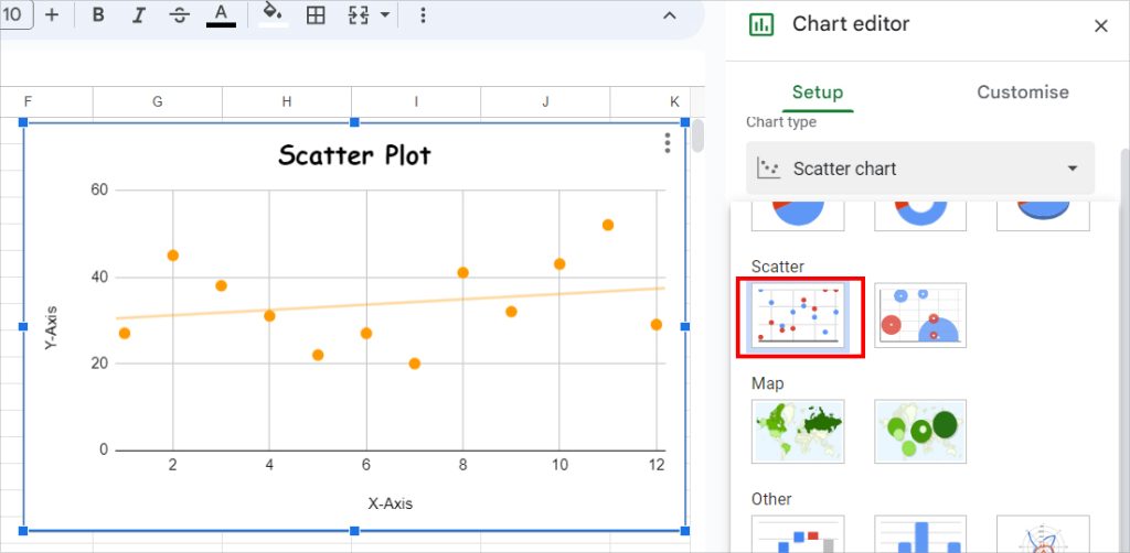
Scatter Plot Graphs are used to display the X and Y coordinate relationship between continuous variables.
Here, the coordinates are plotted in dots. You can even add a Trendline to this Chart.
So, by looking at the scatterplots, you can evaluate whether there is a Curved or Linear Relationship among the variables.
Line Graph
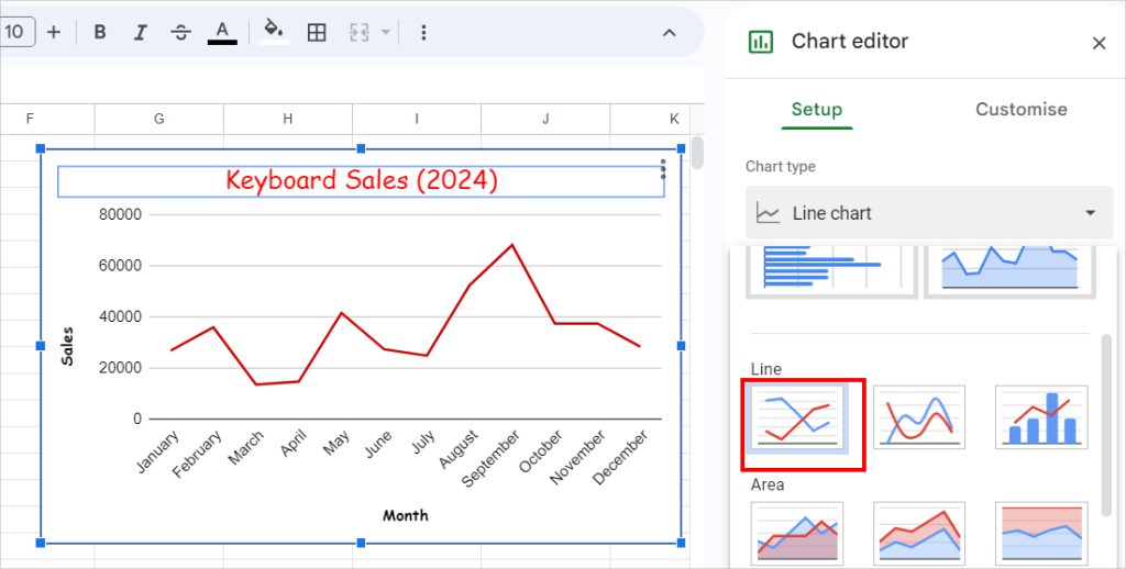
As the name implies, a Line Graph is a diagram with a line showing the trend of variables.
With this graph, you can analyze the positive or negative growth rate of data over a specific time. For example, determine the sales trend for the year 2024.
Bar Graph
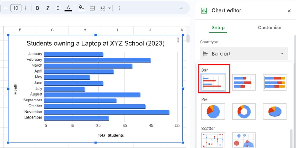
You can insert a bar graph when you find the need to compare the variables. For Instance, evaluate the data of Students owning a Laptop at XYZ School in the year 2023.
Stacked Bar Graph
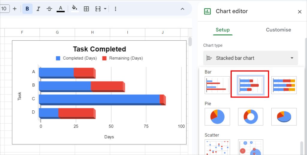
This type of diagram is exactly the Bar Graph – but Stacked. Construct a Stacked Bar Chart when you need to illustrate a single variable in more detail with separate segments.
It can also be best to create Progress Bars, Gantt Charts, etc.
How to Make Graph in Google Sheets?
Now, once you are sure about the Graphs you want to plot in Sheets, prepare your data source. Enter single or multiple Variables as required.
Step 1: Add Charts
- On your spreadsheet, select the Data.
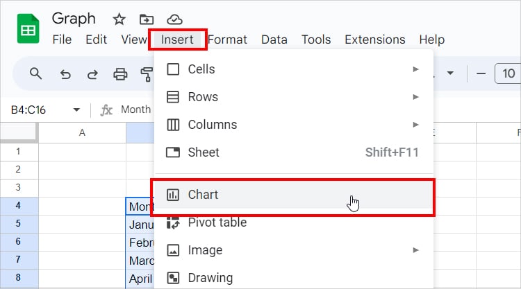
- In the menu bar, head to the Insert Tab > Chart.
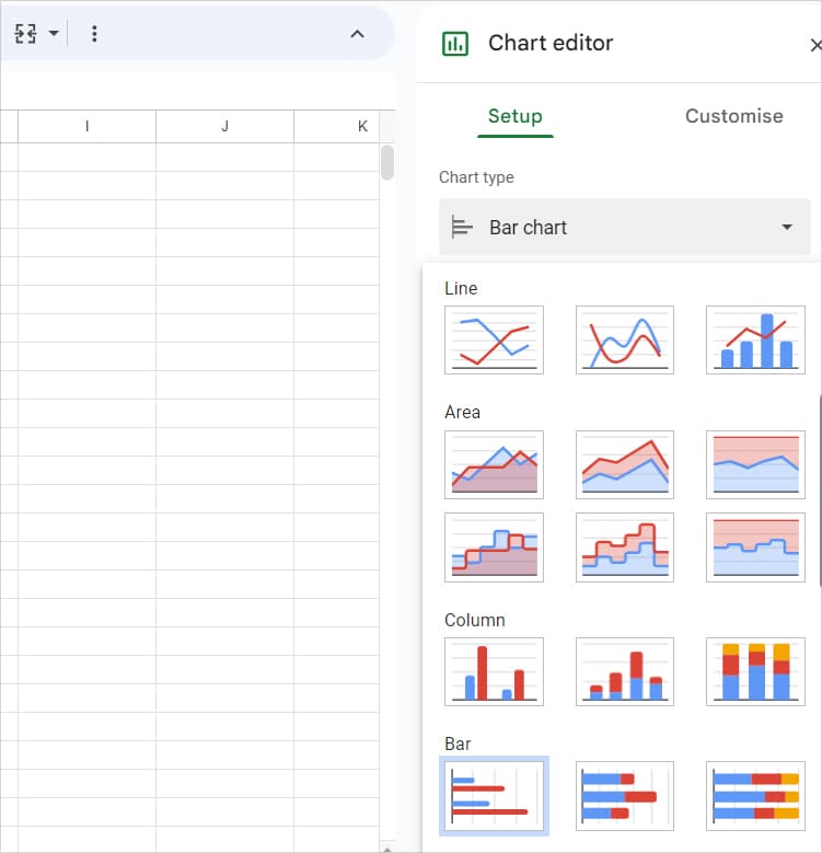
- Below the Chart type, expand the Drop-down menu and pick any Graph from Line, Bar, Scatter, or Other.
Step 2: Format Graph
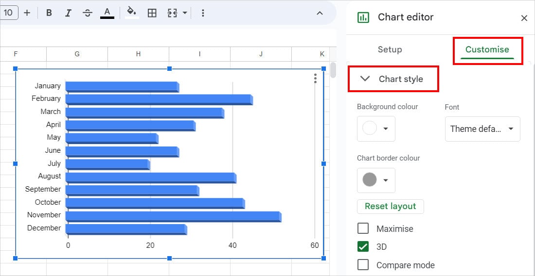
While the Chart is still selected, Double-click on it to bring up the Chart Editor menu. Then, head to the Customise Tab. Expand each menu and apply the Formatting as preferred.
- Chart style: Pick the Background color, Font, and Chart border color. Tick the boxes if you want to Maximize the graph, apply 3D format, or set it in the Compare mode.
- Chart and Axis Titles: Expand the drop-down menu and choose Chart title, Chart Subtitle, Horizontal axis title, and Vertical axis title. Then, set the following.
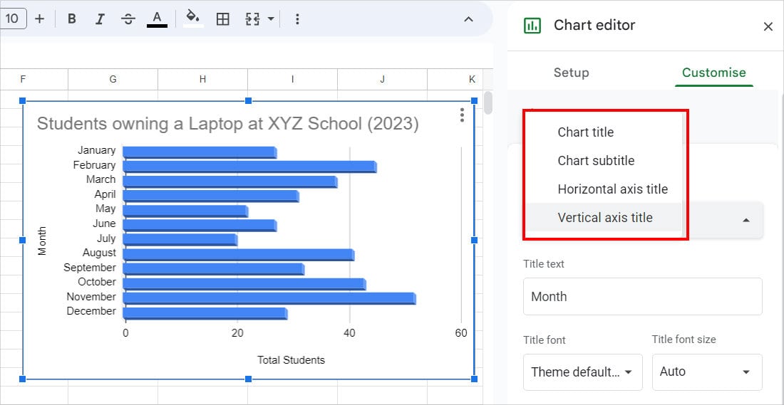
- Title text: Enter the Heading or Name for Chart/Axis Titles.
- Title font: Choose font type.
- Title font size: Pick the size you want the font to appear in.
- Title format: Apply Bold or Italic Style for texts.
- Title text color: Choose font color.
- Series: Format the Line/Dot/Bar in the Graph. The Series option might differ according to your Chart Type. Here’s an example of the Bar Graph.
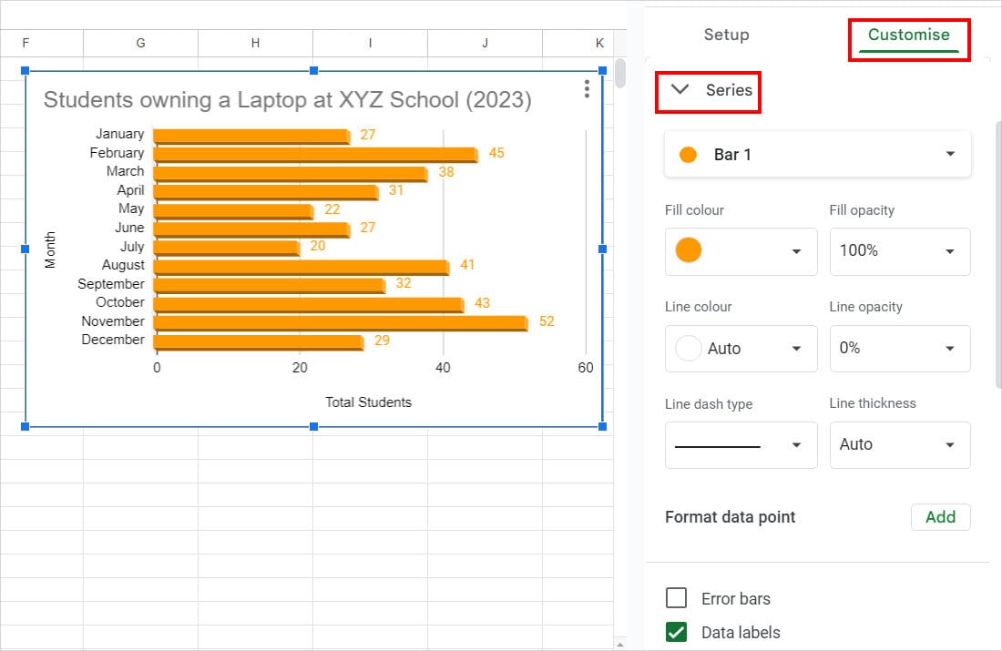
- Color: Change Line/Dot/Bar Colour.
- Fill opacity: Decrease the Percentage if you want to apply Transparency.
- Line Colour: Set a Border Colour.
- Line Opacity: Increase or Decrease the Border Transparency
- Line Thickness: Adjust the Border Thickness.
- Error Bars: Tick this option to add Error Bars. Specify the Percentage and Value.
- Data Labels: Checkmark to show Data Value in the Chart. Define the Type, Position, Data label font, Data label font size, Data label format, Text color, Number format, etc.
- Legend: Choose a Legend Position, Font, Font size, format, text color, etc.
Step 3: Format Horizontal and Vertical Axis
The Horizontal and Vertical Axis menu is different according to the Graph type. For Instance, you won’t have an Axis Scale option for Line graphs.
To format the Horizontal or Vertical Axis Range, on the Chart Editor panel, head to the Customise tab. Expand the Horizontal or Vertical Axis menu and then fill in the following information.
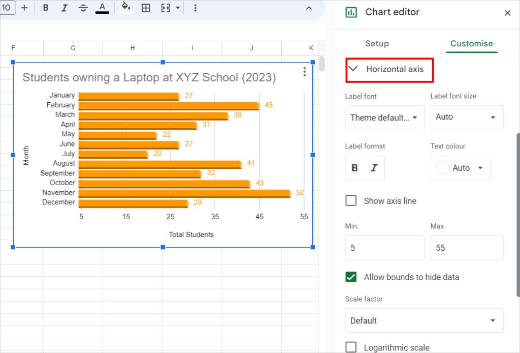
- Font: Choose Font theme, format, size, text color, etc.
- Show Axis Lines: Tick this option to display the Axis Line.
- Minimum Value: Set the starting value.
- Maximum Value: Specify the last value.
- Scale factor: Choose how you want to scale the values, for example, in 1000, 100, etc.
- Slant labels: Rotate the Text/Value on the Horizontal/Vertical Axis.
- Number format: Choose a Number Format.
Step 4: Format Data Series
If needed, you can also add an extra Series to your Data, To format the Data Series, go to the Setup tab in the Chart Editor window.
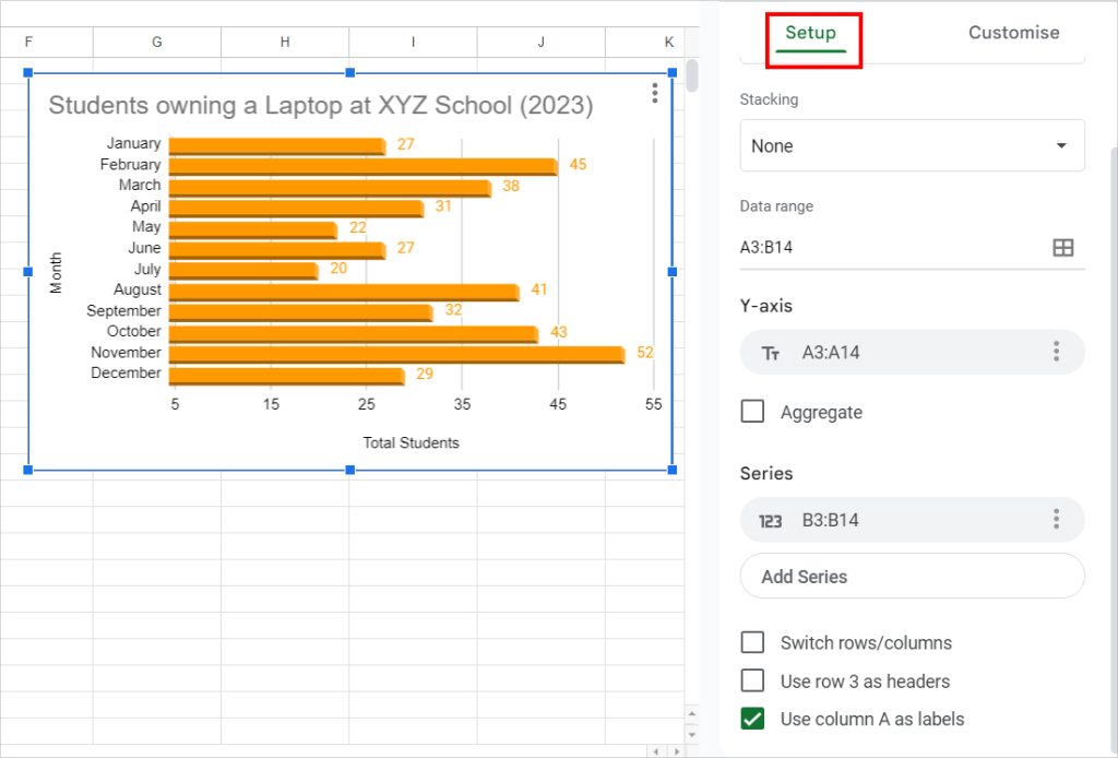
- Data range: Use the Grid Line icon to select the Data Range for the Chart.
- Series: Click on Add Series. Select the Data range.
- Switch rows/columns: Tick this option to swap the Y-Axis value with X-Axis.