A box plot, also referred to as a box-whisker plot is a visual representation of data including the minimum value, first quartile, median, third quartile, and maximum value. In Excel 2016 and later, you have the option to create a box plot under Statistic Charts in the Charts section.
However, if you’re using Excel 2016 or later, you will have to manually create a box plot. In this method, you will have to calculate the quartiles, and quartile differences before creating the chart. Then, you will have to add in the whiskers using the Error bars feature.
In this article, we have included the methods of creating a box plot in both Excel 2016 and later, or the version before. You can also use the second method in Excel 2016 or later.
In Excel 2016 or Later
This method of creating a box plot is pretty straightforward as it has a built-in feature to create a box plot from the Charts section. This way you can spare yourself from the long and tiring process of calculating the quartile and its differences to create the illustration.
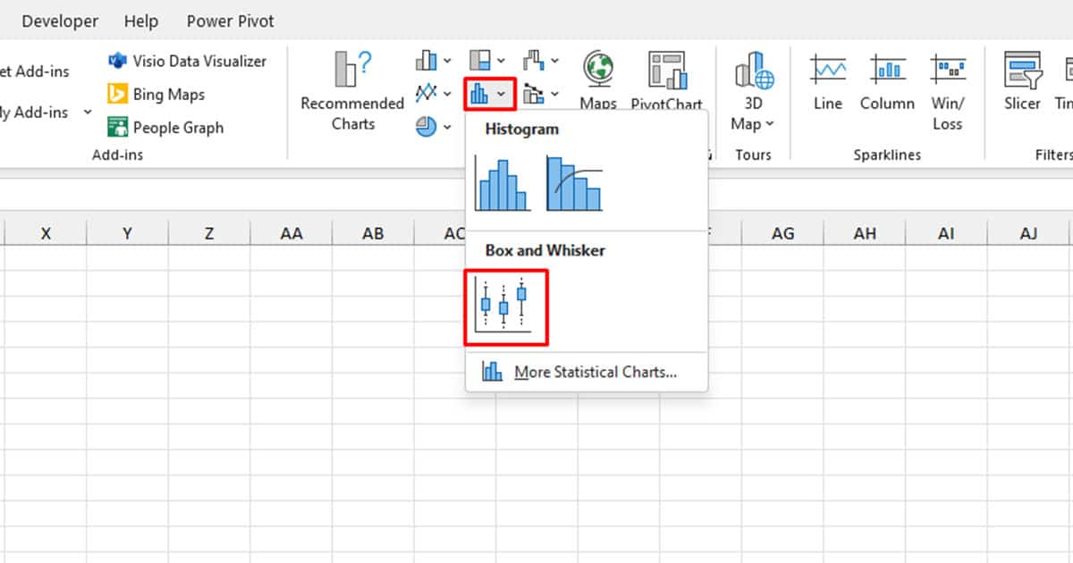
- Select your data from the spreadsheet.
- Head to the Insert tab.
- In the Charts section, select the Statistic Charts icon.
- Choose Box and Whiskers.
You may want to change the title of the chart and format your chart the way you wish from the Chart Design and Format tabs.
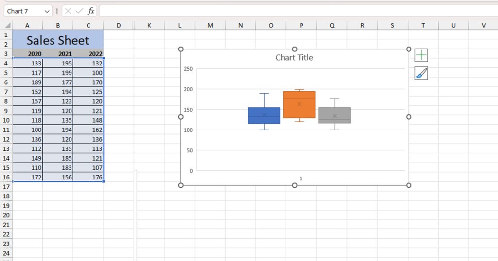
If you can’t find these tabs in the menu bar, click on the chart and they should appear.
In Previous Versions
There isn’t an option to automate the feature of creating a box plot in the previous Excel versions. This method is comparatively quite long but worry not! We have included visuals that will make following the instructions a breeze.
Step 1: Calculate Quartiles
A box plot is created using quartile differences. In order to calculate these differences, you will first have to calculate five values: Minimum value, First Quartile, Median, Third Quartile, and Maximum Value.
Here are the functions we will be using to calculate these values:
MIN(range): To calculate the minimum value of a range.QUARTILE.INC(range, quartile): Calculate the quartile of a range. In the quartile section of the argument, you can set 1 to calculate the Q1, 2 for the Median, and 3 to calculate the Q3 or a range.MAX(range): This calculates the maximum value of the range.
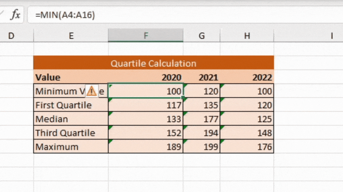
Using the same sheet we used the first method, we calculated the minimum value, first quartile, second quartile, third quartile, and the maximum value of each range.
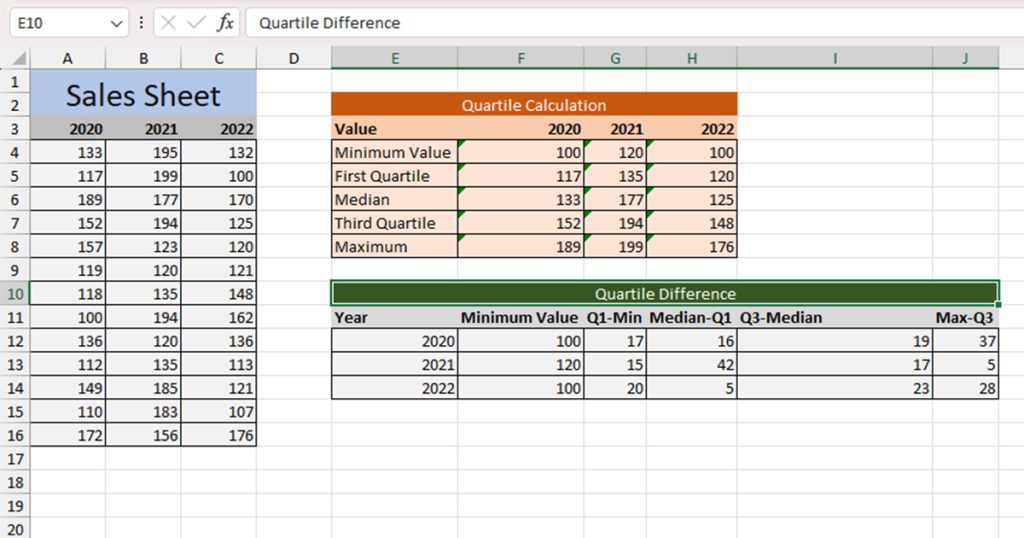
Step 2: Calculate Quartile Differences
Now that we have our quartile values, we can go ahead a calculate the quartile differences in a new table. Our table will consist of the following values:
- Minimum Value
- First Quartile – Minimum Value (Q1 – Min)
- Median – First Quartile (Median – Q1)
- Third Quartile – Median (Q3 – Median)
- Maximum Value – Third Quartile (Max – Q3)
- Copy-paste the Minimum Values from the second table.
- Calculate the differences between each item using the subtract operator and cell referencing.
Step 3: Create a Box Plot
We will be creating the box plot using the data in Table 3, the table with quartile differences. We will be using the Stacked Column graph type to create our box plot.
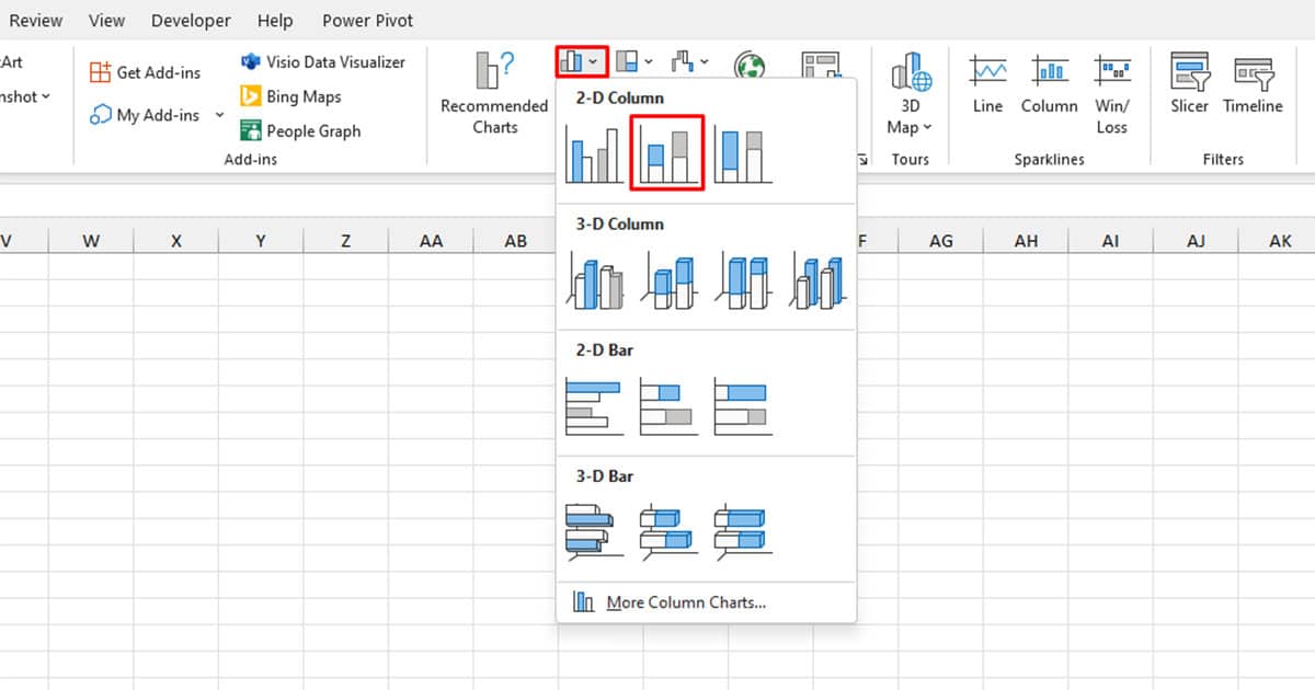
Step 1: Insert Graph
- Select your data then head to the Insert section.
- Click on the 2-D Column icon in the Charts section.
- Choose Stacked Column.
Step 2: Switch Rows and Columns
- Right-click on the chart.
- Choose Select Data.
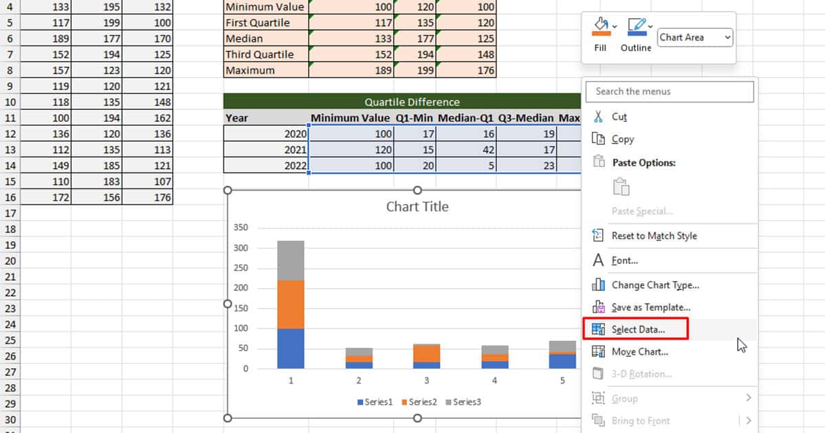
- From the Select Data Source window, click Switch Row/Column.
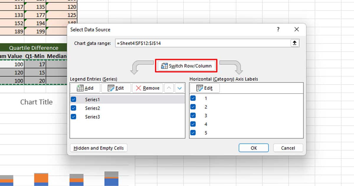
- Select OK.
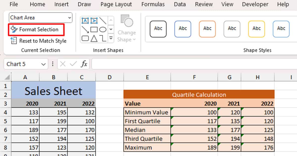
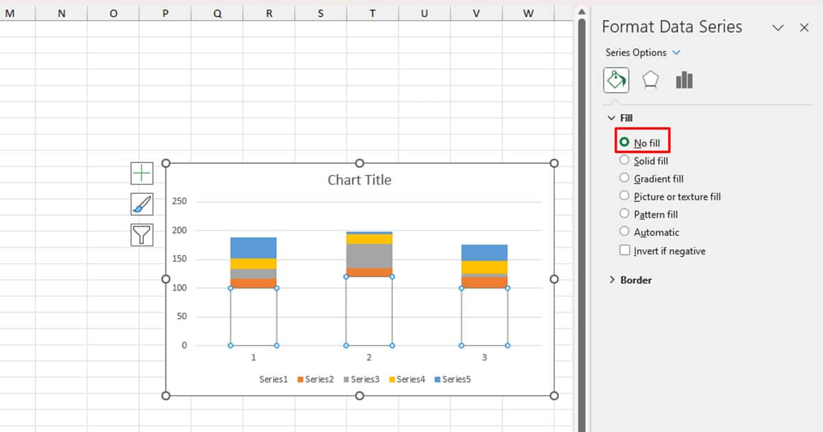
Step 3: Make the Bottom Transparent
- In your chart, select the bottom section of the plot.
- Head to the Format tab.
- Select Format Selection from the Current Selection section.
- Head to the Fill tab.
- Under the Fill section, select No Fill.
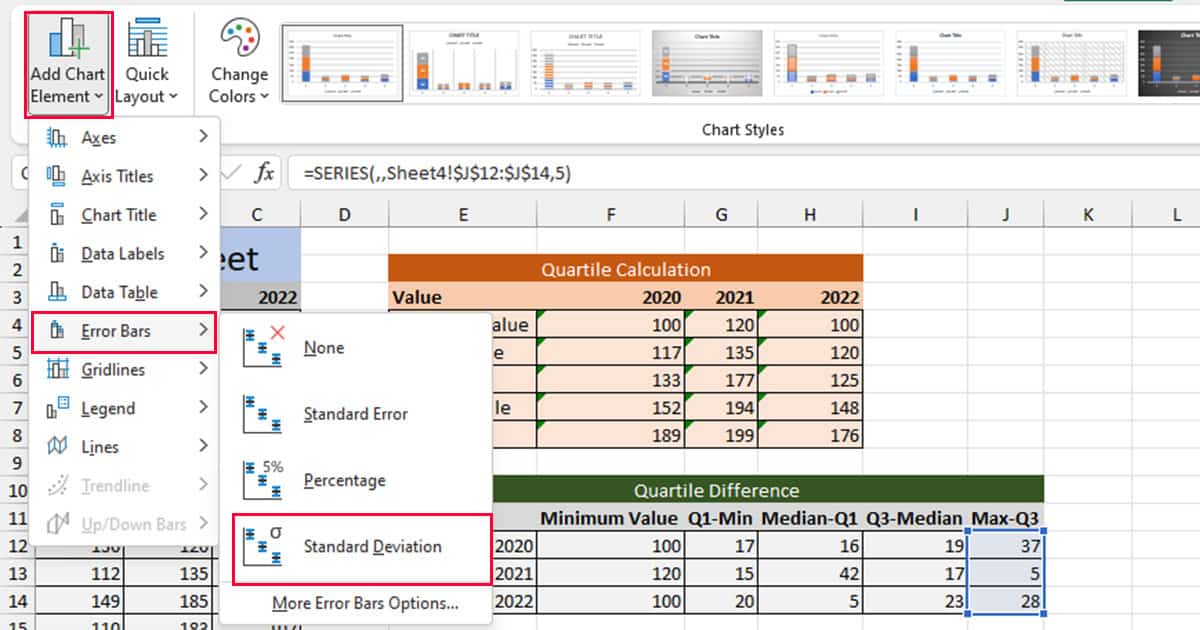
Step 4: Add Whiskers
- From your chart, select the top-most element that represents the Max-Q3 data.
- Head to Chart Design from the menubar.
- Select Add Chart Element > Error Bars > Standard Deviation.
Step 5: Format the Whiskers
- Select the whiskers from the chart.
- Head to Format > Format Selection.
- Under Direction, set it to Minus.
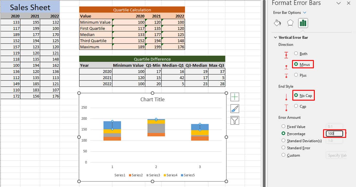
- Choose Cap under the End Style section.
- Under Error Amount, select Percentage and set the number to 100.
Step 6: Repeat Steps 4 and 5
- Select the second-to-last section with the data representing Q1 – Min.
- Insert whiskers using Step 4.
- Format the whiskers using Step 5.
Step 7: Make the Top and Second-to-Last sections Transparent
- Select the top-most part of the plot, representing the Max – Q3
- Use Step 3 to remove the fill for the section.
- Repeat this for the second-to-bottom part of the chart, representing Q1 – Min.
Conclusion
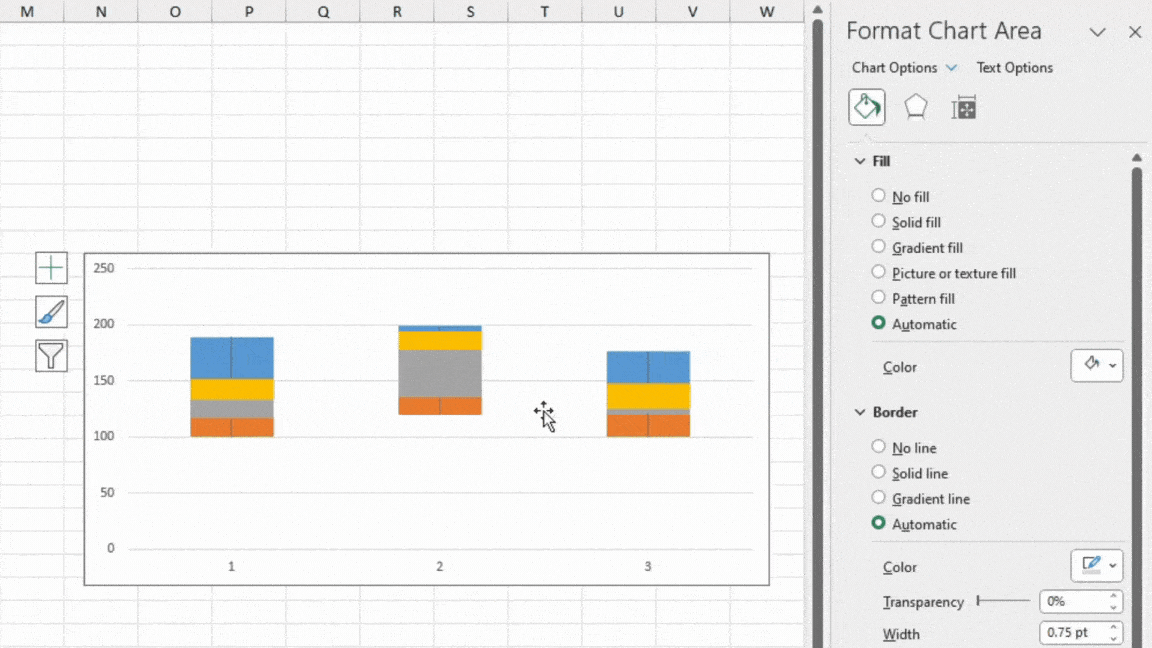
Using both methods, you can create a box plot in Excel. In the second method, If you want your sections to be of uniform color, you can format your plot from the Fill section of the Format Data Series window.
A little advice: If you’re a regular Excel user, it is a good idea to upgrade to Excel 2016 or later. This is because the newer versions have automated many processes like creating box plots. Although you can still create such plots in the previous versions, they are pretty time-consuming.