Inserting illustrations in Excel, such as a pie chart, is an excellent way of representing data. Going a step further, many users choose to explode their pie charts, essentially segregation one or all data items from the entire pie chart. This can be a great way to draw focus on an element, especially when presenting statistics.
There are two ways you can explode a pie chart in Excel. One way is free-handing from the diagram itself, and the other is by setting a scale by which you choose to pull the element away from the pie chart.
Explode the Chart by Moving its Pieces
One of the easiest ways to explode a chart is by using the cursor move. I actually prefer this method as I have more control over placing the piece wherever I want inside the chart area.
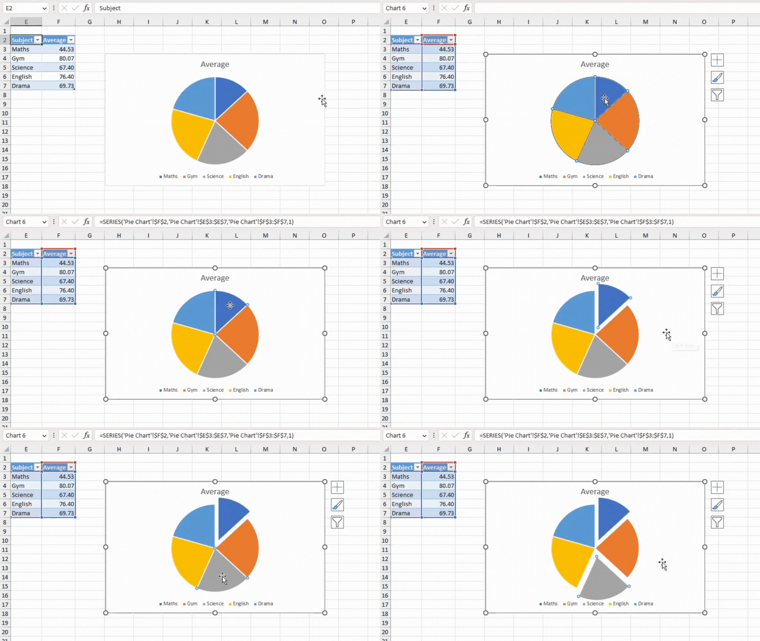
After you insert the pie chart, select your illustration. Select your chart then click on the piece you wish to explode from the pie chart. Drag your piece and drop it and place it at the location you wish to burst the element to.
Scale Pieces Away from the Chart
While you can also explode the entire pie chart using the first method, it is faster using this method. Additionally, if you do not like moving elements without a fixed scale point, then this method is for you.
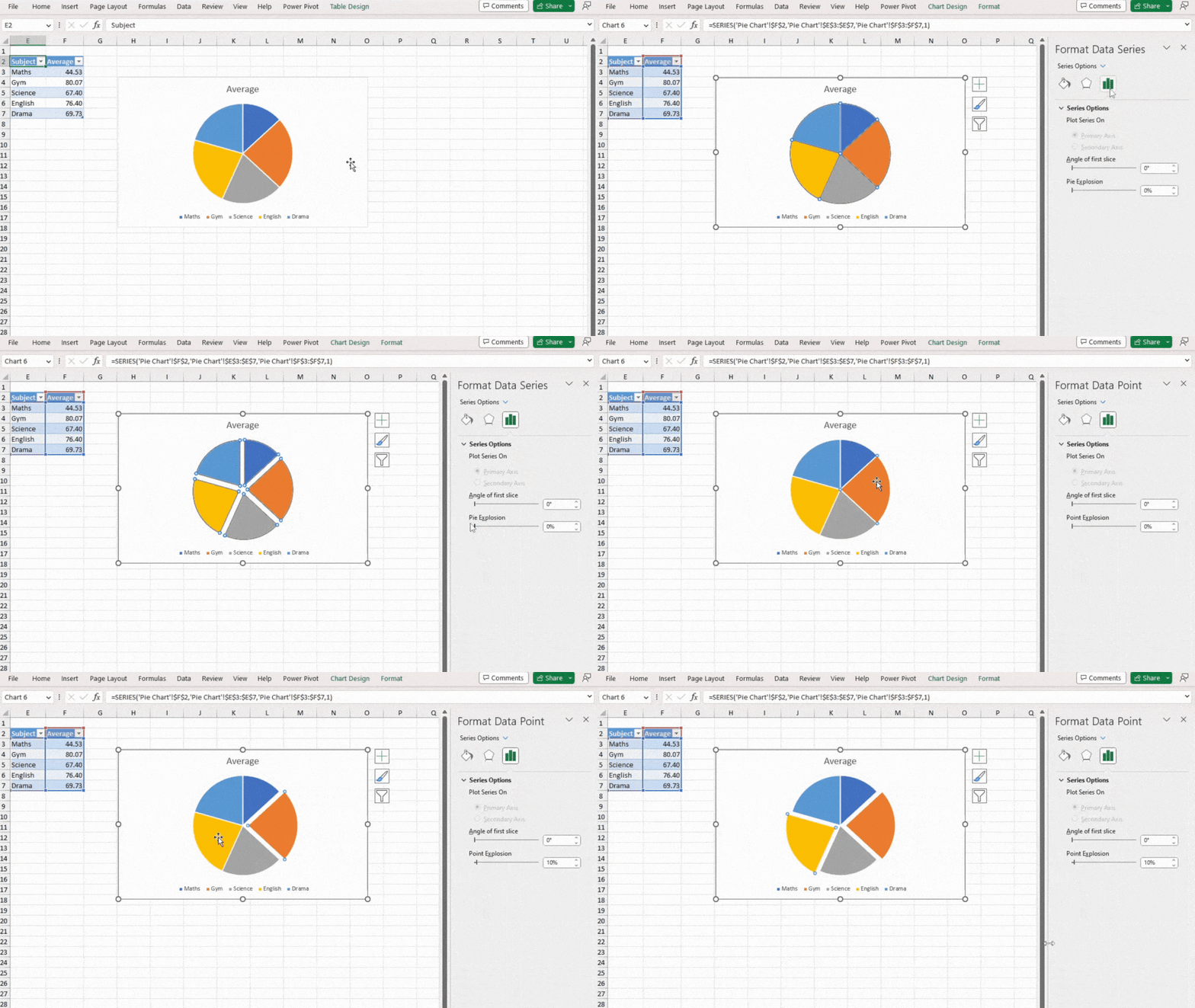
- Double-click on the pie chart area in the spreadsheet. This should open the Format Chart Area window.
- Select your pie chart in the area. If you want to explode only one piece, click on the piece next.
- On the sidebar, head to the Series Options icon on the far right.
- Locate Pie Explosion and slide the cursor to the value you wish to explode your pie to.
Alternatives to Exploding a Pie Chart
If you’re looking to draw attention to smaller elements on your pie chart, there are other ways than just exploding the chart in Excel.
Let’s purpose an instance. You’ve created a pie chart that demonstrates the number of ethnicities residing in a community. The data table to create the chart looks something like this:
| Ethnicity | Percentage |
| Ethnicity A | 70.5% |
| Ethnicity B | 12.8% |
| Ethnicity C | 7.5% |
| Ethnicity D | 5.7% |
| Ethnicity E | 3.5% |
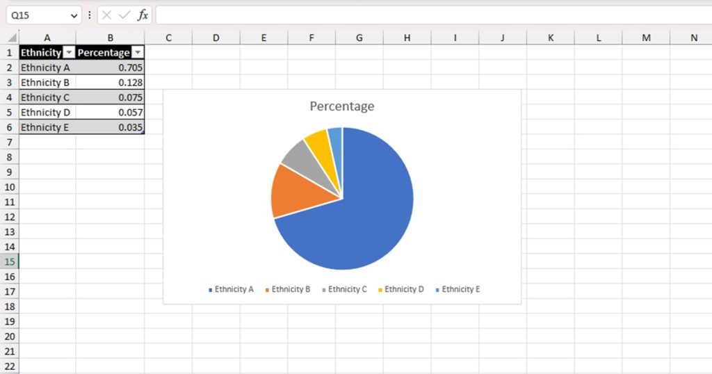
When you put these values to create a pie chart, you may notice that the smaller data value practically gets squished in the diagram. This makes the entire diagram look inconsistent.
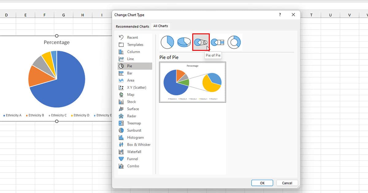
In cases as such, this, you can use the bar-of-pie chart or pie-of-pie chart instead of exploding a normal pie chart. What these chart types do is that it takes the area that covers the least area in the pie chart and creates a smaller pie or bar chart to represent them individually.
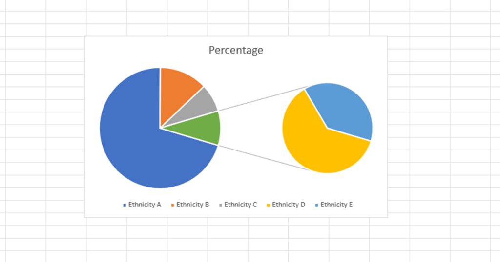
Here is how you can transform an existing pie chart into one of these diagrams in Excel:
- Right-click on your pie chart.
- Select Change Chart Type.
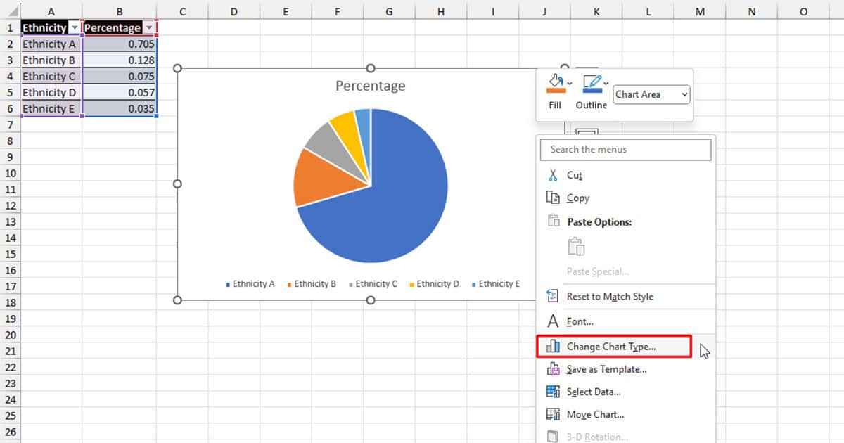
- Choose the third illustration to insert a pie-of-pie chart.
- Pick the fourth illustration to insert a bar-of-pie chart.
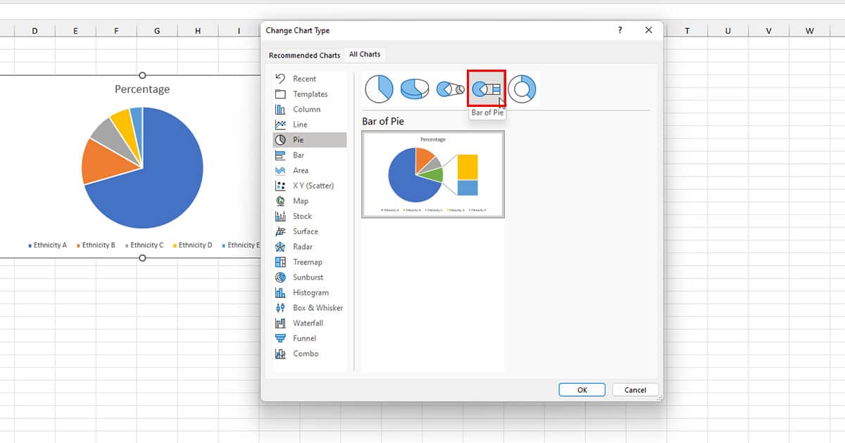
- Click OK.