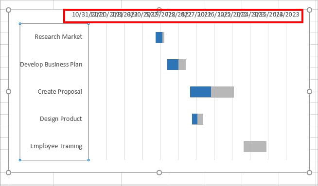
In Excel Charts, you may have X- or Y-axis values representing the data. These axis play a crucial role in how your Chart appears. If the Axis ranges are way too high, your chart object might look cluttered and messy. As you can see in the given chart, Dates are all jumbled up in one place which makes it hard to read and interpret the value.
Whenever you plot a chart, Excel automatically specifies the axis range. However, you can customize both the maximum and minimum value of the Axis scale as per your data. This way, you will have the exact chart figure. Also, from the Axis Options, you can specify the interval between each axis ranges.
So, in this article, let us learn how to change the axis range for your charts in Excel.
From Context Menu
The quickest way to change the axis scale in an Excel chart is from the context menu. Check out each step for the Horizontal and Vertical axis range.
Change Horizontal Axis Range
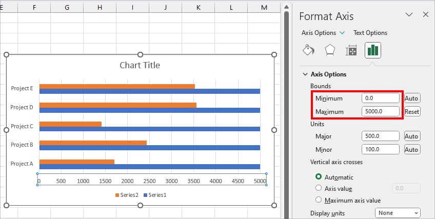
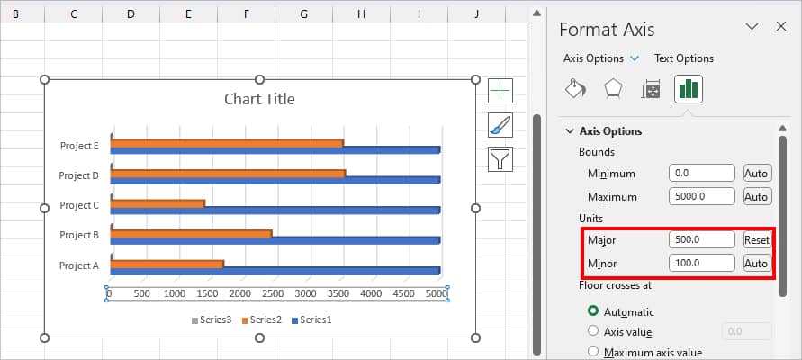
Let’s suppose, I have a 2-D bar chart in Excel Spreadsheet. Here, the highest range in the horizontal axis of the chart is 6000. So, my chart looks uneven and incomplete. To address this, I want to set the range to 5000 at max which is my Target Value.
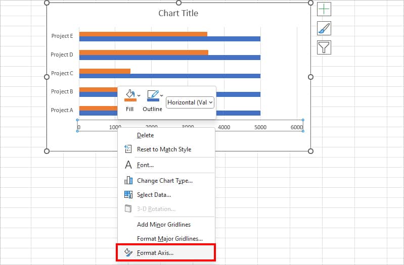
- Select the Horizontal Axis Range in your chart and right-click on it. Then, pick Format Axis.

- Under Bounds, Set the Minimum and Maximum Value. Here, I left the Minimum value as it is and changed the Maximum Value to 5000.
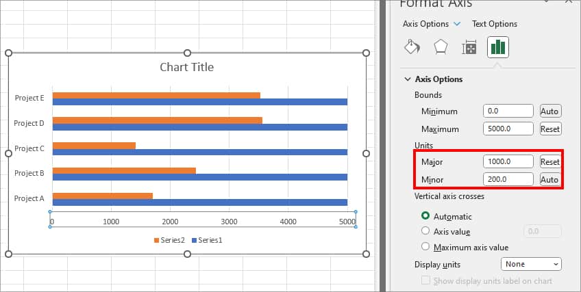
- Under Units, you can edit the Major and Minor Value. Units determine the gap between each range from first to last.
Change Vertical Axis Range
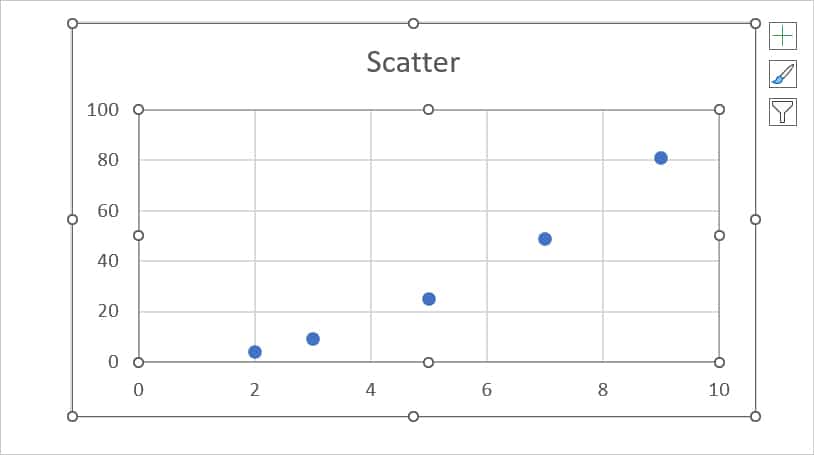
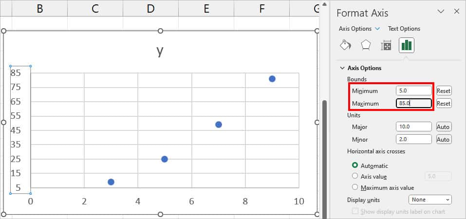
On some charts like Scatter in Excel, there are values in the vertical axis range. In this scatter chart, the vertical range is 100 at maximum. However, as my highest plot is 81, I want to keep the value to 85 at max.
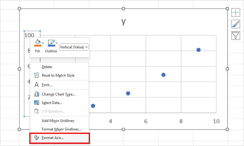
- Select the Chart Area.
- Right-click on the Vertical Axis and pick Format Axis.
- On Axis Options, set the Minimum and Maximum Value for Bounds.
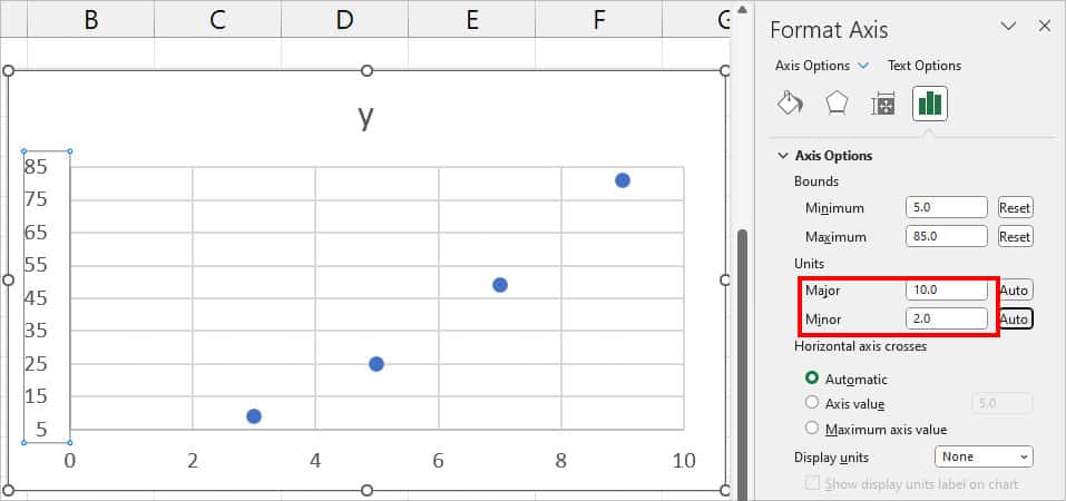
- Under Units, adjust the Major and Minor to specify an interval between each unit.
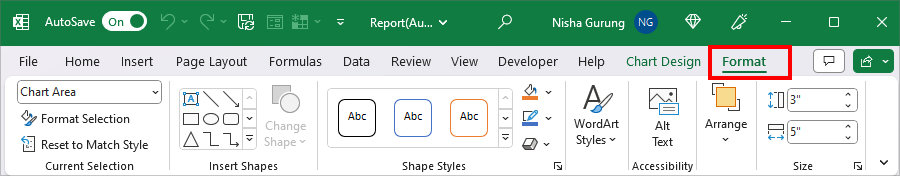
From Format Tab
Although you could quickly access the Format axis options from the context menu, some users might find it problematic. Since the chart graph, axis ranges, and axis titles are in the same area, chances are you might select the wrong element instead. In such cases, you could access the Axis options from the Format tab.
- Click on the Chart Area and navigate to the Format tab.
- On the Current Selection, pick the Horizontal (Value) Axis or Vertical (Category) Axis.
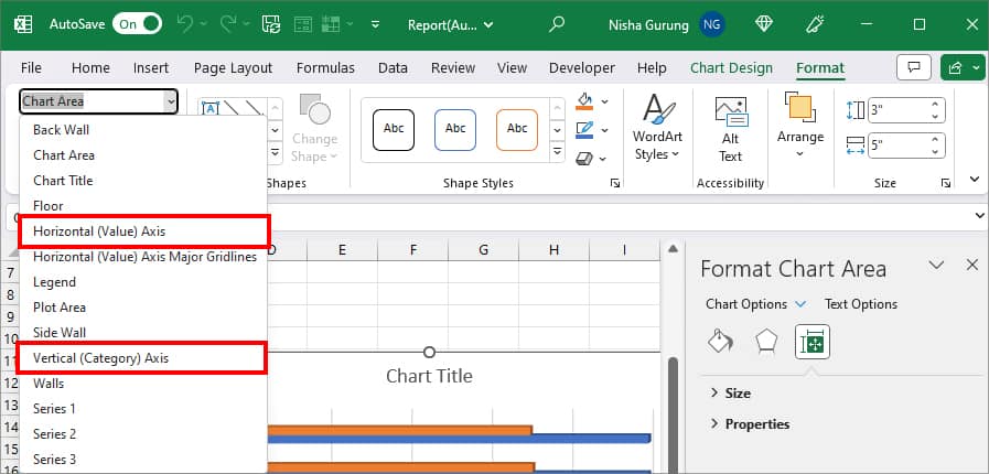
- Again, from Current Selection, pick Format Selection.
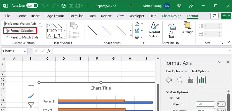
- On the right panel, you can see Axis Options. Set the Minimum and Maximum Values for Bounds.
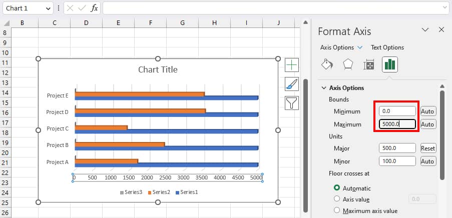
- If you want to re-adjust the axis interval, change Major and Minor values.
How to Format the Axis Range in Excel Chart?
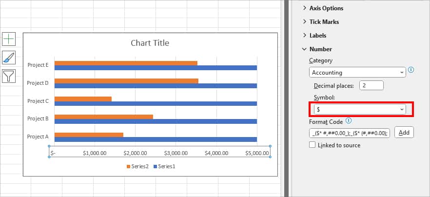
Once you’ve changed the axis range in Excel Chart, you could format the value according to the data. It will make your value appear more presentable and comprehensible. For this, you need to go to the same Axis Options as we did earlier.
- Select the Chart and right-click on one of the Axis ranges. Then, pick Format Axis.
- Under Number, pick any one of the options for Category.
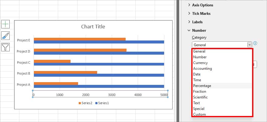
- For each format you choose, you’ll also have the Symbol or Code option. For Instance, if you pick Accounting format, you can choose a Currency symbol from the drop-down list.