Whenever you plot a new chart, Excel adds some of the chart elements by default. Legends also known as “Series” is one of them.
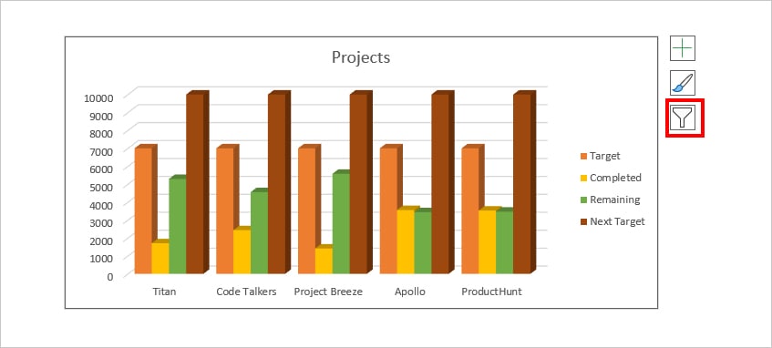
Legends are pretty useful when you have two or more series value in the Charts. It is basically a label of what each bar of your Column chart or each slice of your Doughnut chart is illustrating. For example, in a Column chart, the orange bar represents the Target, Yellow as Completed, and Green as Remaining.

But, if you’ve deleted Legends when formatting the chart, you may find the need to re-add them. Or, maybe you might want to insert an additional Legend to your existing ones. Regardless of the reasons, we have compiled four different ways to add Legend.
From Chart Elements
If you do not see Legend in your Excel Chart, it’s most likely you’ve hidden it by unticking the option for Legend. So, firstly, you can quickly display the Legend from the Chart Elements itself.
All you need to do is select the Chart Area. Click on the + (Chart Elements) icon and tick the box for Legend. By default, the Legend position will be on the right side of the chart.
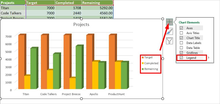
In case you want to choose a different position for Legend, click the + icon. However over the Legend option and click on the Arrow Icon. Then, pick any one from the Right, Top, Left, and Bottom options.
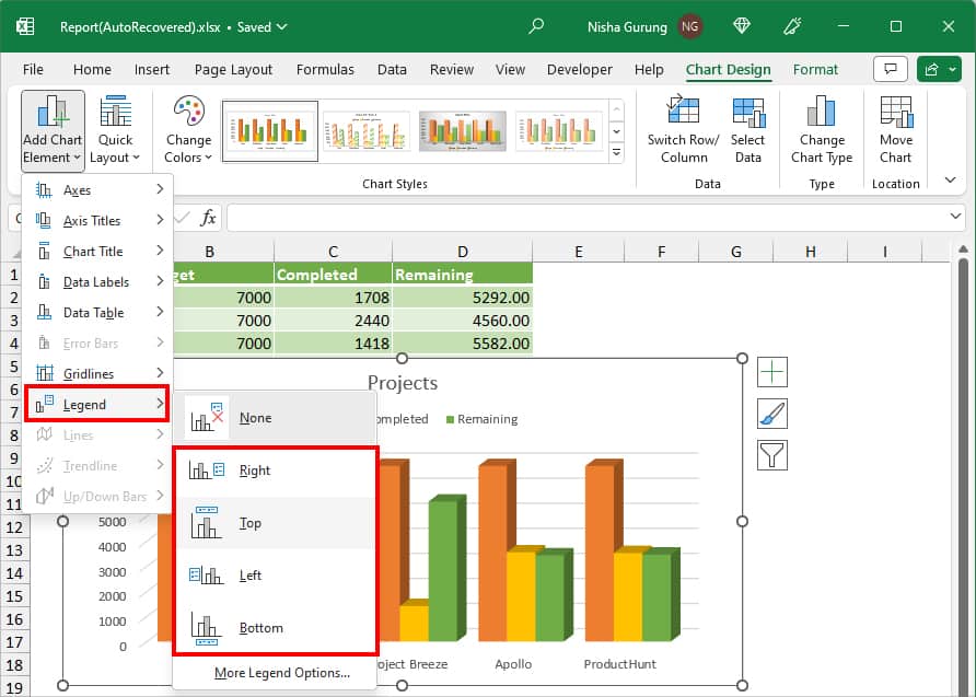
From Chart Design Tab
Another alternative way to add a Legend to your Chart is from the Chart Design Tab. This method is a lot easier when you want to insert a Series in a specific position such as bottom, top, etc.
- Select your Chart.
- Navigate to the Chart Design Tab and click on Add Chart Element.
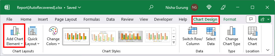
- Hover your cursor over the Legend menu and choose one from Right, Top, Left, or Bottom.
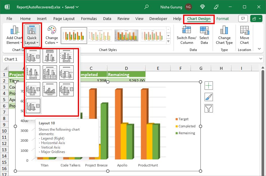
From QuickLayout
If you’re comfortable with changing the Chart Layout, you could apply one of the pre-built chart layouts. This method is extremely useful if you’ve just plotted a new chart as you’ll get to add other chart elements too at the same time.
To change Chart Layout, click on your Chart and select Quick Layout. Then, hover over each Layout to see the Chart Elements. As you can see almost all of the Chart Layout have Legends, pick the Layout with Legend Position you wish to have.
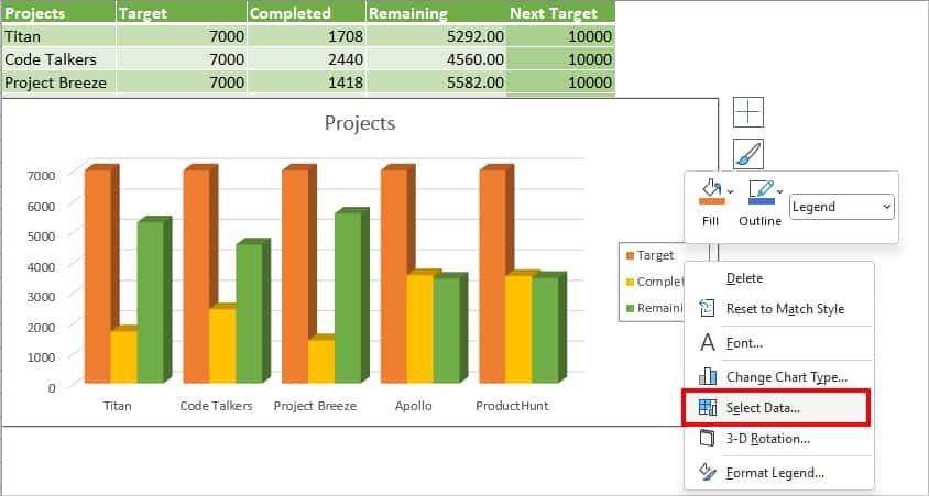
From Select Data
This method is for users who already have a Legend in their Chart but wants to add an extra legend. If you’ve inserted a new column in the table, it’ll automatically update in the Chart too. So, will the Legend. However, if your data is not in the table format, you’d have to manually add a legend.
Remember, you cannot just insert an additional legend. You’d have to select the data range for them too.
- Right-click on your existing Legend and choose Select Data.
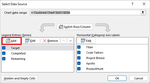
- On the Select Data Source window, click the Add button below Legend Entries (Series).
- On the Series name, enter a Column header. Then, on Series values, select the Cell ranges using the Collapse icon.
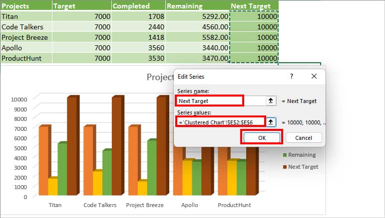
- Click OK.
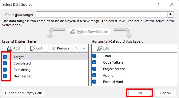
- Under Legend Entries, you should see a list of Legends. Tick the box for all of them and click OK.
How to Format Legend in Excel Chart?
Once you’ve added the Legend to your Chart, you could rename, customize the font, and format the legend.
Rename Legend
When you plot a chart without the column header, legends will appear with the title. For example, Series1, Series2, Series3, etc. But, if you plot the chart along with the column header, you’ll have the same name as in the cell. If you wish to rename the Series, here’s a quick step for it.
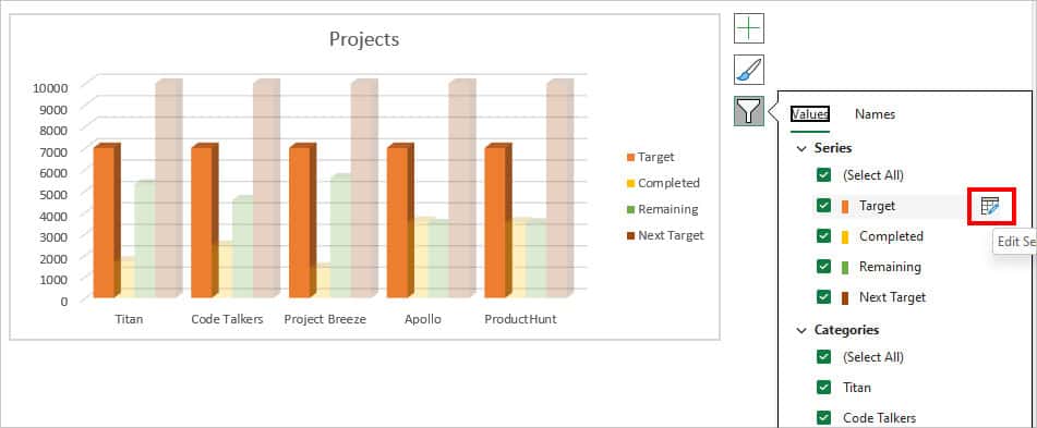
- Select the Excel chart and click on the Filter icon in the upper right.
- Below the Series, navigate to one of the Series and click on the Edit Series icon.
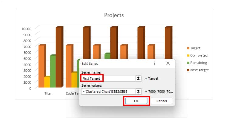
- On the Series name, type in a New name and click OK.
Customize Font
To make your Legend labels appear more catchy, you can set a different font type, size, and color. To do so, check out the given steps.
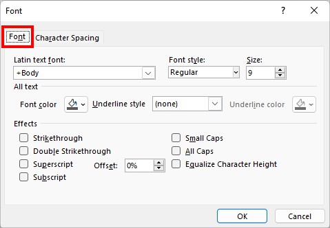
- Right-click on the Legend and choose Font.
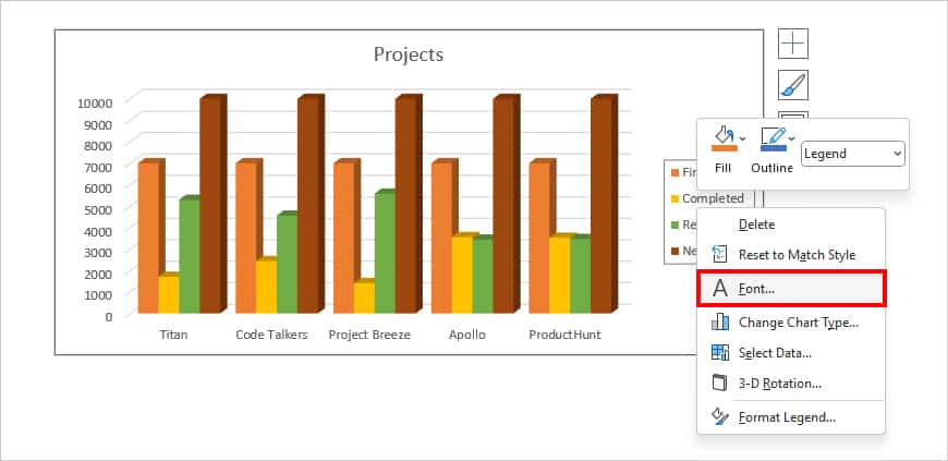
- On Font Tab, choose a Font, Font style, Font Size, Font color, and Effects.
- Go to Character Spacing tab. Then, set the Spacing type and Kerning for fonts.
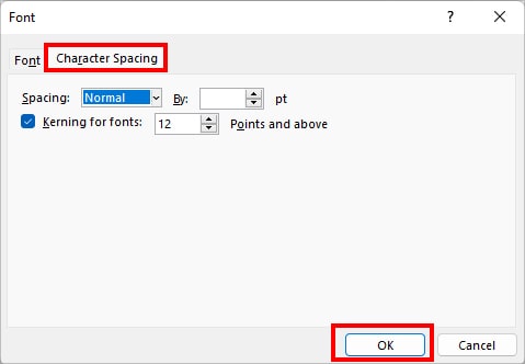
- Click OK.
Format Legend
In this part, we will discuss the ways you can format how your legend appears. Here, you can apply the effects, add borders, change legend placements, and so on.
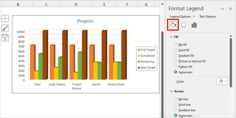
- Right-click on the Legend and pick Format Legend.
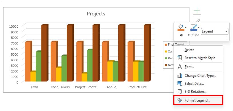
- On the Format Legend panel, you can see three menus Fill & Line, Effects, and Legend Options.
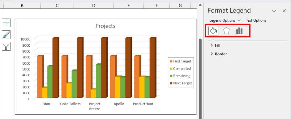
- On Fill & Line, choose Fill, Border type, line color, width, etc for the Legend.
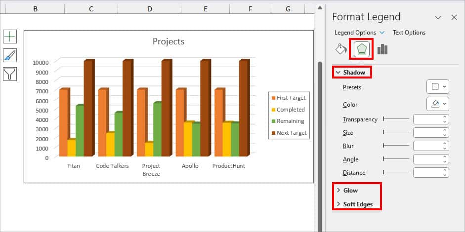
- On Effects, pick any one effect from Shadow, Glow, and Soft Edges to apply to Legend.
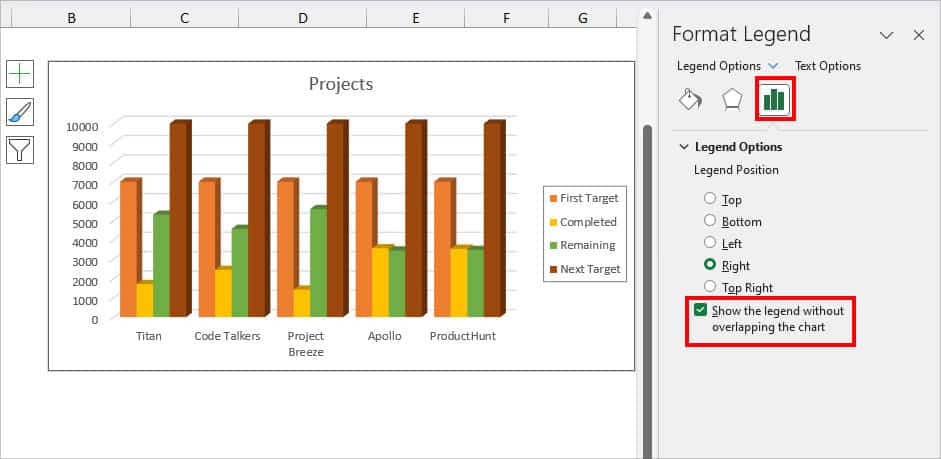
- On Legend Options, select a Position. Make sure to check the box for Show the legend without overlapping the chart.
- When you’re done formatting, close the Format Legend menu.