In Excel charts, the more chart elements you add, the more informative your chart becomes. If you’re working with Column Charts or Scatter diagrams that have only numbers in Axis ranges, you should definitely add an Axis Title. An Axis Title can help you represent the entire context of Axes ranges with just a simple heading.
By default, the newly plotted charts do not have the Axis Title in them. So, you’d have to manually add them from the Chart Elements or Chart Design Tab. Additionally, you can also customize your Axis Title by changing the Font, applying effects, formatting borders, and so on.
Change Chart Layout
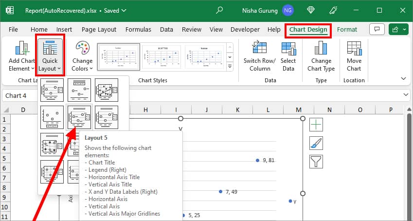
Excel has various pre-built Chart layouts with different Chart Elements. For Instance, Layout 5 has Chart Title, Legend, Vertical and Horizontal Axis titles, X and Y Data Labels, Horizontal Axis, Vertical Axis, Vertical Axis Major Gridlines, etc. So, you could just apply one of these layouts to quickly add the Axis Title. But remember, changing the layout will affect your other chart elements too.
For this, select the Chart and go to the Chart Design Tab. From Chart Layouts, click on Quick Layout and pick a Layout with the Axis Title. Here, we chose Layout 5.
From Chart Elements
Whenever you click on the Excel Chart, tools like Chart Elements, Chart Styles, and Chart Filter appear in the upper-right corner of the chart. As these tools are easily accessible, formatting your Excel Charts will just take a few seconds.
Here, we will use the Chart Elements tool to add an Axis Title. This method is for users who wish to keep their original chart layout intact and insert only the Axis Titles. I preferably use this method when I want to add both Horizontal and Vertical Axis Titles at once.
- On your Excel sheet, click on your Chart Area.
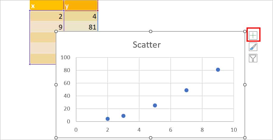
- On the top-right corner, click the Plus icon.
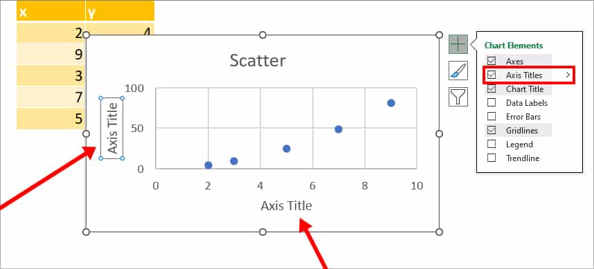
- Tick the box for Axis Title to add both Horizontal and Vertical Axis Title.
- To add only one of the titles, hover over the Axis Titles and select the Arrow icon. Then, pick one of the following options.
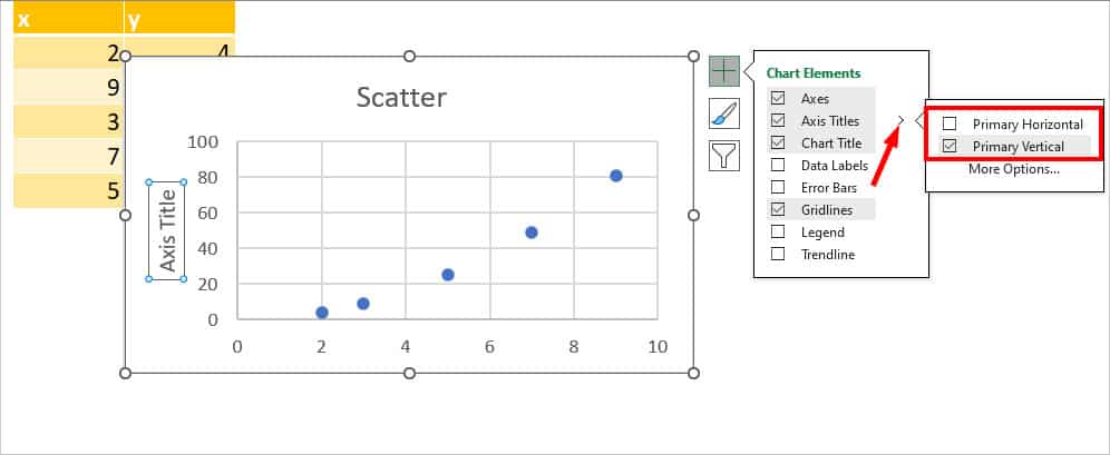
- Primary Horizontal: Insert Horizontal Axis Title.
- Primary Vertical: Insert Vertical Axis Title.
- Now, click on one of the Axis Titles. Select the Text and rename the Title. Do the same for another Axis Title.
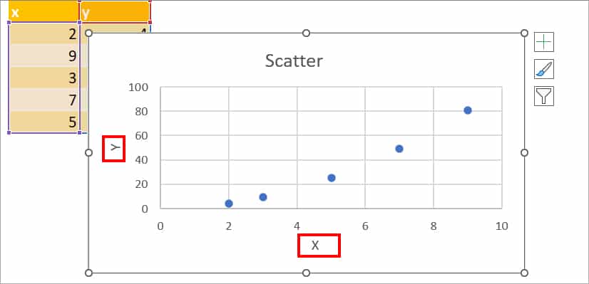
From Chart Design
Another way to add Axis Titles is from the Chart Design Tab. This method is comparatively convenient when you want to add only one of the Axis titles to your chart.
- Select the chart and click on Chart Design Tab.
- From the Chart Layouts group, select Add Chart Element.

- Hover over the Axis Titles and click on one of the options:
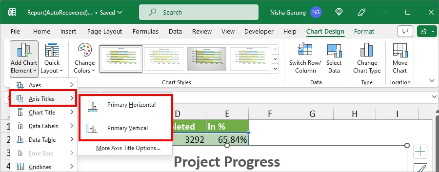
- Primary Horizontal: Add Axis Title in the Horizontal axis.
- Primary Vertical: Insert Axis Title in the Vertical axis.
- Now, click on Axis Title. Select the Text and Rename it.
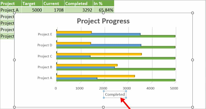
Dynamic Axis Titles
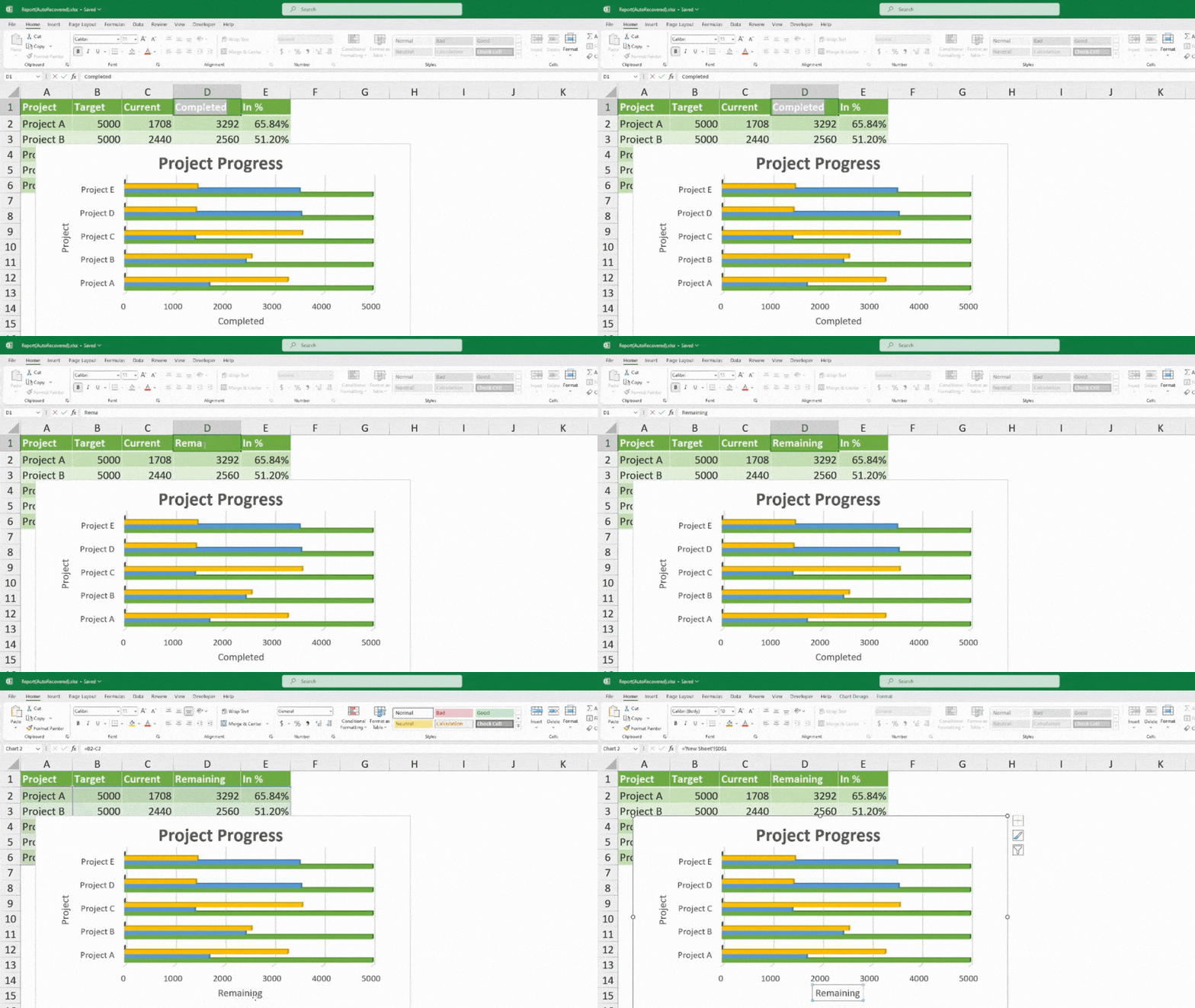
When you Add Axis titles from the Chart Elements or Chart Design Tab, you’d have to manually rename the title each time you wish to change them. But, there’s a way to make your Axis title dynamic. After inserting the Axis Title, you can create a direct reference with a specific cell/column header. By doing so, the values you change in that cell will automatically update in the Axis Title too.
Firstly, add Axis titles using any one of the above methods. Then, follow the given steps.
- Select one of the Axis Title.
- Head to the Formula Bar. Enter = and select the Cell to create the reference. Your formula should look something like this
='New Sheet'!$D$1.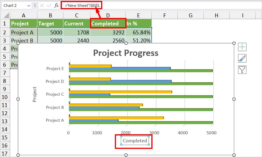
- Now, when you change the name in cell D1, the same name will update in the Axis Title too.
- Repeat the same step 1 and 2 for another Axis Title.
How to Format Axis Title?
By default, the Axis Titles you add to the Charts are formatted in Calibri font and grey color. If you wish to match the Title to your Chart theme, you can change the Text direction, Title Styles, Font, Colours, and Size as per your wish.
Customize Font
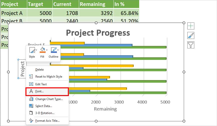
- Right-click on the Axis Title and choose Font.
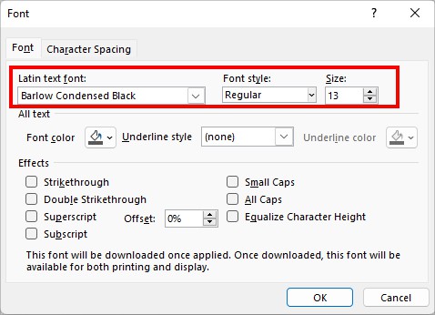
- On the Font window, set a Font type from the drop-down list of Latin text font. Then, choose your Font style and select a Font Size.
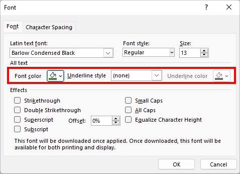
- Below the All text menu, set a Font color and Underline style.
- On the Effects menu, tick any one of the options.
- Now, go to the Character Spacing tab. Then, set the Spacing type and size for Kerning for fonts.
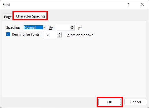
- When done, click OK.
Format Axis Title
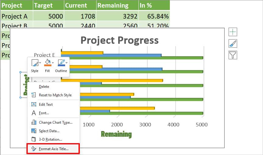
- Right-click on Axis Title and select Format Axis Title.
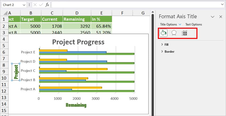
- You can see Format Axis Title on the right panel with each Fill & Line, Effects, and Size & Properties menu.
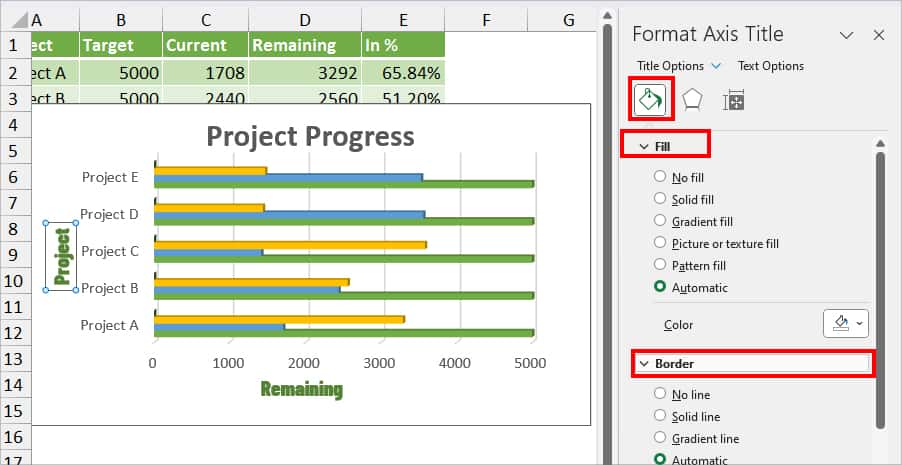
- On Fill & Line, specify the Fill, Border, Border type, Border color, Transparency, Width, Compound Type, etc.
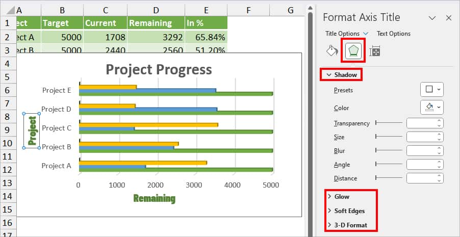
- Go to Effects to apply Shadow, Glow, Soft Edges, or 3-D format to the Axis Title.
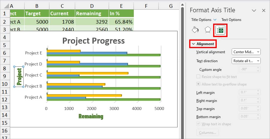
- Click on the Size & Properties menu to change the Alignment, Text direction, Margins, etc.
- Once you’re done, close the Format Axis Title menu.
Related Questions
How to Remove Axis Titles in Excel?
Removing Axis Title in Excel is as easy as adding them. If you no longer wish to keep the Axis Titles, select the Axis Title and enter the Delete key. Alternatively, you can select the Chart and click on +(Chart Elements icon). Then, untick the box for Axis Titles.