Having a good-looking email signature may be on the lowest of your priority list, but if done right, it could make a great first impression on your client. Whether you’re opting for an artistic email signature or a professional one, there’s no denying that it adds a little flair to your email.
You can get an email signature professionally done by an artist, or do a quick DIY. There are also plenty of templates available online you could use as a reference while creating an email signature.
No matter how you get your email signature done, you would want your email signature to stand out from the crowd. In this article, we’ve gathered some of the key elements that make up the best email signatures, so keep reading!
Best Email Signatures
Every email signature has its own specialty. Depending on your profession, you can add elements that will elevate a standard email signature.
Keeping it Simple and Stylish
Sometimes, less is really more. If you’re professionally a lawyer, your clients would want to be spared from the glitz and get straight to the point.
To create a simple email signature, opt for a white background and a clear font type. Make sure you use the same font throughout your signature. Use solid colors, and avoid adding too many patterns and symbols.

Add Your Name Pronunciation
Even if you’re not a linguist, you should definitely include your name pronunciation in your email signature. You can use phonetics to break down your name into syllables to help the recipient of your email learn how your name is pronounced.
This will spare you from the embarrassment of a mispronounced name when you physically sit down for a meeting.

Include your Pronouns
You can also include your pronouns in your digital signature to avoid getting misgendered. Adding your pronouns to your email will also make sure that when the recipient writes back to you, they will correctly refer to you as sir or ma’am.

Add your Headshot
Once you add a headshot to your email signature, you know that’s a signature they will remember. Adding a headshot is not only a stylistic option but a great way to show your clients how you look like.
This will also spare you the awkward “How do I recognize you?” conversation with the client before you schedule a meeting with them.

Insert your Brand Logo
Adding your brand’s logo to your email signature will help your client instantly recognize the sender of the email. This will also make your signature look more professional and more in tune with your company.

Use Vibrant Colors
Using eye-catchy colors is a great way of making your email signature stand out. Especially if you’re in a creative field, you can use lively colors as such to draw more attention to your email signature.

Play with the Background
If you’re working a white color job, it’s better if you use solid colors as your background. However, if your job is more flexible, you can get creative with your background.
For example, if you run a pottery business, you can set a picture of wheel throwing. This is not only a good stylistic choice, but also a smart way of reminding your client about your business.

Working with Brand Colors
If you usually write emails for your company, incorporating your brand colors would look amazing on your email signature.
Take, for instance, Google. If I would have to create an email signature for Google, I’d use the colors in Google’s logo: red, yellow, green, and blue. Using brand colors would not only be a good aesthetic choice, but it definitely is a great way to show team spirit.

Go Monochrome
Monochrome colors are different shades of the same colors. While being elegantly timeless, using monochrome colors adds dimension to your document.
If you’re looking for a style that is more professional and stylish, you should incorporate monochromatic colors in your email signature.

Use Bold and Clear Fonts
Your email signature is a way your clients can contact you in the future. Therefore, you don’t want to use cursive fonts which can be hard to read.
Use readable font types such as Arial, Times New Roman, or any similar font to make your information more clear. You can also apply the bold formatting to words you wish to emphasize. Remember, your email signature is not only for aesthetics.
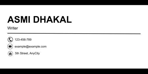
Establish a Hierarchy with Font Sizes
This may sound simple, but font sizes play a huge role in every document. We are naturally drawn more text with bigger font sizes before the smaller ones. You can use this to create a hierarchy within your email signature.
Use bigger font sizes on basic details such as your name, company, and your title. If you wish to add extra information, you can enter them in smaller font sizes. In addition to establishing a hierarchy, it will also make your email signature look less littered.
Leave White Space
Your email signature will look like a mess if you do not leave some white space in between them. You need to make sure that the data in your email signature is nicely spaced out so that they appear more clear.
If you already inserted a lot of information, avoid using textured backgrounds, and adding decorative elements to your signature. Remember, content is king.
Insert Icons
Instead of typing the name of the social media, you can use their icons and then enter your username. Similarly, you can add icons in place of writing “Phone Number”, “Email address”, and “Home Address”. This will save space in your email signature and make it look less cluttery.
Incorporating Social Media
Social Media has become a part of our lives. Personally, I’m more likely to answer a direct message than a phone call.
If you run an e-commerce brand, you could drop your social media handles including, Facebook, Instagram, and Twitter. For more professional use, you can insert your LinkedIn username.

Insert a Call to Action Button
Instead of telling people how to do it, show them. You can use CTA elements in your email signature to make them more interactive.
Your CTA element can be something like “Book Now”, “Contact Us”, or “Learn More”.

Attach Links
You can add links to your personal work, or even your company website in your email signature. Additionally, you can hyperlink the social media icons to redirect the user to your social media page in one click. When you do so, your client can look into your or your company’s work in more detail.
Apart from usability, hyperlinks are interactive elements that make your email signature more visually appealing.

Place a QR Code
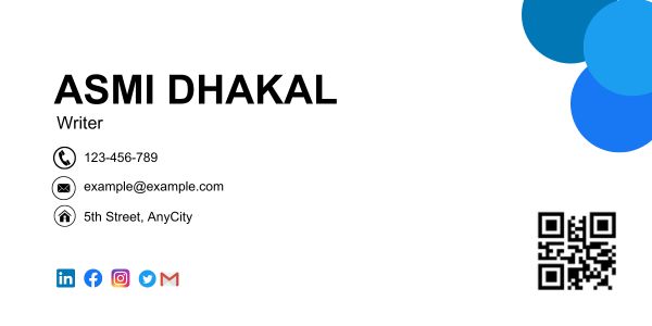
You cannot fit everything on your email signature. Therefore, you can insert a QR code that leads the email recipient to a separate document with the rest of your information.
If you’re an employee, you can create a document specifying your employee ID, joining date, project number, and other similar information. Then, you can create a QR code and attach it to your email signature.
Add Related Pictures
Say, you’re sending an email to the attendees for a campfire event you’re about to host. Adding a visual element such as a tent amidst the woods can be a great way to grab the attention of the attendees. This will also give the receipts something to look forward to, adding to the anticipation.

Draw your Signature
This is personally my favorite way to personalize an Email signature. Anything handwritten adds a stylistic touch to a digital document. Not only this, but adding your hand signature is also a great way of validating the fact that this email was in fact, sent by you.

Use Symbols
If you have a lot of white space in your email signature, you can fill these empty spaces using symbols in the background. This is a quirky way of decorating your email signature to make it stand out from the rest.

Attach Festive Greetings
It is important to keep your email signature up-to-date. This includes not only updating your headshot with time but also adding a few festive elements to your signature. This will make your email signature look fresh and updated. Let’s be real, who doesn’t like a little “Happy New Year” greeting at the end of the year?

Embed Brand Offers
If you’re in the marketing business, your email signature could be a great way to attach offers your brand is giving out right now. This could easily be a part of your marketing campaign.
For instance, if your company is having a Black Friday sale, all your employees could have ads like “50% off for Black Friday” at the end of all their email signatures.

Attach Legal Requirements
If there are any legalities you need to disclose with your client, you can declare them on your email signature.
This information could be about the sent information or your company in general. It could state that the email you just sent is confidential, or something that’s relevant to your email.

Insert a Visual Instruction
If you’re writing an email as an instruction to perform an action, you can help the recipient visualize the process through an animated GIF.
Let’s assume your email asks users to complete a survey, your email signature could have a GIF that shows the recipients to get to the website where the survey is being taken.

Include Audio
You can also add an audio element to your email signature. This element could be concerning your work or even your pronunciation. You can use one of many websites available online to create an email signature that supports audio files.
Make your Signature Mobile Friendly
Your signature is probably not the best if it only looks good on a desktop. You need to make sure that your email signature looks great no matter which device it was viewed on.
Use appropriate dimensions to make your signature more mobile-friendly. As most phones don’t fit dimensions of more than 400 pixels, we recommend you create your signature smaller than that.
Animate your Signature
You can add life to your signature by adding animated GIFs! You can even go a step further and animate your headshot. Imagine your client’s reaction when they see your headshot waving at them through the screen!

Add a Mini Portfolio
Adding a mini portfolio featuring your best work in your email signature is a clever way of grabbing your client’s attention. If you’re a photographer or an artist, you could make their heads turn by adding a few of your works under your email signature.

End with a Quirky Quote
You could add a more personal touch to your email signature by writing a quirky note toward the end of your email signature. This extra element usually impacts more than you realize. If you’re witty enough, you could make the most memorable applicant for your client!

Add a Thoughtful Message
If you usually send out digital documents through emails, you can end your email signature with messages such as “Save Paper” and “Think Before Printing”. You can also add other messages that are more relevant to your conversation.
